


The sun is out, your shirtsleeves are cuffed, a spring’s in your step, and you’re ready for your… first day of kindergarten?
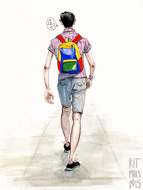
Groupings of primary colors are forever associated in my head with children’s toys, color-coding, and the simple, friendly atmosphere of school classrooms for young children. Bright, uncomplicated reds, yellows, and blues felt condescending to me as a kid, like the world of package design was telling me that I wasn’t smart enough for more nuanced tones yet.
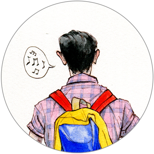
I don’t think this gangly adult human walking in front of me in New York City was deliberately trying to look like a small child, but that backpack looks like a prop from Sesame Street, or like what a performer at a drag ball would wear to accomplish “schoolboy realness.”
The costume effect was very much downplayed by the pastel pinks and blues of his shirt and shorts, but this could also be something of a deliberate subversion—toys marketed to little girls are often in shades of pinks, purples, and soft blues, while neutral and “boy” toys are generally in solid (and to my mind, grating) hues of red, yellow, green, and darker blue like the we see on the backpack.
Here’s a facetious question on the performativity of gender: is this outfit a representation of feminine people carrying the baggage of masculinity? Perhaps! But it’s probably a coincidence. Never let anyone tell you that fashion doesn’t mean anything.
Follow The Art of Style by Kit Mills. For more of Kit’s work, check out their website.