

 Image via One World Metro
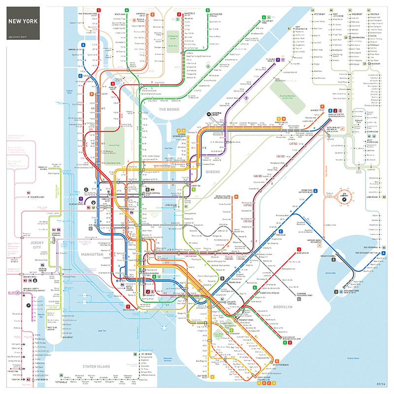
Every lost commuter knows that the New York City subway map is not the easiest thing to read. Over the years, it has been tweaked over and over again in an effort to make it more consumable and user-friendly. (Check out our roundup of historic and future iterations here.) Paris-based designer, Jug Cerovic, is the latest mastermind to take on the daunting task. Back in 2014, he created his own rendition of the NYC subway map, and after receiving some feedback from users, he’s added final touches, including a more geographically accurate depiction of Brooklyn.
The new map is part of an expansive series created by Cerovic, who set out on a mission to redesign mass transit maps for over three dozen international cities. They can be found in a 160-page hardcover book, One World Metro, which is currently behind funded on Kickstarter.
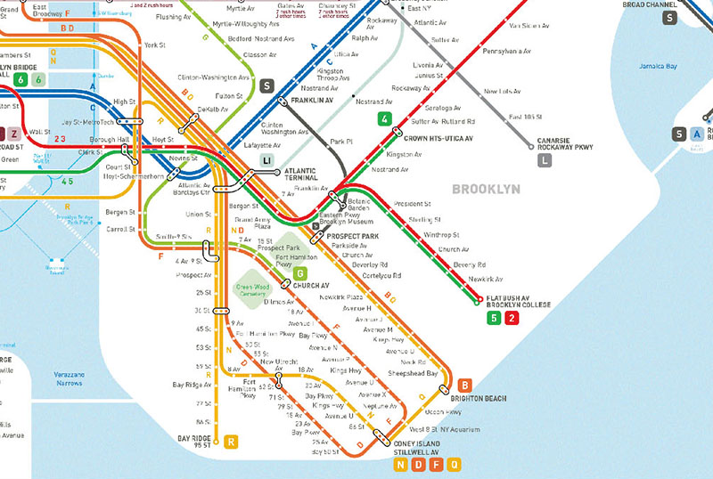 Image via One World Metro
Alongside some smaller aesthetic changes (Staten Island, ferries and Newark have been added), Cerovic’s updated version of the NYC subway map includes an enlarged layout to fit Brooklyn in a topologically accurate way, on a diagonal axis. Previously, the borough was squeezed into a squared layout, which distorted its shape. Coney Island, consequently, ended at the same ‘latitude’ as Downtown [Manhattan], Cerovic explained to Gothamist.
The colors for the B and D subways lines have also been reverted back to their usual orange shade. Originally, Cervoic had depicted them as magenta in order to differentiate them between the F and M lines on his 2014 map.
Next, check out this NYC Subway Map that shows every stop named after women, and a map that includes subways AND buses.