After-Hours Tour of the Fraunces Tavern Museum: "Path to Liberty"
Explore a new exhibit inside the oldest building in Manhattan, a witness to history throughout the Revolutionary War Era!


Whether you’re a local or visitor, you are bound to have stepped foot in Times Square at least once. Located within the “Special Midtown District,” Times Square has its own set of zoning rules. In fact, the garish billboards that have became the hallmark of Times Square are not a coincidence, but planned down to the smallest detail from the minimum surface area of light on street frontages, where signage must face, to the mandatory level of brightness for illuminated displays. With more than 360,000 pedestrians passing through Times Square everyday, it is no wonder many stores have joined in the competition and add a little extra to their usual signage displayed elsewhere.
Here are the 10 most “blinged out” signage that passersby won’t miss even if they try to:
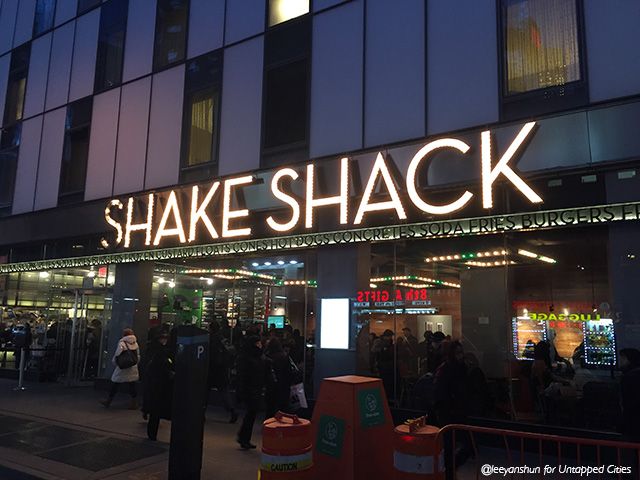
Eat while taking in the action in Times Square at Shake Shack
Shake Shack started off as a simple, high quality burger joint sold from a hot dog cart in Madison Square Park. The brand’s iconic minimalistic signage is found at its 17 outposts, but this one in Times Square is nothing but. Rumor has it that burgers served here is the least shackburger-like, but it looks like the jazzy signage and large windows are still attracting large amounts of patrons.
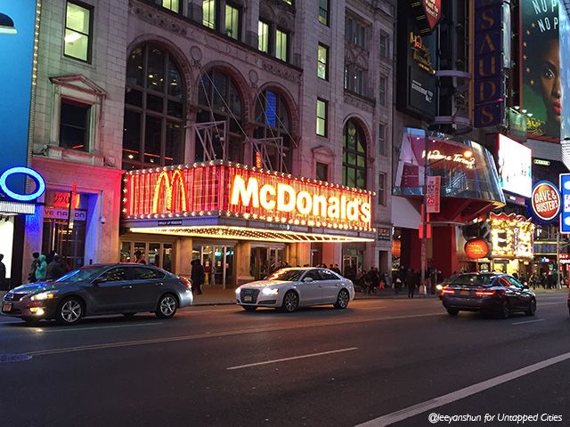
It’s a different world under that McDonald’s marquee
Not all McDonald’s are created equal. Most are in fact quite pedestrian, with the easily recognizable “M” set in on a wooden grating. If the Golden Arches has a New York flagship store, the one on 42nd Street would be it. The full length theater marquee with a total of 7,500 light bulbs running along all sides harken back to the era of the Harris Theater– a state-of-the-art picture palace designed in the Italian Renaissance style. Blasting music greets patrons as they order from a counter that looks more like a box office than a fast food chain.
The Times Square McDonald’s is located in the Candler Building, constructed between 1912 and 1914 by the founder of the Coca Cola company. The terra cotta building, listed on the National Register for Historic Places, was one of the last to be built under the 1916 Zoning Resolution, which featured setbacks.
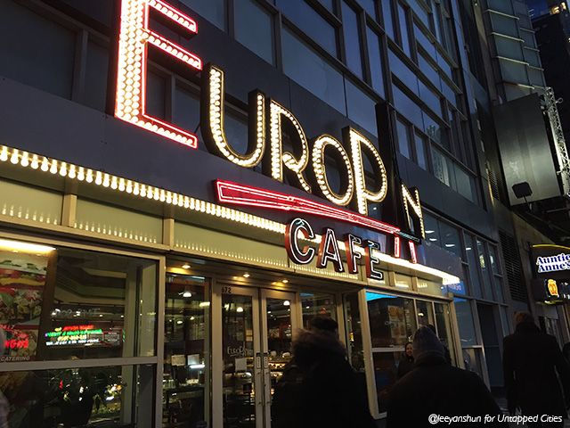
Grab a snack at the flashiest Europan in town
Offering a large selection of pastries, sandwiches and desserts, Europan Cafe is a deli cafe popular among locals and tourists alike. Considered more of a low to mid price option, the cafe’s signage usually features the universal acrylic light box, adorned by close-to-tacky green and red neon lights, and the Eiffel Tower in place of the “A.” In Times Square, its fancy cousin features illuminated bulb lights with oversized words for extra bling.
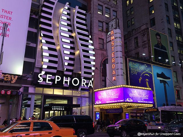
Sephora’s black and white signage competing with all the bling around
The ubiquitous beauty and cosmetics store Sephora is known for its white sans serif name set on a black background. Even at high end malls like The Mall at Columbus Circle, the store simply illuminates the side walls with its iconic stripes and “S” logo. In Times Square, the Sephora sign is accompanied by a lavish three-dimensional backdrop emphasizing the brand’s S-shape logo with offsetting black and white horizontal lights.
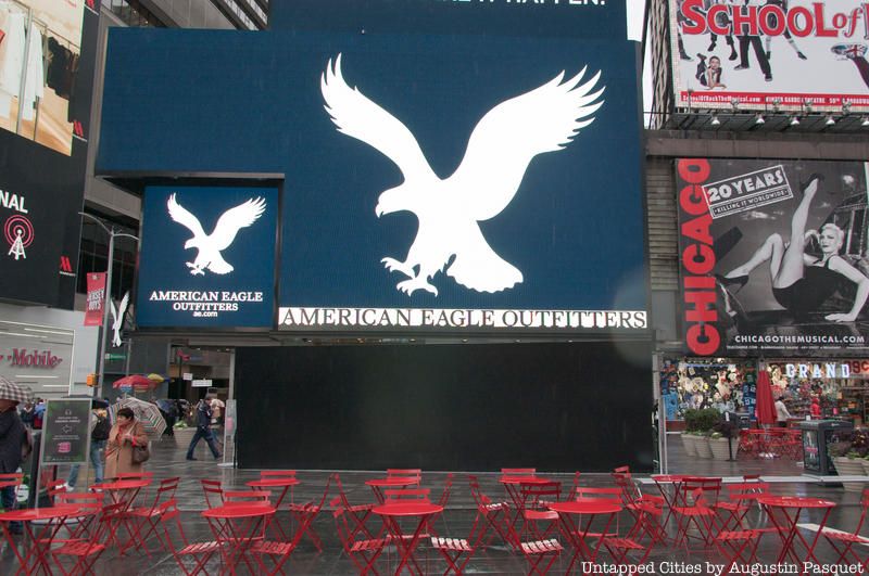
American Eagle Outfitters brand emphasizes the quintessential American style, using a simple palette of navy blue, white and red for its serif font signage, a perfect representation of its preppy garments. Compared to its counterparts, American Eagle’s flagship store on takes form of a 25-story multi-tiered display made of 12-faceted LED panels, almost 15,000 square feet in size.
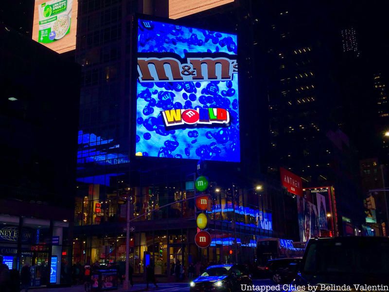
The M&M’s World in Times Square doesn’t have another store in New York, but also doesn’t need one to be compared to. As one of the must-sees for tourists, the two-story candy and novelty goods store has a billboard pretty much the height of the building. Diagonally facing the intersection, the LED screen displays in-your-face images round the clock and oversized M&M candies on thefacade.
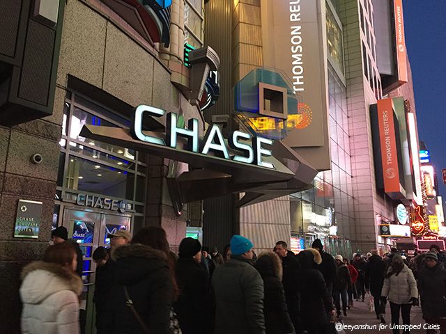
Chase bank in Times Square is more subtle but still hard to miss
Even the bank needs to stake its claim in Times Square. Chase Bank’s 500 other branches in New York are mostly utilitarian, with rather small logos etched onto windows only to delineate different kinds of branches. Though glittering signage are not to be seen at the JPMorgan Chase & Co. bank branch at Times Square, it sets itself apart by repeatedly using its logo on every window. At the main entrance, the lantern-like octagonal logo not only lights up, it even rotates!
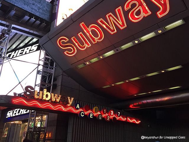
42nd Street entrance
MTA subway stations are usually announced by signature green railings with the letter “M” printed on white and green light bulbs. It might be considered inappropriate for the city subway to be too glam-ed up, but the MTA is definitely not shy about their flashy subway entrances. One of the more extreme ones on 42nd Street features wavy awnings with lit sides and blinking letters on the word “Subway.” This renovation was part of the rehabilitation of 42nd Street in the late 1990s and early 2000s, which also included moving the Empire Theatre 168 feet down the street.
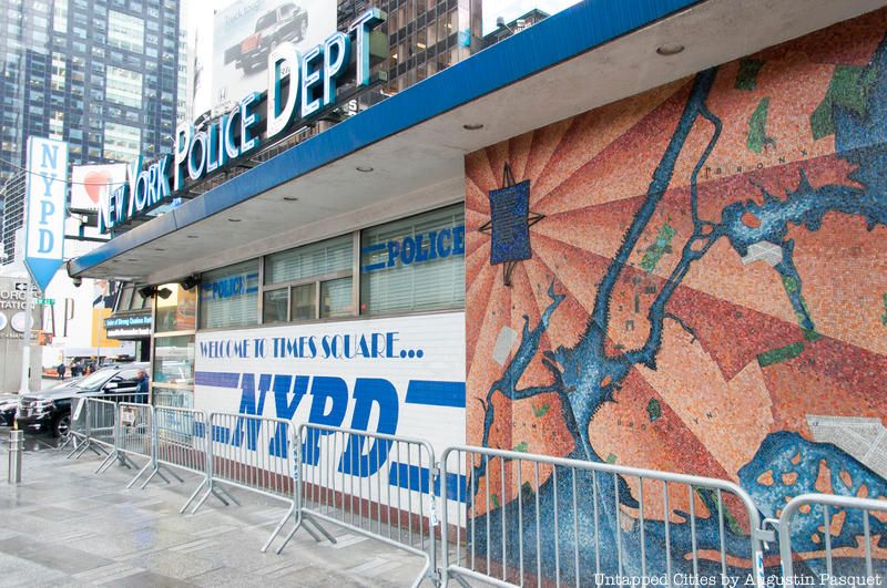
NYPD office sitting in the center of Times Square
Last but not least, why wouldn’t the police want to join in the fun? The NYPD office here looks entirely unique from its other institutional-looking concrete structures, with white and blue letters highlighting the letters NYPD. Even at a single story height, this NYPD office sitting right in the middle of Times Square is probably the most eye catching structure besides the famous red steps. But changes are afoot for this police station, as the New York Times reports.

One Times Square was originally built as the headquarters of the New York Times but today it is one of the emptiest, yet most profitable buildings in Midtown. The only tenant, besides oversized signage, is Walgreens which uses LED panels to announce the “Walgreens NY experience.”
Next, learn more about The Top 10 Secrets of Times Square
Subscribe to our newsletter