


Contrary to what the Starks up at Winterfell would have you believe, summer is coming. For those of us who feel exposed and uncomfortable without a scarf and blazer on, this is a tragic time of year involving a lot of forlorn sweating, sunburn, and gin-and-tonics with a very high ice-to-tonic ratio. On the plus side, not everyone is a total curmudgeon about putting away their collection of wool sweaters until September, which means there are cute people everywhere enjoying their breezy summer duds in the great outdoors. People-watching is better in warm weather, for obvious reasons, so one of my favorite low-intensity things to do is put together a good summer playlist (usually a lot of the White Stripes, Violent Femmes, and Van Morrison) and go for a walk.
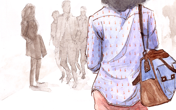
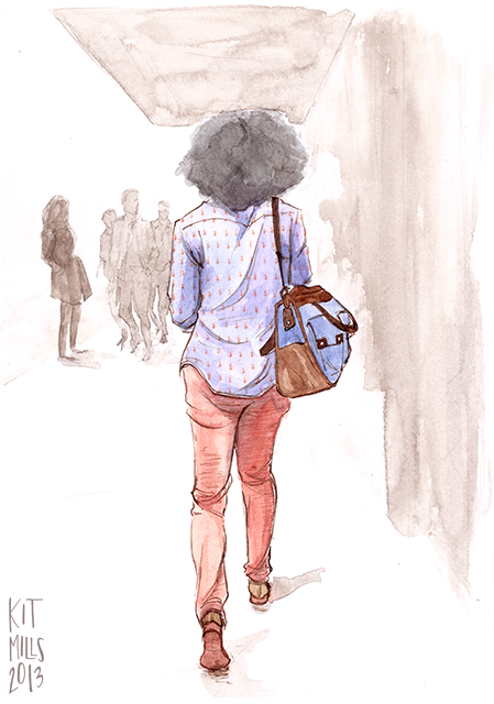
Bright colors are an obvious staple of fashion in the heatstroke months, and I love seeing people matching them in interesting ways. If you work in an office in corporate America, you’re familiar with the bland khakis-and-light-blue-oxford look. It’s so popular because shades of blue and brown/orange are complementary, and the rule holds true even if you bump up the saturation and take it outside in the sunlight away from fluorescent office lights. I ended up walking behind this lady for a few blocks in midtown and never got a glimpse of her face, but I’m almost positive she was wearing some casual but sharp sunglasses (gold-rimmed wayfarers?) to go along with her outfit. The colorful soles of her shoes, almost but not quite matching the shade of her pants, were also a nice surprise.
Follow The Art of Style by Kit Mills. For more of Kit’s work, check out their website.