
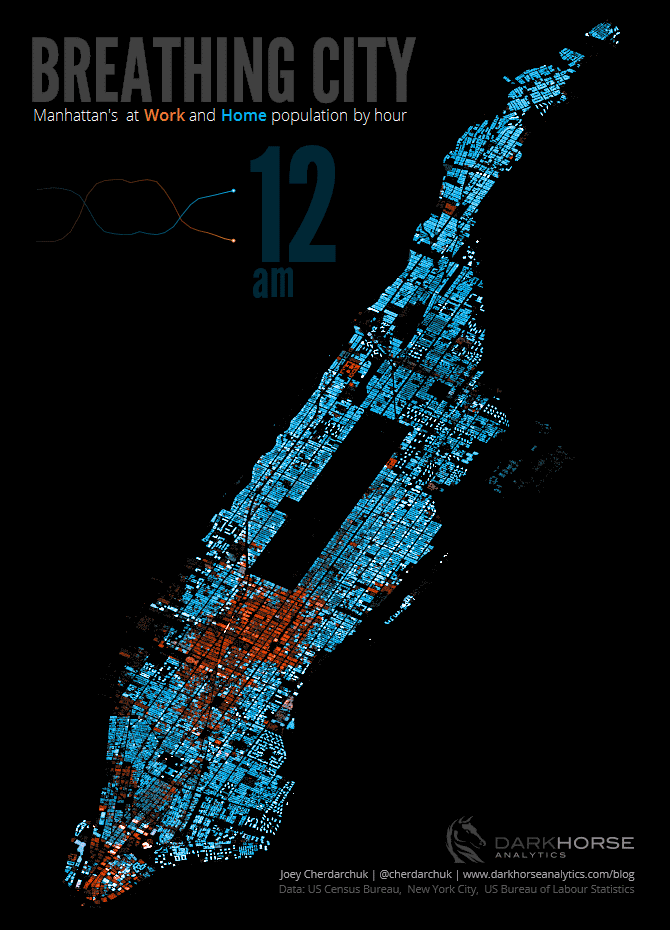
As you know we love maps so much, we have a column dedicated to it. And this one is particularly beautiful. Joey Cherdarchuk of Darkhorse Analytics uses Census and Bureau of Labour statistics to chart the organic life of Manhattan’s live/work population. He writes, “I wondered if I could make a breathing city. Manhattan looks somewhat lung-like, so it seemed natural. Should be a fun, quick project. How naive I was.”
In his blog post, he details the many steps it took to collect, parse through, and map the data. Some assumptions had to be made of the aggregate data, like an estimated work schedule. What we like most is the gif loop it’s presented in, because collectively that’s us here in Manhattan, until one of us pixels hops over to an airport and leaves the data set.
Here’s a post on the subreddit Data is Beautiful where you can see Redditors commenting on Joey’s process.
See more maps in our Fun Maps Column. Get in touch with the author @untappedmich.