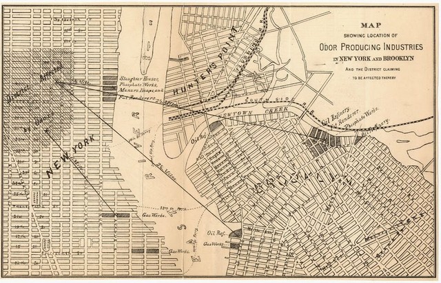
 “Map Showing Location of Odor Producing Industries of New York and Brooklyn,” 1870 from Columbia University Rare Books and Manuscript Library
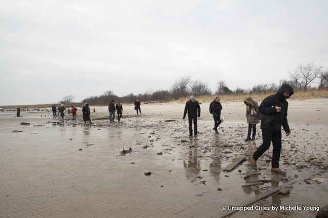
Last week, we showed photographs from the Untapped Cities tour of Dead Horse Bay, including the “fun” fact that odors from the noxious industries there were once so bad, they’d cause evacuations of the hotels on Manhattan Beach. This week, Tanvi Misra at City Lab has uncovered a great “stench map” made by the New York City Metropolitan Board of Health in 1870. Unlike a map of what the sewers smelled like in 1910 we previously covered which locates smells at the point of smell, the Board of Health stench map locates “offensive traders,” or the industrial culprits of the smells.
Although Dead Horse Bay, used first as a horse rendering facility and then later as a city garbage dump, is not on this map, areas like heavily polluted Newtown Creek are. The map also highlights the relationship between Manhattan and Brooklyn, as the five boroughs were not consolidated into one city until 1898. A large swath of upper Manhattan is designated as “district affected by odors,” with the source marked as the gas works at 23rd Street, Newtown Creek‘s oil refineries, fat renderers, and phosphate works, and the industrial activities in an inlet at North 14th Street in Brooklyn.
As Misra points out, this map was produced during a time that industries were moving to Brooklyn to escape the stronger regulations on Manhattan. Unfortunately as we know today, no matter how far away you move noxious industries or how far below bury trash, they’ll still pollute the environment.
Next, see what the sewers smelled like in 1910 or this fun map of street smells today.