


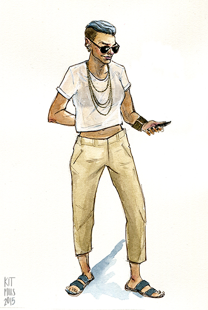
Beige gets a bad rap, as far as colors go. Sure, it may be the color of oatmeal, a food long derided for its blandness. But people who compare boring things to oatmeal obviously aren’t cooking it correctly, because oatmeal with spices and fruit and nuts in it is delicious. Same goes for wearing supposedly “neutral” colors—of course it’s going to look dull if you don’t inject any personality into it.

This person clearly understands the power of neutrals worn deliberately. Everything in this outfit is a shade of brown or grey, but paired with some shiny gold jewelry and a cool silvery undercut the whole thing comes off as a sort of unconcerned-but-still-sharp desert chic. Even the basic white t-shirt avoids plainness by virtue of its cropped cut and sheerness. The confident smirk and the no-nonsense pair of sunglasses help the whole look, too. The only thing I’m not completely sold on is the sandals, but it’s not because they don’t look good with the rest of the ensemble. I just can’t imagine wearing open footwear while walking around in New York City. Gross.
Follow The Art of Style by Kit Mills. For more of Kit’s work, check out their website.