Last-Minute NYC Holiday Gift Guide 🎁
We’ve created a holiday gift guide with presents for the intrepid New Yorker that should arrive just in time—
We’ve created a holiday gift guide with presents for the intrepid New Yorker that should arrive just in time—

From lobster traps to origami animals, discover how quirky trees are decorated across the five boroughs!


New York City’s architecture changes and evolves with design trends. Sometimes, buildings get full makeovers. Other times, they go through slow transitions, barely noticed. Here are 10 buildings and structures in New York City that have had deliberate color changes over the years:

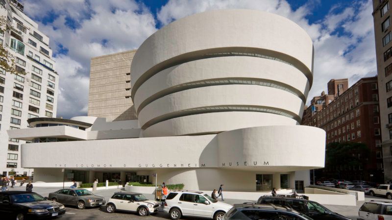 Photograph by David Heald © Solomon R. Guggenheim Foundation, New York.
When Frank Lloyd Wright was designing the Guggenheim Museum, he imagined it in a color, rather than the iconic neutral it is today. As The New York Times reports from the book Frank Lloyd Wright, Complete Works 1943-1959, red was the architect’s first color of choice, with a model made in the color. “Exterior: red-marble and long-slim pottery red bricks,” he wrote in 1944 to Hilla Rebay, art adviser to Solomon R. Guggenheim, “the color of creation.” Earlier prototypes for the museum, in a different form than the iconic spiral, were in blue, pink, peach, and ivory. Red was decidedly not palatable to Guggenheim or Rebay, who then suggested yellow or green marble. Wright came back with black.
By 1952, Wright proposed that the exterior be of concrete and marble gravel, “a look similar to alabaster,” reports the book The Guggenheim: Frank Lloyd Wright and the Making of the Modern Museum but the marble got cut because of the budget. Finally, it came down to the color “PV020 Buff” which the Times describes as a “tepid statement.”
And then when the museum actually opened in 1959, the color was changed to a “tint of cream and very soft yellow.” Wright had no say, as he was already dead, and the choice turned out to be a poor one. Robert Moses was quoted describing the building as “jaundiced.” Architecture critic Lewis Mumford wrote that it looked like a “sort of evaporated-milk ochre.” Since that time, the color has evolved ever lighter, from “an indeterminate beige or buff to the more recent near-white light gray.”
The Statue of Liberty is made of copper (3/32 of an inch thick, in fact) and when it arrived, it was just like the color of the penny. Reports vary as to when the Statue of Liberty started to turn green (from oxidation), but the New York Historical Society reports that the Statue of Liberty was fully green by 1920 based on vintage postcards. By 1910, it was half brown and half green.
Buy tickets online for a Statue of Liberty and Ellis Island Tour and save 10%
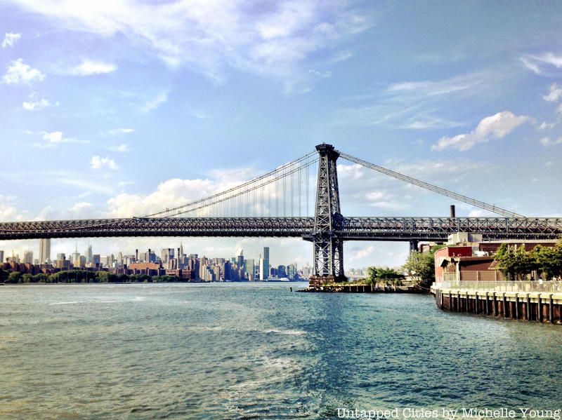
The Manhattan Bridge was originally a medium gray color. But in the 1970s, it was repainted “Manhattan Blue.” The official colors of Manhattan are orange and blue, as you’ll see on the borough flag. The Chief Engineer decides what color is appropriate for any particular structure in the New York City system, “Bridge Man” Dave Frieder tells us.
Hell Gate Bridge was originally painted black, but in 1996 to 1997 Senator Patrick Moynihan (the namesake of Moynihan Station next to Penn Station) decided it should be a deep maroon “Hell Gate” red. Due to a poor overcoat and pigment, it has faded over the years to a light pink. The paint is protecting the steel but the color composition of the paint has failed.
The other bridges in New York City all have had slight changes as well, continues Frieder. The George Washington Bridge, planned as a pink granite Beaux Arts bridge) was originally a silver color, but since lead paint can’t be used anymore, it is painted a very light grey. The Henry Hudson Bridge used to be a forest green to match the trees surrounding uptown. Today, the TBTA bridges, which include the Verrazano, Throgs Neck, Triborough, Bronx-Whitestone and Henry Hudson are all painted a gray green.
Palazzo Chuppi in 2013
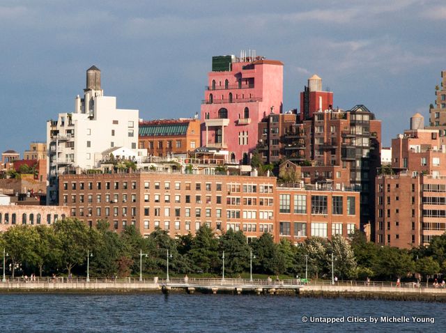
The Palazzo Chuppi is one of the more noticeable buildings in the West Village, rising in pink above former stables. It’s the lair of Julian Schnabel, who lives in one of the units inside. Over time, its shades of pink have changed, going from a hot magenta pink to a shade likened to “Pepto Bismol,” and then to something in between. The Curbed NY archive on Palazzo Chuppi gives a sense of its changing colors. Read more about the Palazzo Chuppi here.
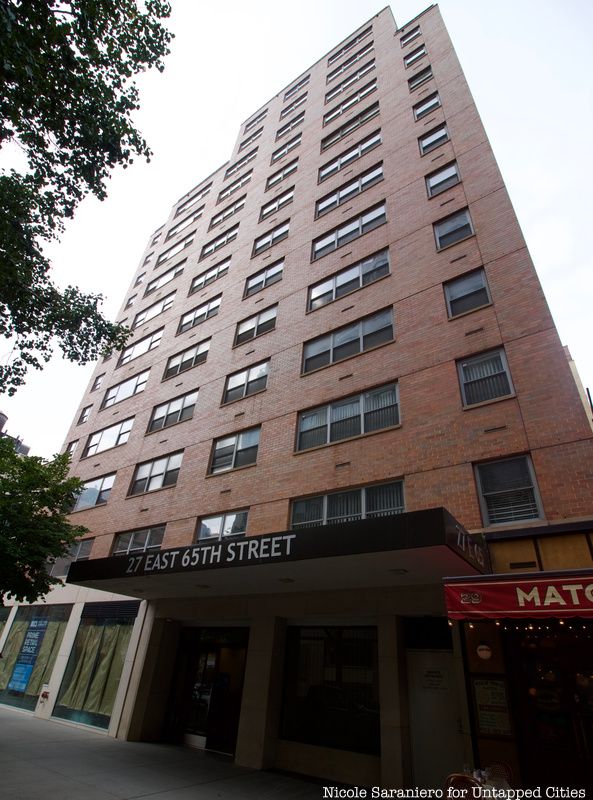
One of the most famous debates about building color took place regarding the Upper East Side co-op at 27 East 65th Street. Its blue-glazed brick was so distinctive, the building was colloquially known as the “Blue Brick Building.” But its difference was precisely what doomed it – it was deemed not contextual to the neighborhood. In 2002, it was changed to red brick, with approval from the Landmarks Preservation Commission, with The Friends of the Upper East Side Historic Districts stating that the blue building did not “reflect any of the characteristics of the district.”
Seri Worden of the organization also called the building’s color “innately inappropriate” in an interview with The Observer. Others like Charles Warren, the chair of Community Board 8, felt that the neighborhood was architecturally homogenous enough, without the change from blue to red. Meanwhile real estate agents felt that the blue had been a deal breaker, and the new color would make the building more sellable.
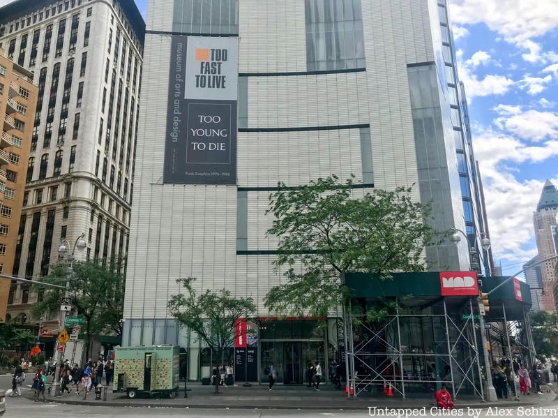
Perhaps even more controversial was the renovation of 2 Columbus Circle, a building that had been part of an on-going preservation battle for landmarking. It began life in 1964 as the Gallery of Modern Art, showcasing the collection of A&P heir, Huntington Hartford, which included works by Dali (commissioned especially for the opening), Rembrandt, Monet, Manet and other famous painters. The marble clad building was divisive architecturally from the get-go, but by the early 2000s there was a sort-of revival for it. It landed on many must-save preservation lists, including the 11 Most Endangered in 2006 by the National Trust for Historic Preservation. By that point, the building had changed hands and was eventually gifted to the city by Gulf and Western.
The Museum of Arts and Design was selected as the developer and commenced a renovation and expansion of the building, changing the appearance drastically. Its striped new look was nearly universally derided by architectural critics when completed, but the views from the popular restaurant atop, Robert @ MAD, are rather stunning.
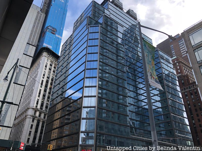
Sometimes, the pressure to fit in is just too much. With the arrival of the Time Warner Center in 2003, the buildings around also got an upgrade. 3 Columbus Circle was the relic of a prior time when Columbus Circle was filled with auto industry companies, following a previous incarnation as a theater district. This 25-story building was originally built by the Fisk Tire Company, nicknamed the Colonnade Building because of the three-ring story of columns at its base. It’s still there, but was completely clad in blue glass in 2010, obscuring the Corinthian column details at street level.

Located on 108 Wyckoff Street in Boerum Hill, Brooklyn, the mosaic townhouse is easy enough to find in the midst of all the brownstones that are located on this tree-lined street. Because unlike the varying shades of brown that characterize the other homes on this block, this house has shards of crockery, colorful beads, round buttons, pieces of marble and more stuck on the outside of this otherwise unassuming house. It’s a brilliantly colored mosaic, with every glance at it bringing to the forefront some component that you may have missed before.

This work of art is the creation of Susan Gardner, who started pasting things on her house years ago in 2001. According to a report in Brooklyn Bureau, Gardner, who was a teacher of art at Yeshiva University, started off the mosaic with a small flower, and has continued sticking on things in the decade that followed. Many of her neighbors, who love the burst of color Gardner’s project has brought to the block, have contributed to the project as well, by bringing buttons, broken plates and other such knick-knacks to the artist’s doorstep. “It was one of those things that seemed to change the tilt of the world,” Gardner says. “Once I started [the mural], I couldn’t stop.”
In the photo above, and in this article, you’ll see the beige brick that forms the base of the townhouse facade.

The original plans for Grand Central Terminal called for an entire city, dubbed Terminal City, to accompany the now landmarked train station.
The Biltmore was the brainchild of Gustav Baumann and was the fourth grand New York City hotel to be designed by Warren & Wetmore, the architects of Grand Central. Its design ensured that at twenty-six stories it still maintained a harmonious relationship with the rest of Terminal City. A palm court, grand ballroom, Italian garden, and private arrival station at Grand Central ensured that the Biltmore would be in a class of its own. Its name lured the likes of Zelda and F. Scott Fitzgerald to honeymoon there. Fitzgerald and J.D. Salinger incorporated the hotel into their stories.
In August 1981, the Biltmore was gutted and from its steel frame was transformed into Bank of America Plaza, or 335 Madison Avenue. A small reminder of the building’s past is still present at 335 Madison Avenue. The clock that once hung at the entrance to the Biltmore’s palm court and its piano can still be found in the lobby of 335 Madison Avenue.

This graffiti brownstone is on 2nd Avenue between 6th and 7th Avenue in Park Slope, Brooklyn. The friendly colors and design contrast strongly with the security camera warnings on almost every window.
The below Google street view image from May 2011 shows the property unpainted with street art but also overgrown with vegetation. The front yard has been cleared and replaced with small sculptures.
Next, discover the Top 10 Secrets of Grand Central Terminal and 10 Architectural Holdouts in NYC.

Subscribe to our newsletter
