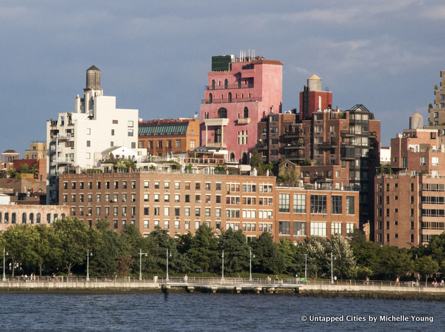
New York City’s architecture changes and evolves with design trends. Sometimes, buildings get full makeovers. Other times, they go through slow transitions, barely noticed. Here are 10 buildings and structures in New York City that have had deliberate color changes over the years:
1. Guggenheim Museum

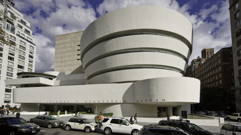 Photograph by David Heald © Solomon R. Guggenheim Foundation, New York.
When Frank Lloyd Wright was designing the Guggenheim Museum, he imagined it in a color, rather than the iconic neutral it is today. As The New York Times reports from the book Frank Lloyd Wright, Complete Works 1943-1959, red was the architect’s first color of choice, with a model made in the color. “Exterior: red-marble and long-slim pottery red bricks,” he wrote in 1944 to Hilla Rebay, art adviser to Solomon R. Guggenheim, “the color of creation.” Earlier prototypes for the museum, in a different form than the iconic spiral, were in blue, pink, peach, and ivory. Red was decidedly not palatable to Guggenheim or Rebay, who then suggested yellow or green marble. Wright came back with black.
By 1952, Wright proposed that the exterior be of concrete and marble gravel, “a look similar to alabaster,” reports the book The Guggenheim: Frank Lloyd Wright and the Making of the Modern Museum but the marble got cut because of the budget. Finally, it came down to the color “PV020 Buff” which the Times describes as a “tepid statement.”
And then when the museum actually opened in 1959, the color was changed to a “tint of cream and very soft yellow.” Wright had no say, as he was already dead, and the choice turned out to be a poor one. Robert Moses was quoted describing the building as “jaundiced.” Architecture critic Lewis Mumford wrote that it looked like a “sort of evaporated-milk ochre.” Since that time, the color has evolved ever lighter, from “an indeterminate beige or buff to the more recent near-white light gray.”