Secrets of NYC
✨You Can Touch the Times Square New Year's Eve Ball!
Find out how you can take home a piece of the old New Year's Eve ball!
Find out how you can take home a piece of the old New Year's Eve ball!

From Brooklyn to the Bronx, we’ve rounded up the most exciting giant menorahs that will light up throughout the next eight evenings!


Image via The Standards Manual/Pentagram
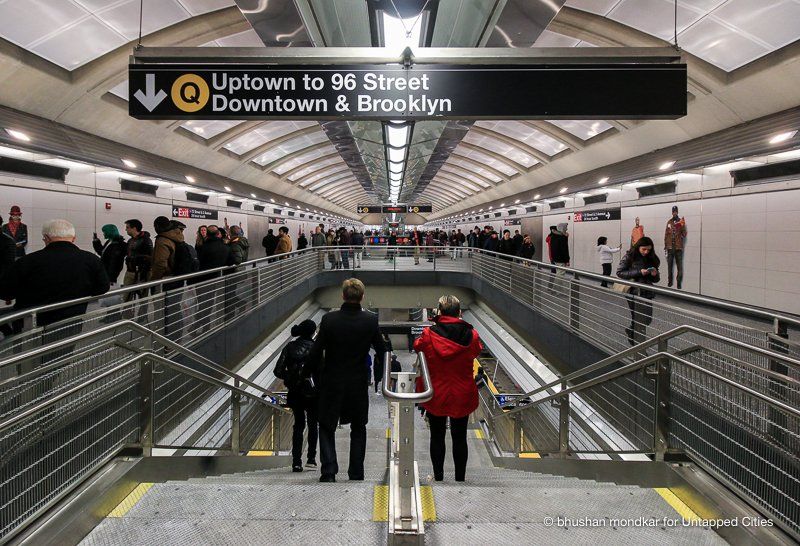
When most people think about the New York City subway, they think of the Milanese graphic designer Massimo Vignelli. And when most people think about Vignelli, they think of the typeface Helvetica. Massimo Vignelli arrived in the United States in 1965, and soon started his first project with the New York City Transit Authority. His major work was the New York City Transit Authority Graphic Standards Manual, which unfortunately, was loosely adhered by the NYCTA. The collaboration was not satisfactory to say the least, causing much frustration to the designers, the implementers as well as passengers. Here are 10 secrets of the graphics standard manual, which Vignelli would probably roll over in his graves had he seen the current “designs”.
It is widely known that Vignelli was a strong proponent of the Helvetica font, and did express his desire to deploy it to the 1970 manual. Contrary to believe though, the original typeface chosen for the subway signs was not Helvetica, but a very similar typeface – Standard Medium. According to Paul Shaw’s article on AIGA, Helvetica was already offered for sale in New York City at the time, but due to unavailability in American type books as well as barriers in the sign making process, it was “not available” to NYCTA.
In 2011, Paul Shaw’s book Helvetica and the New York City Subway System: The True (Maybe) Story offers readers an in-depth investigation of the emergence of Helvetica in the New York City’s transportation world as well as design world.
The original manual intended signs to be black on white, but were later switched to white on black in order to combat the citywide explosion of graffiti in 1973. The conversion was spearheaded by R. Raleigh D’Adamo, head of the office of inspection and review at the MTA from 1970 to 1975. The intention was to improve legibility, thus information on signs was generally left unchanged. Nevertheless, a thin white line at the same width now becomes the ghost of the black stripe, and is used as a graphic representation not only seen on signs, but on posters and other MTA publications.
In 1966, NYCTA first hired Unimark International – an international design consultancy established by Massimo Vignelli, to advise it on signage and map conventions. The firm was recommended by associate curator in the department of architecture and design at MoMA. Vignelli and Bob Noorda- another founding partner of Unimark, were expected to deliver a report in the short span of four months, and despite the designers’ effort in prototyping sign mockups and creating presentation boards, the proposal was merely “thanked and, apparently, forgotten.” To Vignelli’s surprise, NYCTA fabricated a series of signs using its in-house shop, and carried out Unimark’s proposal without the designers’ instruction and inspection.” In Vignelli’s words, it was “the biggest mess in the world.”
Image via The Standards Manual/Pentagram
After extremely negative response from the public and design professionals, NYCTA rehired Unimark in 1968 to carry on the work they had started. The New York City Transit Authority Graphic Standards Manual was finally issued in 1970. It was a manifestation of four years of work, including “Noorda’s traffic-flow research of mid-1966, the TA’s station December 1967 survey results, and some of the original design and fabrication specifications presented to the TA in fall 1966.”
A copy of the manual was discovered in 2012 in the basement of Pentagram Design in New York City. The firm obtained permission from MTA to start a Kickstarter project to reproduce the manual. Although the Kickstarter ended in October 2014, Vignelli fans can still buy a compact edition from standards manual.
As described in the manual, the sign system consists of a series of modular signs of specific dimensions for 3 types of prescribed signs- 1’x2′ for information, 1’x4′ for direction, and 1’x8′ for station identification. These are all made by juxtaposing 1’x1′ panels that can be used in different combinations.
The graphics manual was an extremely comprehensive guide to how different combinations of letters are used on signs. Everything including word spacing, letter spacing, leading and the number of lines per sign were carefully detailed.
The 1966 design which was also incorporated in the 1970 manual had a black stripe at the top of maps and signs. This was a response to NYCTA’s strict rules that no structural changes could be made to the stations. The visual indicator demarcated the metal channels suspended from the ceiling by black struts to hold the signs. The black stripe was eventually translated from a physical necessity into a graphic element, “whenever the panel requires a different structure, the black band should be a part of the graphics on the signs.”

Map from MTA
Although Helvetica was widely used in many of Vignelli’s work, he did not use it on any NYCTA designs until the controversial subway map in 1972. When Vignelli designed the subway map, he has already left Unimark to set up Vignelli Associates with his wife, Lella. Since he was no longer bounded by any of the decisions previously made, it was no surprise that he naturally gravitated towards Helvetica, his favored typeface.
The introduction of the subway map and a misinformed article was the reason most people assumed Vignelli was the sole contributor to bringing Helvetica and NYCTA together.
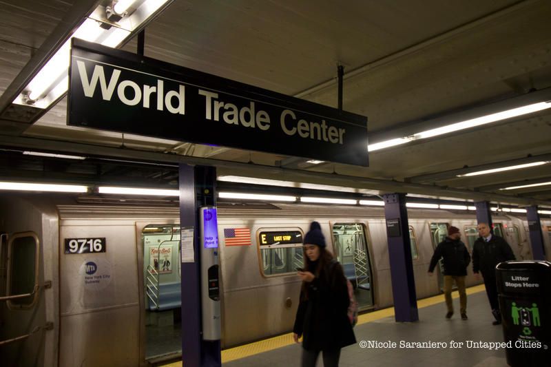
Helvetica did not become the official typeface for the New York City subway system signage until December 1989 – more than a decade after Vignelli’s first graphics standard manual was published. MTA’s Marketing & Corporate Communications Division hired Michael Hertz Associates to update the manual. The goal to update the manual was to unify all of MTA’s constituent agencies, including the Long Island Rail Road and Metro-North Commuter Railroad. From then on, Helvetica Medium has become the standard typeface for the entire MTA transportation system, which MTA passengers still see them everyday.
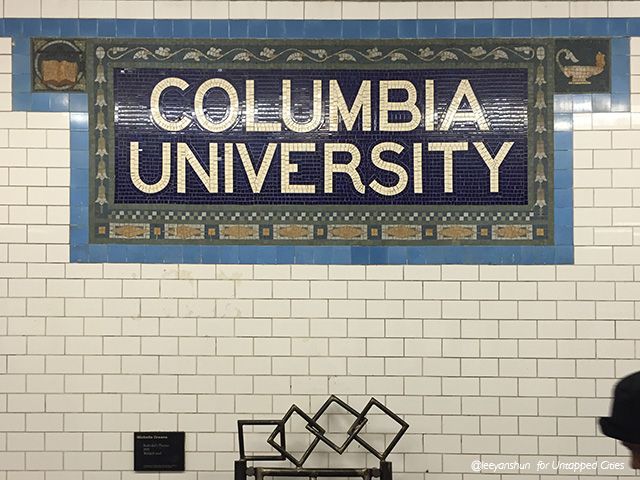
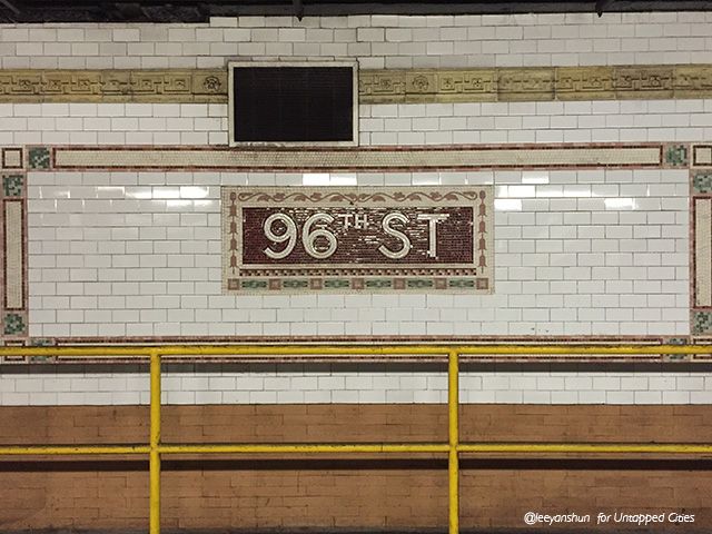
Heins & LaFarge, architects of the IRT – the private operator of the original underground New York City Subway line, designed the first signs in the New York City subway system in 1904. These are the mosaic station name tablets still seen on subway platforms today. The name tablets were made of small tile pieces in both serif and sans serif. There were not any uniform lettering system at this point, including typeface, type style, even the arrows and decorative borders came in many different styles.
Then Squire J. Vickers, chief architect of the New York City system before and after its consolidation of the lines, created a color-coded tile system for the IND subway system to help denote express and local stops.
Next, read about the Secrets of the NYC subway system and fun facts about NYC subway’s opening day.

Subscribe to our newsletter
