 Map at the Museum of the City of New York, gift of McKim, Mead & White
Maps are an important part of the Museum of the City of New York’s permanent exhibit about New York City’s 400 years of history, New York at Its Core – a must-visit for both New Yorkers and visitors. In the first two galleries, which cover the eras of “Port City: 1609 to 1898,” and “World City, 1898 to 2012,” the digital maps displayed across a triptych screen shows the increase in population and infrastructure systems for each of the time periods following three main topics that guide the exhibit: money, diversity, and density. “You get to see in a bird’s eye view kind of way the evolution of the city through three different lenses,” museum curator Sarah Henry says.
Then, within smaller screens in “World City, 1898 to 2012,” additional maps are shown on specific sub-topics, such as manufacturing in New York City, which allow the visitor to interactively engage with the map. Finally, in the Future City Lab, a large curved central display rotates through maps to your hearts desire,
The digital displays in New York at Its Core are designed and programmed by the studio Local Projects. But there are also more maps to see in other exhibits at the Museum of the City of New York, particularly in the exhibit “Mastering the Metropolis: New York and Zoning” which closes this Sunday.
Here are 5 maps we’ve highlighted to look out for in the museum (but in most cases, each map subject comes with many maps, so it’s map heaven in there):
1. Future City Lab Maps
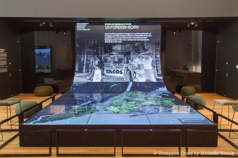
The Future City Lab has the “largest collection of digital data of the city anywhere,” says museum curator Sarah Henry. It’s the intention of the museum to keep that data up to date, so the lab is a true living, breathing tool for the future. The above map, one of many that cycle through the curved display screen, shows how many foreign born residents there are in New York City and where they live.
About 1/3 of the population of New York City is foreign born, of which the two largest groups are Dominicans and Chinese. Immigrants and their American children make up 55% of the city’s population. The display further highlights how “you can hear that diversity in the estimated 800 languages spoken in New York, making it the most linguistically diverse city in the world.” The map that follows shows that immigrants own 49% of the small businesses in New York City, distributed all over the city.
The maps in the Future City Lab fall under five main categories: Housing a Growing City, Living with Nature, Getting Around, Making a Living, and Living Together.
2. NYC Subway Development Map
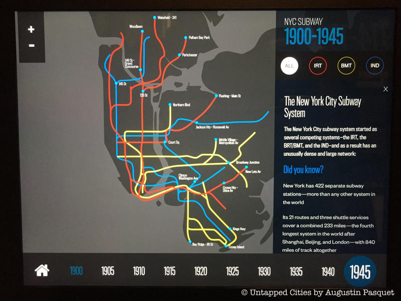
In the gallery “World City, 1898 to 2012,” you can trace the evolution of the subway system between the launch of the IRT subway line in 1904 and 1941, when the city bought the previously private subway lines (IRT and BMT) and unified them. The displays mention August Belmont, who financed the IRT line and had his own private subway car.
Today, the New York City subway system (with 840 miles of track) is the fourth longest in the world, after Shanghai, Beijing and London. Another fun fact is that the subway fare stayed constant for 40 years, from 1904 to 1948 at just five cents.
3. Industrial Map of NYC
 Map at the Museum of the City of New York, gift of McKim, Mead & White
One map is featured in two exhibits at Museum of the City of New York now. This industrial map of New York City was created by the Merchants’ Association of New York in 1922 utilizing 1919 Census data shows the diversity of manufacturing industries in New York City in the Roaring ’20s. In Mastering the Metropolis, the map is shown in its original form while in New York at Its Core, it’s converted into a digital, interactive display that highlights key takeaways.
As Sarah Henry, Deputy Director and Chief Curator at the Museum of the City of New York told us about this time period in the city:
There’s massive amount of production going on. It’s hidden in plain sight in New York City, but unlike cities that are famous for manufacturing, but were much smaller like Detroit or Pittsburgh, those places were dominated by a single industry and they were producing things in very large factories. In New York, there were many many different industries and the factories tended to be small so even though they employed many more people and produced much more product, you couldn’t necessarily see it.”
Women’s clothing brought in over $866 million a year, producing over 71% of the country’s production in that category. Men’s clothing $531.5 million a year, but was a smaller percentage of overall national production at 42%. These categories do not include other clothing categories like fur, millinery and lace goods, hats, shirts, buttons and more. New York City produced almost 96% of the country’s paper patterns (for construction clothing), almost 81% of the country’s tobacco pipes, and 90% of the country’s lapidary work (stone engraving).
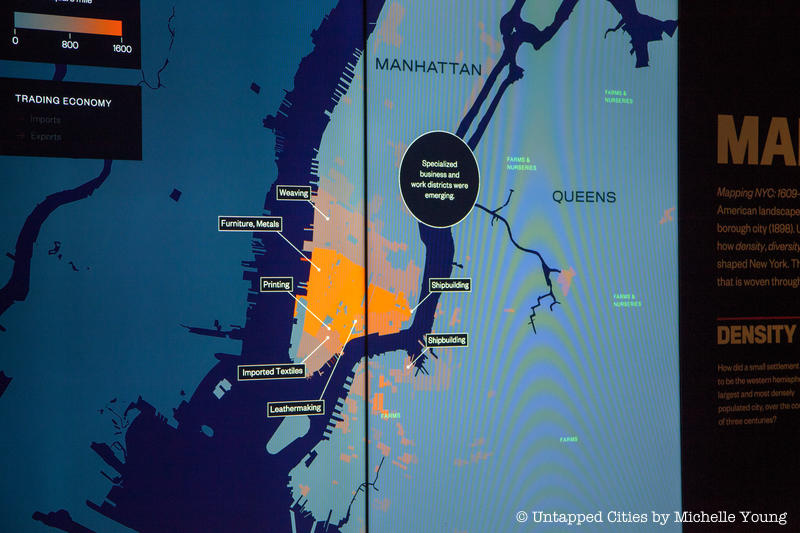
4. Following the Money from 1609-1898
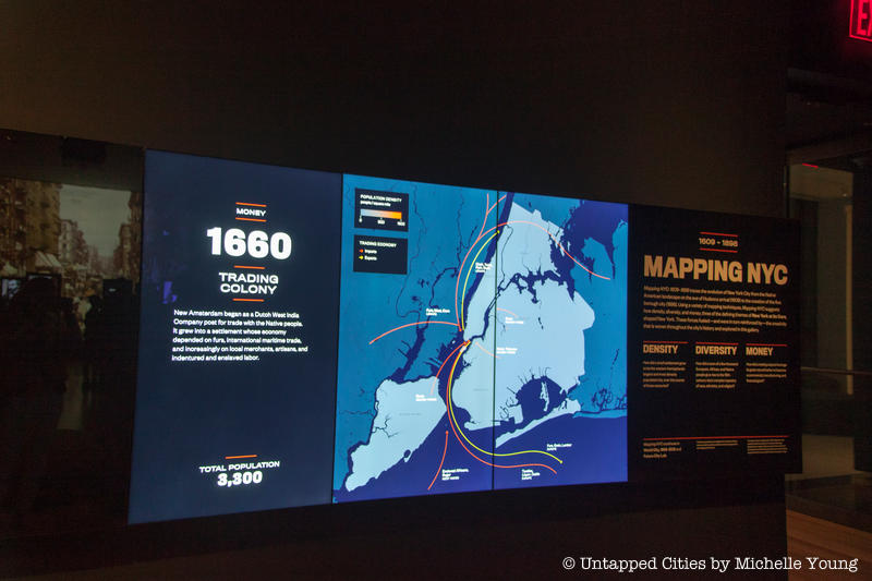
At the entrance of the gallery,”Port City: 1609 to 1898,” within New York at Its Core, one of maps series shows the evolution of New York City from trading outpost to commercial, manufacturing and financial giant. One specific map shows the trading routes under the Dutch West India Company – how fur, grain and leather were shipped to Europe in exchange for textiles, liquor and cattle. Enslaved Africans and sugar came from the West Indies, and the displays note that both the Dutch and the English economy relied on enslaved labor, with New York City as the largest slaveholding city in the northern colonies under the English.
By 1835, specialized manufacturing districts were emerging in New York City for printing, leathermaking, shipbuilding, weaving, furniture and meats:
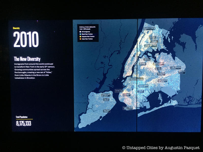
5. Diversity from 1609 to today
In the first gallery of New York at Its Core, “Port City: 1609 to 1898,” diversity is centered on the religious end. The city’s first Muslim resident who settled during the Dutch era and the first Jewish community are mapped. Under the mostly tolerant Dutch, only Catholicism was not allowed in the settlement.
Diversity in the second gallery “World City, 1898 to 2012,” is focused on ethnic diversity. The maps on density and diversity show how the 1965 immigration law, which allowed the settling of mass numbers of Latin Americans, Asians, and Africans, helped reverse a population dip – in 1990, New York City’s population was at its lowest point in 40 years.
And finally, don’t miss the full exhibit Mastering the Metropolis, which closes this weekend with a plethora of 2D maps to inspect up close:

Next, check out 10 Must See Artifacts from New York at Its Core. Read more about the Future City Lab at the Museum of the City of New York.