
Things to Do
🛶 Canoe on the Gowanus Canal + More Ways to Summer in Brooklyn
Untapped New York's founder and author of Secret Brooklyn, Michelle Young, shares her favorite things to do!
Untapped New York's founder and author of Secret Brooklyn, Michelle Young, shares her favorite things to do!
Discover how the criminal justice system has impacted music history throughout the 20th century!

Join an exclusive behind-the-scenes tour with owner Joe Cooke!


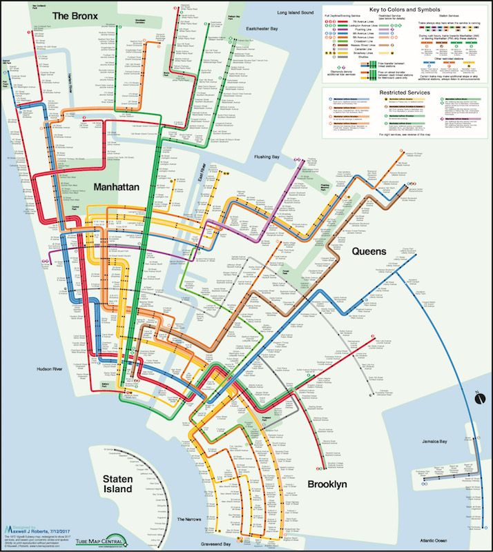
Max Roberts’ Vignelli style map. Image courtesy of Max Roberts
A few years ago, we were presented with a map of the New York City subway system that reimagined it in concentric circles. Mapmaker Max Roberts created this design to visualize the city’s cohesiveness, focusing on aesthetics to convey a perspective other than the sharp angles and geographic accuracy. To celebrate the 50th anniversary of his newsletter, Tube Map Central, that reimagines maps of the world’s underground systems, Roberts has created a brand new design of his map in the Vignelli style.As with Vignelli’s map— the original NYC subway map– each route is represented, meaning the 4/5/6 when on the same path before diverging into their respective dimensions, there’s a line for each route, so there’s three green lines next to each other, creating thick bands.
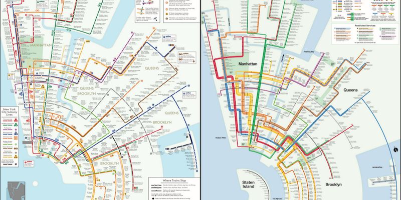
Comparison of Roberts’ original concentric circle map (left) compared to his newest using Vignelli’s design (right). Images courtesy of Max Roberts.
Roberts explains in his newsletter that the thickness of these bands made it difficult to plot everything and that he had to attempt Manhattan five times before being satisfied. But the end result is beautiful. While he and we agree that geographical purists will not be happy with this, the fact of the matter is is that New York’s subway map was never geographically accurate — Brooklyn and Queens are distorted and Manhattan was made to look more compact, with Central Park wider and the lines closer together than they actually are.
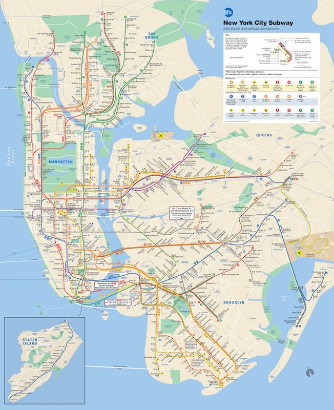
Current NYC Subway map. Image via the MTA
Roberts’ layout starts in the southwest corner with Staten Island, working up through Lower Manhattan and radiating out into the Bronx, Queens, and Brooklyn. Complete with all the station dots and information listed on all NYC subway maps, everything is the same expect that it’s been laid out in circular arcs.
Roberts like Vignelli, sees the benefits and beauty in focusing on the network than the geography. “The almost other-worldly power and marvelous precision of Vignelli’s original translate well to these design rules,” says Roberts about his concentric circle design. “A good geographical map shows where the network is, a good schematic map shows how the network fits together.”
For more fun maps, check out this Vintage 1970’s Vignelli Subway Map Unearthed At Subway Station in Midtown, NYC and a New App Maps All Real Time NYC Subway Arrival Times.

Subscribe to our free newsletters
Free Newsletters
Get the best stories and things to do sent straight to your inbox.