Last-Minute NYC Holiday Gift Guide 🎁
We’ve created a holiday gift guide with presents for the intrepid New Yorker that should arrive just in time—
We’ve created a holiday gift guide with presents for the intrepid New Yorker that should arrive just in time—

From lobster traps to origami animals, discover how quirky trees are decorated across the five boroughs!


What is your favorite New York City building? Which one(s) do you passionately detest? Often times, those most loved are also the most hated. Some are critics darlings or, alternatively, the people’s choice. Some just take awhile to get used to, while others capture the zeitgeist but fade in popularity as tastes change. Some are forever polarizing. Some, like the Twin Towers, get a second chance in public opinion, but only because of the circumstances of their loss.
Looking over New York’s architectural landscape, for your consideration we’ve identified eight controversial works, from the beginning of the twentieth century to today, that are still standing. We’d love to hear your thoughts on these or any other buildings you adore or despise.
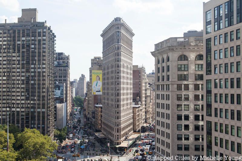
A muse of artists, photographers, and, of late, Instagrammers, the Flatiron Building is one of New York’s best loved icons and a neighborhood namesake. However, in its early days, negativity and controversy swirled around it like the wind storms it purportedly created. Insults came from many directions. “Some would call it gorgeous; it is in reality grotesque” (New York Press) and it is “a monster that violates every principle of architectural art” (sculptor William Urdway Partridge). The New York Times called it a “monstrosity,” The New York Tribune describing it as a “stingy piece of pie,” the Municipal Journal & Public Works called it “New York’s latest freak in the shape of sky scrapers” and the Municipal Art Society went as far to say it was “unfit to be in the Center of the City.”
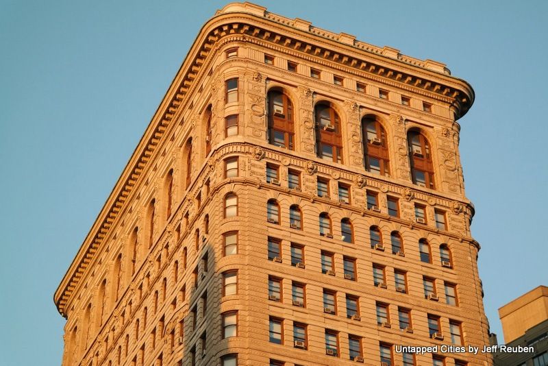
Montgomery Schuyler of Architectural Record lamented that architect Daniel Burnham “built to the limit” and went on at length about the odd shape site: “Having an awkward triangle as a site, he has not recognized its awkwardness, nor its triangularity.” What time has shown, however, is that by following those awkward dimensions, Burnham supplied the Flatiron Building with much of its singular popular appeal.
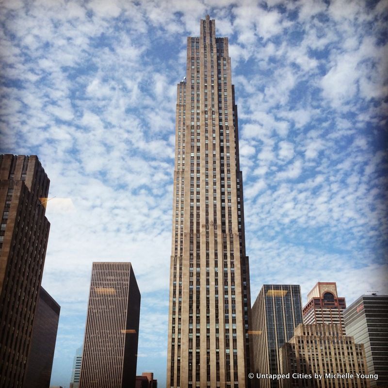
Rockefeller Center, designed by an architectural team including Raymond Hood and Wallace K. Harrison, is widely considered “the greatest urban complex of the twentieth century” (AIA Guide to New York). But it was not always so. In 1933, as it was taking shape, leading architectural critic Lewis Mumford wrote that “the whole effect of the Center is mediocrity — seen through a magnifying glass” and “every touch of ornament is bad with an almost juvenile badness.”
He was not alone. Its artwork formed a “Rockefeller chamber of horrors” (art critic Thomas Craven) and its “raw pylons, obelisks, ovoids and pyramids have nothing to do with man; their scarps and tall cliffs crush him and his soul” (architect Ralph Adams Cram).
Upon the completion of the center’s original buildings in 1940, Mumford conceded “they get by,” but called the roof gardens “insipid,” Radio City Music Hall “superfluous”, the Atlas sculpture “idiotic”, and so on. “Rockefeller Center,” he predicted, “will look pretty old fashioned by 1970.” Instead, “the center looks at once both backward and forward,” architecture critic Paul Goldberger countered, in 1976, a view that still prevails today. Or as a Gershwin song goes: “They all laughed at Rockefeller Center, now they’re fighting to get in,” Mumford excepted.
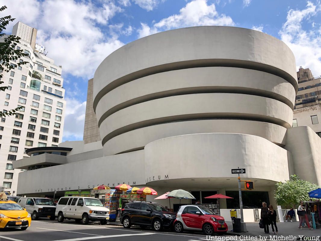
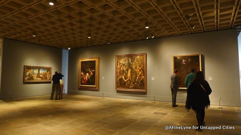
From the moment Frank Lloyd Wright unveiled his design in 1945 to its opening in 1959 and up to today, the Guggenheim Museum has evoked strong, but mixed responses. As Lewis Mumford concluded, “this is an all-or-nothing building; one takes it on Wright’s terms or one does not take it at all.”
Joining Mumford in the latter camp was Wright’s second cousin by marriage, Robert Moses, who in 1947 saw it as “a gigantic inverted cup and saucer with a silo added for good luck, [that] has no functional advantages,” later updated in 1959 to an “inverted oatmeal dish and silo.” As for its creator, “when I look at Cousin Frank’s Guggenheim Museum, I know somebody has been afflicted with a complex, Oedipus or otherwise, and has been chasing the Id down the spiral ramps in a facile descent to Avernus.”
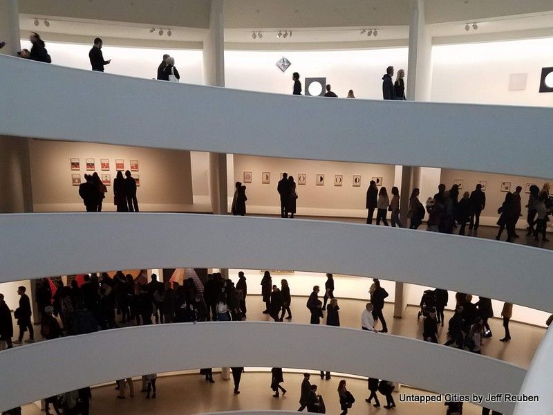
Vitriol notwithstanding, at the Guggenheim’s opening in 1959, months after Wright’s death, Cousin Bob revealed a behind the scenes role. “I can claim credit here only for successful efforts to keep Cousin Frank close to, if not quite within, the law.”
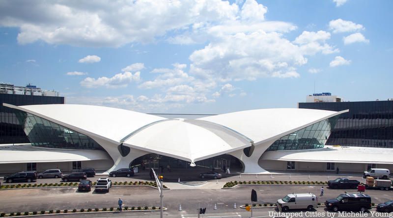
Eero Saarinen’s TWA Flight Center at JFK Airport is now considered an architectural masterpiece. However, with its curved reinforced concrete structure it broke the mold of boxy Modernism and received mixed reactions when it debuted in 1962. Most press coverage praised it for resembling a giant bird in flight. Saarinen, who died the year before it opened, dismissed this overt symbolism, saying the design meant to convey the “excitement of travel.”
Instead, many of his peers saw the bird and hated it: “a disgraceful, expressionist mannerism,” as architect Philip Johnson later recalled. Italian engineer-architect Pier Luigi Nervi believed “that Saarinen has allowed the purely ornamental instincts of the architect to take undue precedence over the engineer’s feeling for sound economic construction.”
British architect Alan Colquhoun ridiculed its “crude juxtaposition of incompatible forms” and even architecture critic Allan Temko, an admirer of Saarinen, concluded “its eloquence seems too rich for the content of the problem and in the context of its surroundings.”
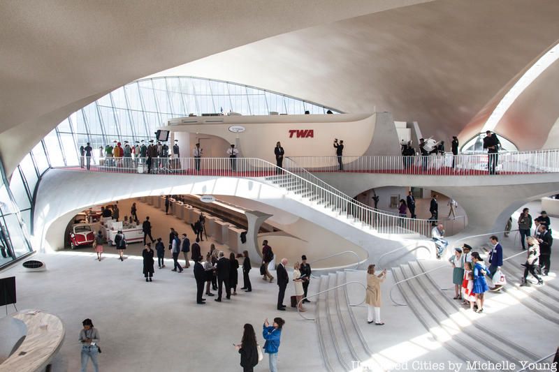
Those negative sentiments did not prevail, enabling it to survive obsolescence and abandonment until its recent nostalgic transformation into the TWA Hotel. In terms of recent critique, Michael Kimmelman, architecture critic for the New York Times, focused on the hotel’s initially rocky soft opening and challenging service, and felt that the hotel is “a theme park for that fantasy version of 1962.”. One of our readers however, who visits the hotel regularly, told us this week that the service was good, and even Kimmelman admitted that Richard Southwick, architect from Beyer Blinder Belle that led the restoration, ” deserves a key to the city. I watched people walk around as if in a trance, snapping selfies, pointing and gazing at the thin, vaulted, soaring, twin-tortoise-shell concrete roof, breathing deeply, to inhale the building’s aura, lingering because, well, just being in that space seems to inspire happiness.”
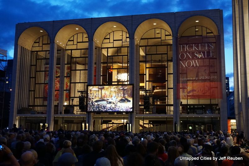
Designed by a posse of big name architects (Abramovitz, Belluschi, Bunshaft, Harrison, Johnson, Saarinen), when Lincoln Center opened in stages during the 1960s, many reviewers had a love-hate relationship with it. “It is not a disaster’ concluded both New York Times architecture critic Ada Louise Huxtable and art curator Charles W. Millard in separate appraisals. Positives: “elegant scale, color and surface” (Huxtable) and “at night Lincoln Center is an enchanting hive of activity” (Millard). Negatives: “the architecture sets no high water mark for the city” (Huxtable) due in part to a plan “isolating it from the surrounding neighborhood” (Millard).
In a similar vein, Progressive Architecture declared the Library-Museum building a “modern gem” though with a problematic interior where “masses of people and book jackets somewhat dissipate that disaster.” And let us not forget that Lincoln Center was born of a massive urban renewal that demolished a lively jazz neighborhood, part of Robert Moses’ seemingly unending slum clearance proposals to cut through swaths of New York City in the name of progress.
That ambivalence proved prescient. Lincoln Center succeeded despite a litany of problems, which have been eased by various correctives over the years, investments justified by its enduring popularity as a cultural hub.

Completed in 1966, the Whitney Museum by Marcel Breuer, with its inverted granite pyramid and spacious galleries, was embraced with mostly positive reviews, touting its “stately cladding of warm gray granite” (architectural critic James T. Burns), “clarity, force, and perceptive organization” (art critic James R. Mellows), and “suavity of detailing” (Charles W. Millard).
Among the dissenters, the “Madison Avenue monster” was “aggressive, arrogant” (art critic Emily Genauer). As for the public, it was “the most disliked building in New York,” an opinion Ada Louise Huxtable acknowledged but rebutted.
It remains admired and disliked, because the two sides see different things. “I love the potted plaza below street level, and the little bridge” (architect Winka Dubbeldam in 2011); “it’s a grim place to exhibit art… It is particularly cruel to painting.” (art critic Mark Stevens in 1998).
In 1985, the Whitney Museum even released a much-derided expansion plan to add 10 stories to the museum, which was countered by the an unofficial competition for an alternative design led by the Storefront for Art and Architecture.
Grim or not, the art keeps coming. The Whitney left for a bigger space in 2014, leasing it to the Metropolitan Museum of Art to which opened the Met Breuer, which will now sublease it to the Frick Collection, for a temporary stay, starting in 2020, when the Frick is under renovation.
The AT&T Building (later the Sony Building) at 550 Madison Avenue by Philip Johnson and John Burgee became a lightning rod as soon as it was announced in 1978 due to its Postmodern design featuring a grand arch, stone facade and, most especially, its broken pediment roof widely thought to resemble Chippendale furniture. Following decades of dogmatic Modernism, with Johnson in a leading role, a new age in architecture had arrived and with it a new criteria for judging it: humor.
Paul Goldberger wondered if the Chippendale part “suggests that a joke is being played” that in the end “may not be quite so funny.” Others dismissed the top as a “historicist joke” (art critic Robert Hughes) and a crass “one-liner” (architectural theorist Charles Moore).
To supporters, the joke was on the haters. “There is humor in his AT&T design,” architecture critic Paul Gapp agreed, hoping that in response American architecture “will stop boring us to death.” Johnson for his part did not deny his intentions. “Let’s have fun,” he said in an interview.
Architectural writer Susan Doubilet saw it as “a serious attempt to bring humor” to building design. That concerned architectural historian Frank Beckum. “If he’s doing it as a joke, then that’s alright… but if he’s doing that thing as a serious answer to the problem of today’s skyscrapers, it’s a tragedy.” Goldberger smiled in the end. When it was completed he called the Chippendale a “happy presence.”
There is one other fun angle to this building. Robert Moses may have predicted the AT&T Building. In a 1947 article, he contended that Modernist architecture and design would eventually fall out of favor and “when that day comes, Chippendale, Inc. will again sell briskly at par.” At the very least, an ironic coincidence.
550 Madison Avenue is undergoing a large, controversial renovation plan that will demolish the original privately owned public space on the ground floor, and replace the lower level facade with glass. Due to protest, a movement was led to landmark the building which took place in 2017, but exterior landmarking did not prevent interior demolition to begin in January 2018.
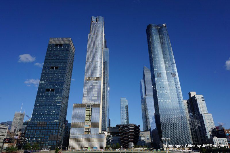
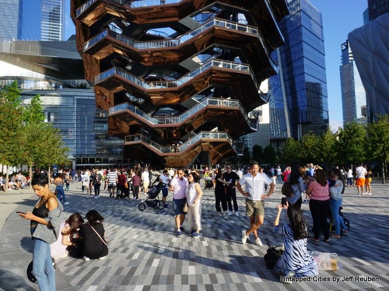
As Hudson Yards rolls out its first major phase this year with works by a stable of notable architects, its public spaces, shops, cultural venue The Shed, and stairway-sculpture The Vessel have attracted large crowds in contrast to mostly scathing criticism.
Architecture critic Michael Kimmelman is representative of the damning sentiment. Like Millard’s read of Lincoln Center, Hudson Yards “declines to blend into the city grid” and reminiscent of Mumford’s tone on Rockefeller Center, the Vessel is “casting egregious shadows over what passes for public open space.”
But the key complaint speaks to current concerns, intertwining architecture and urbanism with social and economic issues that twentieth century reviewers were less apt to conflate. Hudson Yards is “a supersized suburban-style office park, with a shopping mall and a quasi-gated condo community targeted at the 0.1 percent.”
Looking back, most contemporary reviewers barely mentioned let alone objected that Lincoln Center was a “slum clearance” project that pushed aside lower income residents for cultural facilities primarily serving those of means or challenged Marcel Breuer’s comment regarding the Whitney that “I didn’t try to fit the building to its neighbors because the neighboring buildings aren’t any good.” Hudson Yards is emblematic of its times and, so too, are the responses of critics.
Next, read about 15 secrets of the Met Opera at Lincoln Center, 10 fun facts about TWA Hotel, and a first look inside Hudson Yards.
Contact the author @Jeff_Reuben

Subscribe to our newsletter
