
Secrets of NYC
Top 10 Hidden Beaches of NYC
From Great Kills, Staten Island to Soundview Park in the Bronx, discover secret beaches in NYC for a day in the sun!
From Great Kills, Staten Island to Soundview Park in the Bronx, discover secret beaches in NYC for a day in the sun!

Discover how vacant storefronts are being transformed with works of art!


As of May 18, 2020, there have been a total of 15,888 confirmed COVID-19 deaths in New York City. This is anywhere between about 17% and 25% of all COVID-19 deaths in the United States depending on how the countrywide deaths are counted (as of most recent counts, the Center for Disease Control (CDC) lists 62,515 COVID-19 deaths across the country whereas the Johns Hopkins Coronavirus Resource Center, which has been tracking the data globally throughout the pandemic puts the deaths countrywide at 90,369). Until yesterday, the geographical locations the deaths in New York City are associated with were unknown to the public, although the COVID-19 positive test cases had been associated by zip code since the first release of the data.
We had been awaiting the official COVID-19 death data by zip code, released onto Github yesterday, to add onto our interactive maps of COVID-19 cases which we have been updating since April 2nd. Untapped New York contributor Ben Huff, who is a Master of Science graduate in Urban Planning from Columbia University Graduate School of Architecture, Planning, and Preservation (GSAPP), created all of our interactive maps using by layering the zip code shape file from NYC Open Data with the Department of Health data.
Using the new map of coronavirus deaths by zip code, which includes data starting on March 11th, 2020 (the first date of a death by patient with confirmed COVID-19), you can see the comparative number of deaths by zip code, with lighter colors having fewer cases and darker colors more. Click on a zip code area, and you get a pop-up that shows the zip code, neighborhood name, the population of the zip code, the number of positive coronavirus cases, the number of deaths, and the death rate per 100,000 residents. If you compare the map of coronavirus cases by zip code and the deaths by zip code, you get a pretty similar picture. The areas with the highest number of deaths are in the Bronx, central Queens around Elmhurst, Rockaway in Queens, and on Staten Island, Willowbrook and Stapleton-St. George, which aligns closely with where greater numbers of positive test cases are taking place.
New York City counts a death if there was a positive test for COVID-19 confirmed by laboratories and confirmations of a person’s death from the City’s Office of the Chief Medical Examiner and the Bureau of Vital Statistics. The data in the map does not include probable deaths, which includes deaths with no known positive laboratory test for the virus that causes COVID-19, but the death certificate lists “COVID-19” or an equivalent as a cause of death. Probable deaths are being tracked by the Department of Health however, and over time, probable deaths may get recategorized as confirmed deaths. Below is a map normalized by population, showing positive cases per thousand of people, and helps better understand areas that are harder hit.
Some notes: The neighborhood names are assigned by the NYC Department of Health but they don’t always align with what residents term that area, so you may find yourself questioning some neighborhood designations. Rest assured, the data by zip code is correct. The death data will also differ from those on the New York State Department of Health, which collects data differently.
Williamsburg zip code 11249 continues to be missing from the Github data file for both coronavirus cases and deaths, and we had heard NYC Department of Health has been assigning 11249 cases and deaths to 11211. As such, we have combined those zip codes in these maps so that Williamsburg data does not look misleadingly low. Because the Department of Health data sets for coronavirus cases by zip code did not (and still does not) contain population data, we utilized updated zip code population numbers from the 2014-2018 5 Year American Community Survey Census estimate which is the best count available before the 2020 Census is complete (fill out the 2020 Census!) for our maps of positive COVID-19 cases. Since the death data released yesterday by Department Health does include zip code population data (“calculated using interpolated intercensal population estimates updated in 2019, according to the NYC Department of Health), our Total Deaths by Zip Code map utilizes this population data vs. the American Community Survey Census estimate.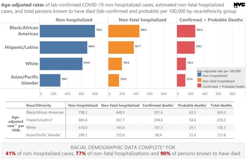
Graphic from NYC Department of Health
The NYC Department of Health has been releasing data by race of confirmed COVID-19 cases per 100,000 since April 8th, 2020. Since this data was first released, the non-hospitalized data completion rate has improved (41% now versus 24%). Completion rate is significantly higher for non-fatal hospitalizations (77%) and deaths (90%). The low completion rate of non-hospitalization data is important — the Department of Health notes that this is because the “vast majority of data is reported by labs and race/ethnicity information is often missing because it is not received on the test requisitions from providers.”
Looking at the most complete data set, deaths at 90% completion, we see that so far if we include confirmed and probable deaths, Black/African Americans are dying at a little over 2x the rate of whites, Hispanics/Latino at 1.99x the rate of whites. according to DOH, “A death is classified as probable if the decedent was a New York City resident who had no known positive laboratory test for SARS-CoV-2 (COVD-19) but the death certificate lists as a cause of death ‘COVID-19’ or an equivalent.” You can see the graphics released by NYC Health below.
As Huff tells us, “I have been looking at this data since the Department of Health started releasing it on April 1st. We have focused to map the data that is available, and given by DOH, rather than try to interpolate from it and make assumptions on who it is affecting. Zip codes are not the best geography for understanding race and class, as they cast a wide net and capture a lot of variation within their boundaries. However after mapping for over a month a few things are clear. Although very dense, lower Manhattan has been spared the worst of the epidemic. Total number of cases, and when normalized for population shows concentrations in the outer boroughs, and particularly in communities of color.”

Subscribe to our free newsletters
Free Newsletters
Get the best stories and things to do sent straight to your inbox.
