Pickled City Book Launch: The Story of New York Pickles
Join culinary historians and authors Paul van Ravestein and Monique Mulder for a lively discussion of their new book!


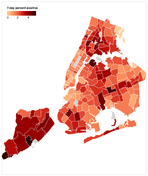
Our last update of our interactive COVID cases map on September 30th focused on the 20 hotspots zip codes that were emerging at the time in south Brooklyn and south Queens. Restrictions on those areas have been pulled back since, but now COVID cases citywide and percent positive tests are increasing. New York State’s statewide Positivity Rate is at 2.93 Percent (as a reference, for months until the September and October resurgence in the hotspots, it had been below 1%). The positivity rate in the micro-cluster hotspot zones is 4.9%. Just yesterday, Governor Andrew Cuomo announced new restrictions on restaurants, bars and gyms which now must close at 10 PM (but can continue to provide curbside pickup and takeout). Personal gatherings must be limited to 10 people. He also announced a new yellow precautionary zone on a large portion of Staten Island, where 7-day average positive rates have been above 2.5%, and cases per 100,000 and new daily hospital rates have increased.
Mayor Bill de Blasio’s spokesperson Bill Neihardt tweeted that “City Hall has been in discussions with the State on these guidelines and fully supports these actions. We must do everything we can to hold off a second wave and these steps will help us fight it back in New York City.” This reference to a “second wave: was echoed by Councilman Mark D. Levine a few days ago, tweeting “This is NYC’s 2nd wave. NYers need to rally again to flatten our curve.” NYC Public Schools are approaching the level of rolling positive rate that may force their closure — it’s at 2.52% and will close if that hits 3%.
The number of zip codes seeing new cases has risen considerably since our update on 9/30 which clearly showed four distinct large clusters (Staten Island, south Brooklyn, south Queens, central Queens) and a few other smaller, less intense ones in Williamsburg, and in the Bronx). Now, those clusters have expanded and we’re seeing new cases diffused through most of the city, particularly in Staten Island, south and central Brooklyn, central Queens, and possibly an emerging cluster in the Bronx.
Untapped New York contributor Ben Huff, who is a Master of Science graduate in Urban Planning from Columbia University Graduate School of Architecture, Planning, and Preservation (GSAPP), created all of our interactive maps using by layering the zip code shape file from NYC Open Data with the Department of Health data. The interactive map at the top of this article shows cases since the beginning of November, by zip code. Below, we’ve updated the total number of COVID cases by zip code since the beginning of the pandemic until 11/9 as well as the deaths by zip code, so you can have a cumulative sense.
Below is an interactive map of deaths by zip code in New York City. New York City counts a death if there was a positive test for COVID-19 confirmed by laboratories and confirmations of a person’s death from the City’s Office of the Chief Medical Examiner and the Bureau of Vital Statistics. The data in the map does not include probable deaths, which includes deaths with no known positive laboratory test for the virus that causes COVID-19, but the death certificate lists “COVID-19” or an equivalent as a cause of death. Probable deaths are being tracked by the Department of Health however, and over time, probable deaths may get recategorized as confirmed deaths.
Some notes: The neighborhood names are assigned by the NYC Department of Health but they don’t always align with what residents term that area, so you may find yourself questioning some neighborhood designations. Rest assured, the data by zip code is correct. The death data will also differ from those on the New York State Department of Health, which collects data differently. Williamsburg zip code 11249 continues to be missing from the Github data file for both coronavirus cases and deaths, and we had heard NYC Department of Health has been assigning 11249 cases and deaths to 11211. As such, we have combined those zip codes in these maps so that Williamsburg data does not look misleadingly low. Because the Department of Health data sets for coronavirus cases by zip code did not (and still does not) contain population data, we utilized updated zip code population numbers from the 2014-2018 5 Year American Community Survey Census estimate which is the best count available before the 2020 Census is complete for our maps of positive COVID-19 cases. Since the death data released by Department Health does include zip code population data (“calculated using interpolated intercensal population estimates updated in 2019, according to the NYC Department of Health), our Total Deaths by Zip Code map utilizes this population data vs. the American Community Survey Census estimate.
You can also see a map from NYC Department of Health of positive test data in the last 7 days on the department’s COVID information page:

Subscribe to our newsletter