NYC's Long-Awaited Davis Center Opens in Central Park
A stunning new facility at Harlem Meer opens to the public this weekend!


Architect James Polshek has written his memoir, Build/Memory (Monacelli Press), with all the substance, drive, and élan that made him famous in the first place. His buildings aren’t just structures standing quietly, waiting for something to happen. Instead, they live vigorously in their neighborhoods, engaging with their surroundings and landscape, changing with the light, evolving with the seasons. While you may not have heard of his name yet, you’ll definitely recognize some of his buildings, like the Brooklyn Museum and the Rose Center for Earth & Space at the American Museum of Natural History. Here are some of his favorites—and ours.
Does anyone not love the Rose Center? As you approach the American Museum of Natural History from West 81st Street, it seems to emerge, like a child’s idea of a fanciful alien space ship, from the remnants of the original Hayden Planetarium—itself a child’s idea of an astronomical playground. Both versions—Polshek’s and the 1935 original designed by Trowbridge & Livingston—speak profoundly to children and their dreams of universes beyond the earth.
While the first Hayden was not a New York City landmark, it was deeply loved—even when outdated and deteriorated. (Polshek calls it “despressing,” which isn’t quite fair.) And the surrounding enormous museum complex of multiple buildings and lavish grounds not only is a city landmark but is listed on the National Register of Historic Places. Polshek had to watch his step.
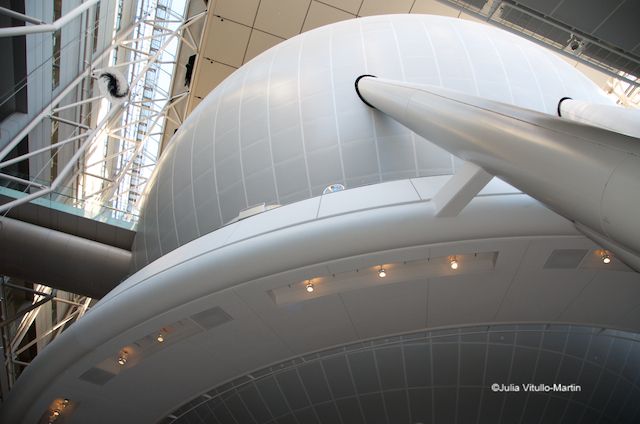
The orb within the cube seems weightless, says Polshek, because only one of three sets of supports is visible.
Heeding a guideline from the city’s Landmarks Preservation Commission that alterations to a landmark had to be reversible, Polshek decided to maintain the Hayden footprint. This would allow the museum to complete its early 20th-century plan for the original exterior envelope, if it so chose, while quieting neighborhood critics who wanted to keep everything as it was.
But quite a few neighborhood critics objected to the Rose Center’s potential success—and its accompanying foot and vehicle traffic—as they much as they feared any failure. Polshek recalls that “working on the technical aspects and public portrayal of the building simultaneously shifted our work into high gear. It was very much like planning an invasion, with equal emphasis on offense and defense.” Within this preservationist-seeming spirit Polshek and his colleague Todd Schliemann created something utterly new on top of the old—an 87-foot wide sphere, contained within a 7-story, 95-foot-tall glass cube that shimmers at night and invites in the neighborhood by day.
Yet today it’s probably fair to say that most Upper West Siders agree with the New Yorker‘s architecture critic, Paul Goldberger, who wrote in 2000, “By the standards of New York, where cultural daring is usually cut off at the knees, this may be the most important building of the decade, if only because it happened.” Goldberger goes on to say that no one knows why the Rose Center has had such a charmed life, but surely one aspect was the Normandy-like planning and campaigning that Polshek and his colleagues undertook.
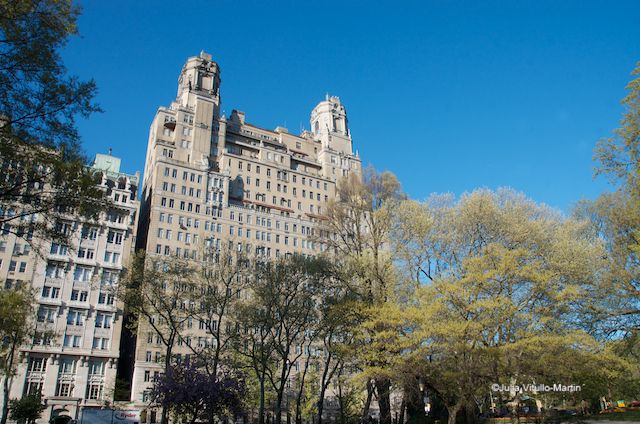
The most ferocious opposition came from the museum’s fellow landmarked building, the Beresford, across the street.
Buildings on top of buildings are fun, and New York just doesn’t have enough of them. It’s as if our local apprehension of new construction and rigid adherence to conservative zoning have blinded us to the exuberance of putting wild new structures on top of old staid ones. We ban the new and stick with the staid.
So anyone wandering around the well-preserved but sadly dull South Street Seaport Historic District who comes upon the old Seamen’s Church Institute headquarters—seemingly an elegant white ocean liner—perched on top of the Schermerhorn Ship Chandlery at 241 Water Street is likely to smile. Common in European cities, this kind of building-on-building is just so far out for New York. In our view, it’s good architecture—and good preservation. A late 18th-century mercantile building, whose brick facade includes a lovely quoined service entrance, the chandlery is one of the few left from New Amsterdam.
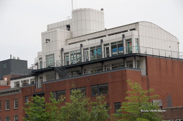
Seamen’s Church Institute on top of Schermerhorn Ship Chandlery in South Street Seaport Historic District
But achieving this combo wasn’t easy—and must have been phenomenally expensive. They started with a serious engineering problem. They had been planning to integrate the historic edifice into their new building, but Polshek found that the chandlery’s foundations “were supported on three layers of 18th-century timber cribbing.” The city’s buildings department said the masonry walls were unsafe and had to be demolished. Polshek saved the façade, reconstructed it on the original location, and replicated the footprint and floor plan. Because they were building on landfill they needed a lightweight steel structural system, he says.
The story has one of those familiar sad/happy New York real estate endings. Given that New York is no longer the destination of choice for ships (or sailors), and that Port Newark had decades ago rendered New York Harbor obsolete, the Seamen’s Church Institute in 2010 decided to relocate to Newark itself. But they made a handsome profit selling their building to the Blue Man Group, which has converted it to a lively school. “After all,” says Polshek stoically, “blue is the color of the sea.”
A final fun fact: the Seamen’s Church Institute got its start as a floating church in the East River.
Why, you might well ask, did the Brooklyn Museum need a flamboyant new entrance to its gorgeous but reserved Beaux Arts building, designed by McKim, Mead & White in the late 19th century? The answer is one of New York’s most astonishing acts of official vandalism—the destruction of the magnificent 68-step classical staircase that led visitors from the sidewalk to the third-floor lobby. Ordered by museum director Philip Youtz (called a “theological modernist” by Polshek) and promoted as a populist move, the 1934 demolition meant that visitors would henceforth enter through the dismal basement.
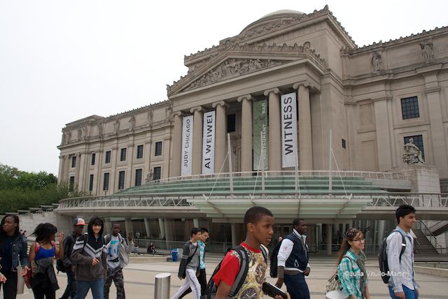
Polshek’s rounded glass entrance seeks to correct a 1934 act of vandalism.
For many reasons, including federal disability regulations, Polshek did not seriously consider replacing McKim Mead & White’s stairway. Instead, he decided to maintain the museum’s classical symmetry while embracing contemporary democratic notions of merging indoor and outdoor spaces in welcoming ways. This he accomplished with a curvilinear entry that includes a sheltering glass pavilion and an elevated walkway for which he uses the French term, passarelle (meaning skyway or fast bridge).
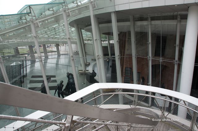
Polshek’s passarelle connects one side of the arc to the other while allowing you to see into the pavilion.
The light thus allowed into the museum reveals the Rodin sculptures in all their detailed glory while also shining on the surrounding neighborhood and borough that have so long sheltered the museum, through hard times and now good.
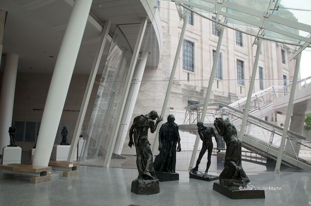
Rodin’s Burghers of Calais stand in the Rubin Entrance Pavilion of the Brooklyn Museum.
Get your copy of Build/Memory on Amazon. Julia Vitullo-Martin is a Senior Fellow at the Regional Plan Association. Get in touch with her @JuliaManhattan.
Subscribe to our newsletter