Last-Minute NYC Holiday Gift Guide 🎁
We’ve created a holiday gift guide with presents for the intrepid New Yorker that should arrive just in time—


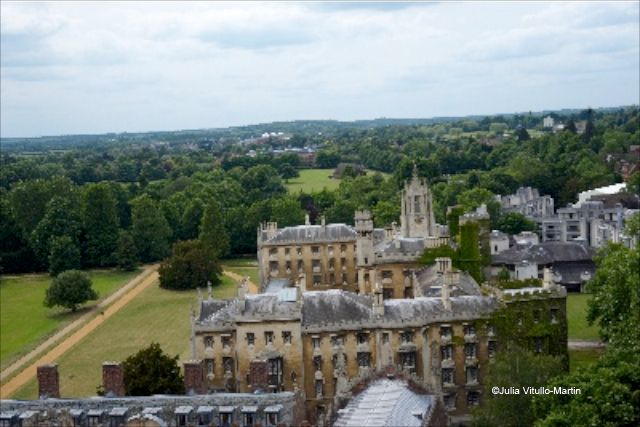
How is it that nearly a century after its birth, pure architectural modernism can still shock—and even repel—sophisticated urban dwellers? We pondered this question recently while wandering around one of our favorite small cities—Cambridge in the United Kingdom. Home to the University of Cambridge, which was founded in 1209, Cambridge had been settled centuries before by the Romans and then the Saxons. It was conquered in the 9th century by the Vikings, who brought trade and wealth, and by the Normans in the 11th century.
Yet this ancient town today hosts a surprisingly large collection of modernist and post-modernist buildings, some of which stand in stark hostility to their surroundings while others are beginning to blend into the landscape, much as their forebears have.
We began our walk, as many do, by strolling The Backs (behind the colleges) in order to make our way to one of Cambridge’s most renowned sights—King’s College Chapel. Begun in 1446 as what we would now call an urban renewal project, the chapel was an obsession of King Henry VI, who spent years buying and leveling a large swath of the city’s once flourishing commercial center, closing streets and cutting off access to the river to enclose what he hoped would be England’s largest and greatest college. The chapel’s foundation stone was laid in 1446 but, as is common in urban renewal, it would take an additional 65 years to finish the stonework and 40 years on top of that for the interior, as the town’s economy languished.
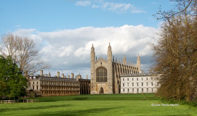
Yet today King’s College Chapel stands in unquestioned magnificence, beautifully sited on the River Cam, once an active commercial thoroughfare now tamed to a quiet host for punters, rowers, and kayakers.
Can modernism compete with this glorious product of the Middle Ages? Perhaps an unfair question.
I made my way across Queen’s Road, with its implacable traffic, and walked up West Road, headed for the Sidgwick Site, one of the largest development sites freed up after World War II. The university’s intention was to consolidate all humanities and social science teaching and research at Sidgwick, directly across from the University Library (UL) and a 10-minute walk from town.
But first I stopped on the site’s border, 5 West Road, to pay homage to the lovely limestone (Ancaster Hard White) Stephen Hawking Building, erected starting in 2005 where his Victorian brick villa had long stood—and where he wrote A Brief History of Time. The demolition of Hawking’s house had given preservationists pause, but their activism had a side benefit: a preservation order covered several trees, forcing the architects to work around them. The pleasing result is the sigmoidal shape—S for Stephen, suggests owner Caius College—which is very unusual in this straight-lined, right-angled town.
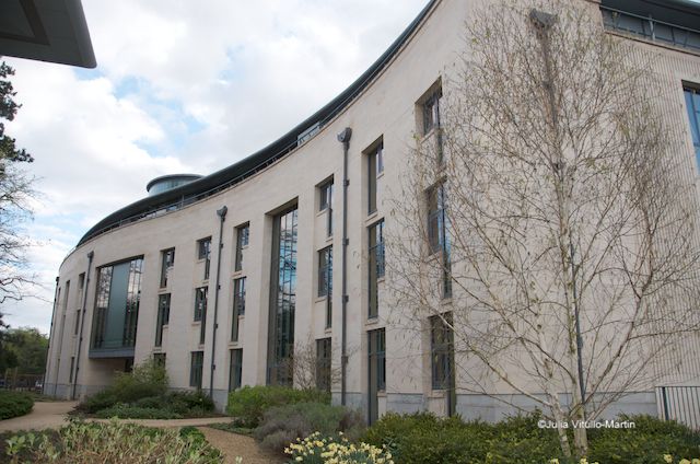
Some Cambridge locals criticize the building for showing insufficient respect to adjacent Harvey Court (designed by Leslie Martin, Colin St John Wilson, and Patrick Hodgkinson), which Nikolaus Pevsner had called “the most sensational new building up to that date (1962) in Cambridge.” Personally I think it’s rather ordinary, but perhaps that’s because—like so many modernistic examples—it’s been much copied.
Harvey Court gives an impression of hostility to its own surroundings. As Peter Blundell Jones notes, “modernist buildings were expected to stand in contrast with surroundings,” and Harvey Court did just that, with a sort of contempt for the street, as if it had nothing to do with it. That, of course, is an underlying planning problem for Cambridge: its old institutions turned away from the street, so why shouldn’t the new?
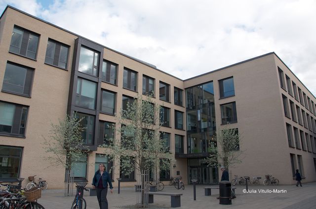
At Sidgwick we started with the Alison Richard Building, designed by Nicholas Hare Architects. It is intended to create an “entrance gateway” to the site, which it does so quietly we didn’t know. Home to CRASSH (Centre for Research in the Arts, Social Sciences and Humanities) and POLIS (Department of Politics and International Studies), it’s an awfully amiable building—simple, almost plain, on the outside, with wonderful light and air inside.
Directly opposite ARB is a building most everyone loves: the English Faculty, designed by Allies and Morrison and completed in 2005. As master planners for the entire site (having replaced the disastrous Casson Conder firm), Allies and Morrison outdid themselves with this gem, which features a serene courtyard containing a garden and terrace, surrounded on three sides by the facades of terra-cotta panels and natural anodized aluminum glazing. Or as critic Isabelle Lomholt points out, “Crisp detailing and strong modelling makes this an interesting and valuable addition to the Sidgwick site, which can seem a bit dead in places.”
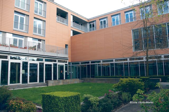
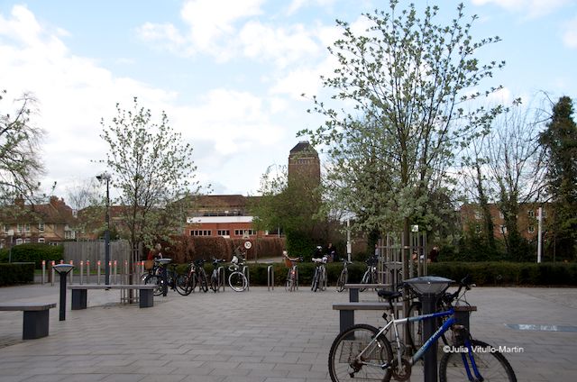
Of course, the site’s “dead-in-places” problem is exactly what A&M were brought in to combat. One tool they’ve used successfully is that oldest of Cambridge tricks: fabulous landscaping, which sooner or later enhances the good while hiding the bad.
And given how confusing the site can be—dramatic buildings set down seemingly randomly—Bob Allies has announced he hopes to construct “a new spine” to clearly connect Sidgwick Avenue through the campus towards the University Library (UL), which now seems to stand forlornly in the distance. (A map can be found on the university’s web site.)
Every university needs a grandiose building or two, and modernism has proved itself more than willing to deliver. What it hasn’t delivered on so well is functionality. Take the History Faculty Building (James Stirling and James Gowan), with its cathedral-like ambitions—vaulted glass cupola, open-book glass panels, and huge glistening windows. Stunning—but inside it was either hot or cold beyond endurance and nearly always noisy.
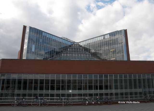
The Cambridge 2000 architectural web site calls it “one of the most reviled buildings in the university, although far prettier than most of the buildings on the Sidgwick Site. One problem is that because of the (largely south-facing) glass it is boiling in summer and freezing in winter. There was some story that the building had to be rotated ninety degrees from what the architect had originally specified in order to fit in the allocated space, but that is not an acceptable excuse. The building also suffered from a leaking roof for many years.”
On the other hand, just consider: completed in 1968, the History Faculty was profoundly radical and experimental at the time. And it still looks reasonably radical almost half a century later. The Guardian’s Rowan Moore wrote amusingly in 2011 that “as they struggled to study in this alternately freezing/boiling greenhouse, with dodgy acoustics, frequent leaks and falling cladding tiles, future columnists and editors incubated a deep loathing of the building, of Stirling, and by extension all forms of ambitious modern architecture.” It narrowly escaped demolition in the 1980s. New Yorkers will appreciate that it was saved by one stubborn don who refused to move out.
The History Faculty is bookended by the Law Faculty (Foster & Partners), with noise and falling-glass problems of its own, to the east and the Divinity Faculty (Cullinan Architects) to the west—both handsome buildings that stand aloof from their neighbors.
Like most Sidgwick buildings, Foster’s Law Faculty was designed to save energy—the north facade is completely glazed while the other walls are partly glazed. Equally important, it is made even more gorgeous by its reflection of the Cambridge sky and landscape in its beautiful high-tech glass.
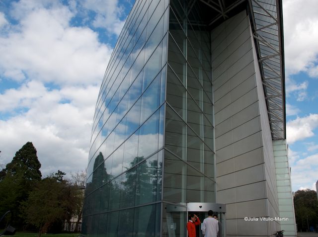
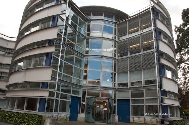
The only fun building on the site is, perhaps surprisingly, the Divinity Faculty’s 4-story rotunda combined with a snaky concrete-steel-and-glass tail (Cullinan Architects), opened in 2002. This building basically works, though it’s had its share of technical catastrophes—a completely flooded basement that the architect attributed to force majeure—and pretty though disastrously malfunctioning outdoor venetian blinds, long since abandoned.
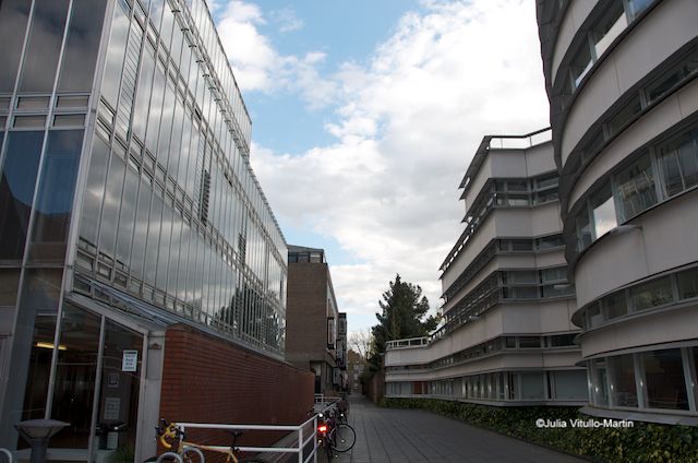
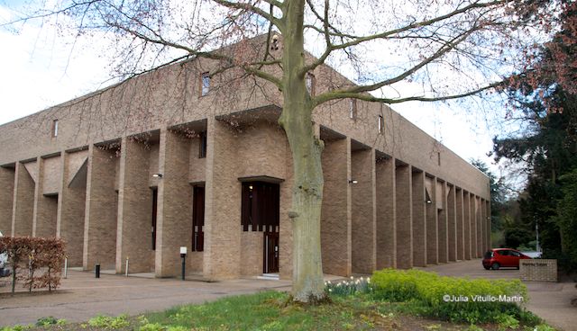
But now let’s head to Sidgwick’s pièce de résistance—the Raised Faculty Building, which is, believe it or not, its actual name. I’ve photographed RFB in all seasons and from all angles and never managed to make it look inviting or warm. On its web site the university says that its original planners, Casson Conder, proposed a series of raised buildings around courtyards, only one of which–the RFB “with its stumpy concrete legs”–was ever built (1959-61).
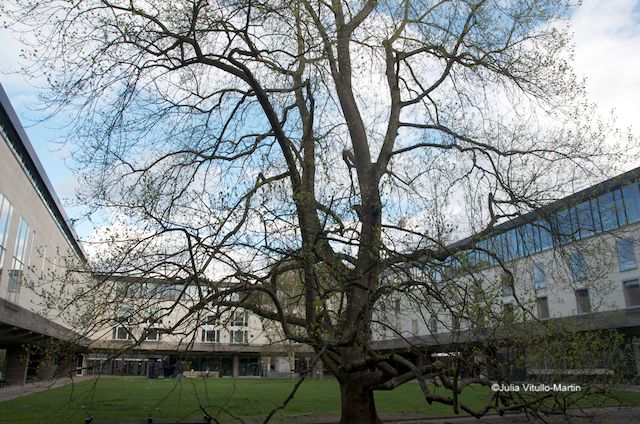
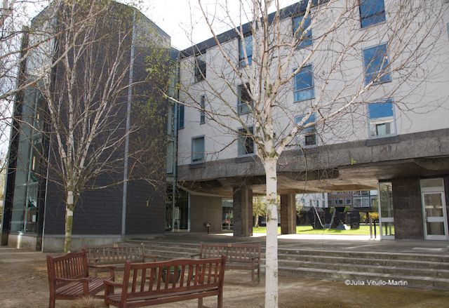
Sidgwick is a sort of museum walk of modernist and post-modernist thinking. What, for example, should one make of RFB’s extraordinarily ugly neighbor, Lecture Block, Casson Condor’s offering from 1958-60? It almost surely would not be built today as its new neighbor, the Institute of Criminology, probably attests.
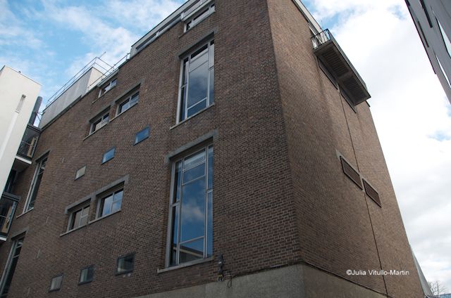
Designed by Casson Conder’s replacements, Allies and Morrison, Criminology is its own distinctive building that nonetheless respectfully parallels RFB’s straight lines and Lecture Block’s bulk while exuberantly displaying a new chic style in quite luxuriant materials. Is this the new modernism, softened by time and a few post-modernist ideas? If so, it’s likely to be embraced in Cambridge and elsewhere.
Julia Vitullo-Martin is a Senior Fellow at the Regional Plan Association. Get in touch with her @JuliaManhattan.
Subscribe to our newsletter