Last-Minute NYC Holiday Gift Guide 🎁
We’ve created a holiday gift guide with presents for the intrepid New Yorker that should arrive just in time—


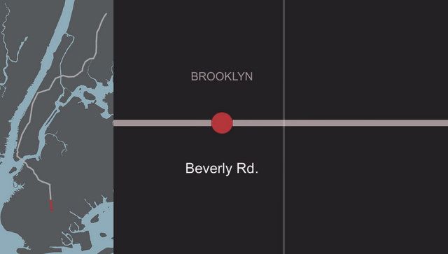
In New York City, where the income gap is still large and looming among neighborhoods across the five boroughs, experts are constantly refining how to discuss the issue. Coming from a completely different angle is Brain Foo, an artist we previously covered in his project Continuous City, who recently created a song on his site “Data-Driven DJ” that explores income inequality through music. At 4 minutes and 45 seconds, Brian’s music track takes something as simple as a ride on New York City’s 2 train line and recreates it into a sonically inventive experience for music listeners.
Brian tells us “The logic behind choosing the 2 Train was that I wanted to cover as many boroughs as possible, so that automatically eliminated the trains which just served just one or two boroughs. About half were left after that. Second, I wanted to cover the length of Manhattan, so that brought it down to just a few stations. Then, looking at the income data, I wanted to choose the line with the greatest income inequality which would create the song with the most contrast. The 2 Train was the winner by far. The median income went from under $14K to over $200K.”
Here are some quick facts about how Brian constructed his musical piece.

Brian will be creating one song a month until January 2016, exploring other issues like migration data, pollution data, and language data, but he’ll probably also do a song about the 4 line. Check it all out at Data-Driven DJ. See Brian’s work in the Continuous City, about a city that changes shape based on resident’s moods.
Read on for our Fun Maps column on re-imagining New York City’s subway system into concentric circles.
Subscribe to our newsletter