Last-Minute NYC Holiday Gift Guide 🎁
We’ve created a holiday gift guide with presents for the intrepid New Yorker that should arrive just in time—


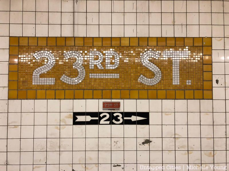
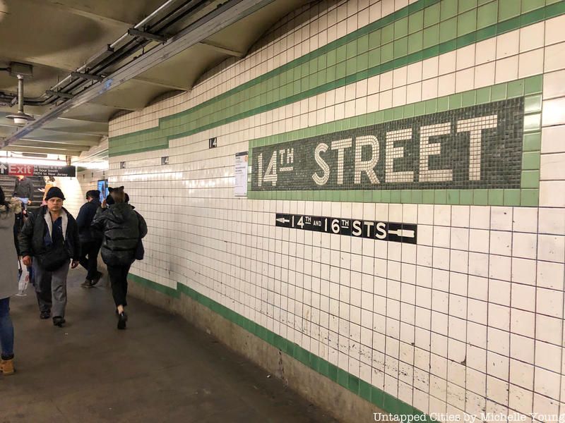
Standing on the platform waiting for your train, did you ever think, “What do the NYC subway colors mean?” Is there a reason the colored bands of subway tiles that run along the platform wall are yellow at 23rd Street but green at 14th Street and red at Penn Station? These colored tiles are the remnants of a coded system from the Independent Subway, one of the three original subway systems that competed in the early days of New York City’s subterranean transit system. Today, we associate the colors of the subway – blue, red, orange, yellow, green, purple, grey, and brown – with their respective routes, but before the 1970s when a unified color coordination system was adopted, things were a little more complicated. New York Transit Museum curator Jodi Shapiro helps us break it down for you!
The Interborough Rapid Transit Company (IRT) was the first subway system to open in New York City in 1904. The first stop was the now-abandoned City Hall Station. The Brooklyn-Manhattan Transit Cooperation came along in 1923 after acquiring the Brooklyn Rapid Transit Company (BRT). The Independent Subway, the first city-owned system, opened in 1932. Each of these systems operated independently of each other until 1940 when the city took over operations of all lines. Before the systems were merged, each had their own wayfinding and identification systems.
The IRT used numbers to identify their lines, many of which have stayed the same to this day. The design of the stations by architects Heins and Lafarge under the direction of chief engineer William Barclay Parsons incorporated elaborate ornamentation including intricate terra-cotta mosaics. These mosaics, notes New York City Transit Museum curator Jodi Shapiro, may have been a piece of wayfinding in the IRT system. The unique mosaics at each stop related to the history or landmarks of the ground above. For example, at the Wall Street station, the mosaics depict the old wall erected at the northern border of Dutch New Amsterdam, at Columbus Circle, you see mosaics of ships Christopher Columbus sailed on. The BMT also used numbers to identify their routes, even going into double digits. Just as in the IRT Stations, the BMT stations boasts fanciful ornamentation.
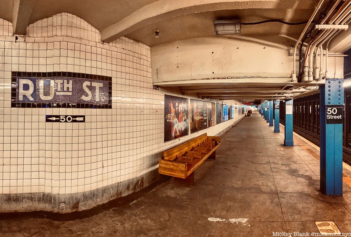
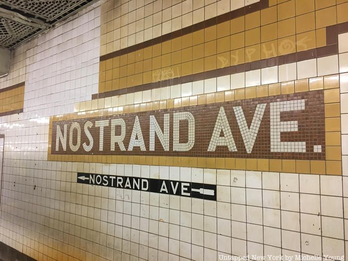
The IND system identified its routes with letters and assigned colors to its stations to distinguish between local and express stops. The colors are signified in a band of tiles that run along the platform wall and provide the background for the station name. At every express stop, the color changes, rotating between five primary color families of red, yellow, green, blue and purple. These color shifts would signify to passengers where they could switch from an express to a local train. At express stations, the color is darker and the band of tiles is wider than at local stops. At local stops, the color is lighter.
There is no definitive answer as to why IND architect Squire J. Vickers chose the color-coordinated system he employed. New York Transit Museum curator Jodi Shapiro says it is one of the most common questions she gets asked. One popular theory is that the colors helped non-English speaking riders, or people who couldn’t read at all, navigate the system. “There isn’t anything that we were able to find that says definitively ‘This is the reason why we are doing that,” notes Shapiro, “It does make sense, and that’s part of the reason for the iconography used in the IRT stations and BMT stations.” Though there is no known document where Vickers explains himself yet, “It might be out there,” says Shapiro, “There may be some diaries of his that we don’t have where he runs down that logic. I hope we find it one day.”
Here’s how Vicker’s system worked. Let’s say you are in Queens riding west from Northern Boulevard which is purple. The next stop is 65th Street, another local stop, so it is also purple. Next, Jackson Heights-Roosevelt Ave., an express station. Here, a new color comes in, dark blue. The next five stations are all local, so they are a lighter shade of blue. At the next express stop, Forest Hills-71 Ave., the color changes green and all subsequent local stops are light green until the express stop at Union Turnpike-Kew Gardens. At Union Turnpike, the station colors change to yellow. You can see the assignment of station colors in the chart below, and compare them to the Pantone colors used in today’s station which can be found on the MTA website.
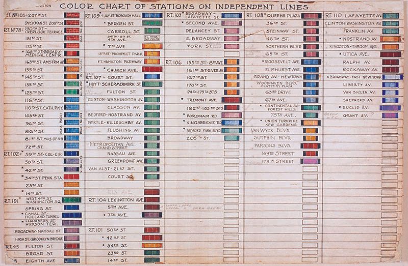
Squire Vickers’ subway color chart. Image courtesy of New York Transit Museum.
The IND stations have a minimalist aesthetic compared to the ornate IRT and BMT stations. Vickers had worked with architects Heins and Lafarge on IRT and BMT stations. The city-owned IND opened during the Great Depression, meaning the expensive ornamentation found in the stations of the former two systems just simply couldn’t be afforded. “City Hall was meant to be a showpiece,” notes Shapiro, but by the time of the IND, the system needed to be more utilitarian and cost-effective. The whole aesthetic was pared-down. The font used in IND stations is a machine-age san serif in heavy capitals, as opposed to the variety of fanciful fonts found in IRT and BMT stations.
There is no expensive terra-cotta, but instead visually clean tiles, that are also easy to physically clean. With artificial light, the minimal design helped make the stations appear bigger and brighter. “Maybe that played into the color choices also,” says Shapiro, Vickers likely chose “colors that would be discernible in artificial light and also not look dingy and have some kind of cheerful effect. There are yellows, greens, and blues, there are some reds. Yellow, green and blue are very natural colors: yellow like sunlight, green like grass, blue like water. I don’t think that’s an accident.” Another theory concerning color choice, maybe those colors are just what was available in large quantities from the manufacturer.
After the three subway systems merged in 1940, new stations were no longer designed according to the IND color system. It took decades for all of the color, letter, and number wayfinding systems to get organized into one cohesive network. “There was a huge amount of information being imparted to riders via signage and not only that, now you have to figure out how to manage all of these different routes,” Shapiro says of riding the subway after the merge. Perhaps most confusing were the route identification numbers and letters. You could get on a subway labeled 4, but depending on if it was an IRT or BMT 4, you’d either end up in the Bronx or Coney Island. Some riders relied on their knowledge of a hold-over from the elevated railroad systems, marker lights on the front of the subway car. Depending on the combination of white, red, yellow, or green lights, you could decipher where the train was headed.
By the 1950s, riders had had enough. The transit authority was inundated with complaints about the confusing signage and jumbled routes. It didn’t help that there were also no official subway maps. Until the first official subway map produced by the transit authority came out in 1958, maps were produced by private companies who could skew the information to their own advantage, such as a hotel making its location most prominent.
The first step to clarify and declutter subway information was the release of the Official New York Subway Map and Guide in 1958. This map assigned one color – black, red, and green – to each of the former systems, the IND, IRT, and BMT. The routes were superimposed onto a simplified map of the five boroughs. While this was a good first step, it only clarified the system on paper. In the stations themselves, people were still scrambling to find their way.
The Chrystie Street Connection, which opened in two phases in 1967 and 1968, rerouted eleven existing lines and threw the system into further chaos. Shapiro told Untapped New York that at least one operator took his car on the wrong track! In 1967, the New York City Transit Authority hired Unimark to finally overhaul the subway’s wayfinding. Unimark is an international design firm that at the time was headed by Massimo Vignelli and Bob Noorda. The company did its own research about graphical communication and studied other transit systems. They were also likely to influenced by the work of George Solomon, Stanley Goldstein, and Raleigh D’Adamo, three men who created maps, books, and studies suggesting ways to fix the subway. The Unimark system would need to be applied to not only the subway, but also New York City buses, the LIRR, and eventually the Metro-North.
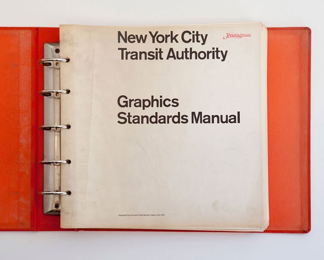
Vignelli and Noorda produced in 1970 what Shapiro refers to as “the Bible,”the Graphic Standards Manual. The manual is an exhaustive volume that instructs how every sign everywhere in the subway, bus, and train systems should look: inside a subway car, outside a subway car, inside a bus, outside a bus, hanging in a station, and on and on. The san serif font Vignelli and Noorda chose for signage provided “the easiest legibility from any angle whether the passenger is standing walking or riding.” They chose a rainbow of 22 different colors to assign to each subway line and gave the routes new names. While this was a major improvement, the system was still complicated and required a certain level of subway literacy to navigate. Vignelli and Noorda employed double letter names, such as the EE and GG, and colors were sometimes shared by different routes.
In 1979, instead of having a different color assigned to each separate route, colors were reassigned based on “trunk routes.” The trunk route is the portion of subway tracks that go through Manhattan. All trains that share a trunk route are the same color. For example, Lexington Ave’s 4,5,6 routes are all green, and Broadway’s N, Q, R, W routes are all yellow, regardless of their terminal destinations. G doesn’t go through Manhattan at all, and the 7 and L don’t share any trunk routes, they have their own colors. This is the color system we use today! However, it wasn’t until 1985 that all double letter routes were renamed.
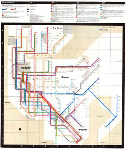
While the colors are set now, the subway map is still evolving. New proposed designs were put on display in August 2020 in Bay Ridge, Brooklyn. The simplified design was based on the beloved Vignelli map of the 1970s. Today, the mix of all three original subway lines along with changing architectural trends, new technology and works of art created for MTA’s Arts for Transit Program, make every subway station unique. “New York’s subway stations don’t look like subway stations anywhere else in the world, says Shapiro, “There is still some of the older stuff in there and its part of the charm of our system. If our system had been built all in one shot, by one group of people, it wouldn’t look as beautiful as it does. I think our system is beautiful, even though it is very idiosyncratic. There are so many cool things to look at.”
Uncover more secrets of the subway by joining Untapped New York for an upcoming Underground Subway Tour!

Ride through the oldest stations, uncover hidden art, and more!
Next, check out Cities 101: The Actual Purpose of NYC Subway Globes and Inside the MTA Transit Sign Shop That Makes All of NYC’s Subway Signage
Subscribe to our newsletter