A Salvaged Banksy Mural is Now on View in NYC
This unique Banksy mural goes up for auction on May 21st in NYC!


Source: Co.Design
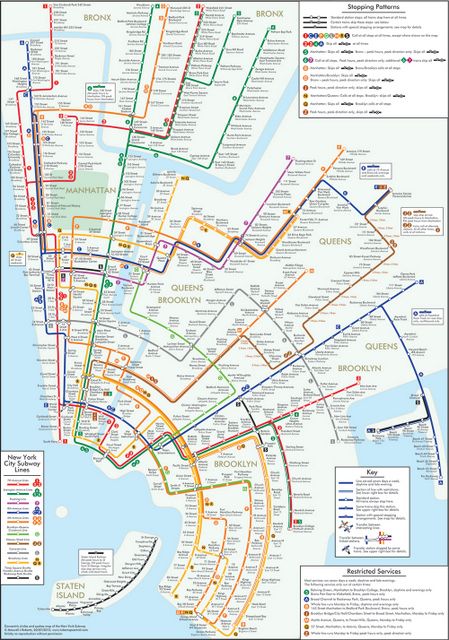
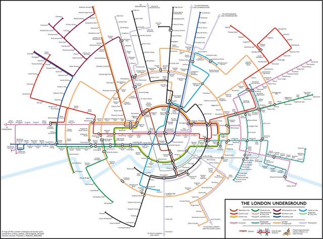
New York City subway maps are inherently difficult to create. Map designers have often had to trade off between geographic accuracy, simplicity, cohesiveness, and aesthetics. With these maps of the NYC subway and London Tube, mapmaker Max Roberts has decided to focus instead on conveying the system’s cohesiveness.
As featured in Fast Co Design, Roberts’ maps “aim to challenge conventional map dogma, a lot of which he says are outdated. Rather than emphasize straight lines, clean angles, and geographical accuracy, Roberts’ maps embody a more nuanced approach to mapping, one that combines aesthetics with usability.”

Source: Co.Design
Especially due to New York’s unconventional landscape, the map relies on heavy geographic distortion to accomplish its goal of showing how the pieces of the vast network relate to one another. For instance, Manhattan is made very compact to show the close proximity of its stations. Most unrecognizable are Brooklyn and Queens, which have been combined together.

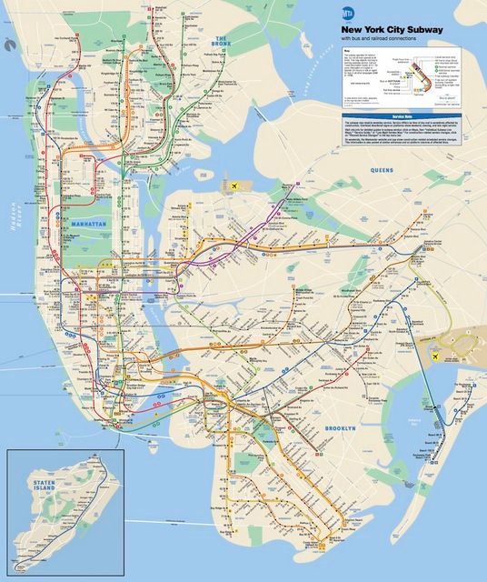
The MTA subway map, for comparison. Note that even this map has been slightly distorted. Manhattan, and specifically Central Park, are not actually so wide, nor is Manhattan oriented exactly north-south. Source: Co.Exist
It seems as if New Yorkers will never give up trying to revamp–or at least re-visualize– the subway system to their liking. A couple of weeks ago, we wrote about Third Rail, a game that allows players to create their own subway lines. We also visited the Masterpieces of Everyday New York exhibit at Parsons, which included a subway map from the 70’s that also attempted to maximize functionality over geographic recognition.
We can’t imagine Roberts’ map moving beyond the theoretical realm, but it’s certainly thought-provoking. He plans on making more maps of New York and other cities that continue to emphasize networks over geography.
Get in touch with the author @YiinYangYale.
Subscribe to our newsletter