Spring Photo Walk at The Green-Wood Cemetery
Capture striking photographs of the gorgeous grounds and statuary of The Green-Wood Cemetery with the expert guidance of photographer Bethany Jacobson!


Today’s map is from an exhibit that was part of the Design and Elastic Mind show at the MoMA in 2008. The project, The New York Talk Exchange, was run by the SENSEable City Lab at MIT.
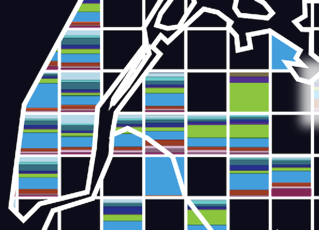
With Saskia Sassen as a research adviser, the team set out to explore the way communication technologies “eviscerat[e] the constraints of distance.” They used AT&T long distance phone data and IP data to track the connections between New York City and the rest of the world, and then visualized it. The map titled “The World Inside New York.”
From the project:
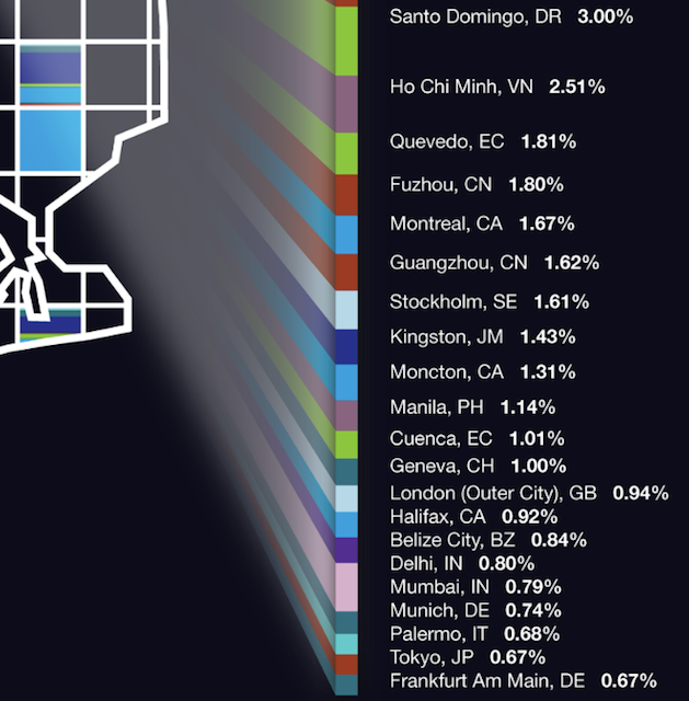
The city is divided into a grid of 2-kilometer square pixels where each pixel is colored according to the regions of the world wherein the top connecting cities are located. The widths of the color bars represent the proportion of world regions in contact with each neighborhood. Encoded within each pixel is also a list of the world cities that account for 70% of the communications with that particular area of New York.

Manhattan and part of Queens and Brooklyn
Here you can also watch a short movie of the interactive map showing other neighborhoods. Although unfortunately the map is not publicly available to play with, they do provide a generously high resolution copy of the still frame above. Above is a closeup of most of Manhattan. The three most noticeably dominant colors are the light blue, the green, and the dark red. The green is Santo Domingo and the red is Shanghai. Not surprising. But the blue? Toronto. Why might New York be so in touch with Toronto?
And the rest of the colors? Well, here is the key showing the data for highlighted area in Flushing, Queens on the top map. It also reveals a good range of the colors in Manhattan. See the dark turquoise chunks popular in the two central swaths of Midtown and Wall Street? According to this key it looks like it’s Geneva. Perhaps the map is highlighting the communication traffic between Midtown and Wallstreet and their offshore Swiss banks.

See more from the exhibit at the New York Talk Exchange website. See other work by Senseable City Lab at MIT on their website.
Get in touch with the author @youngzokeziah. See more maps in our Fun Maps column
Subscribe to our newsletter