Last-Minute NYC Holiday Gift Guide 🎁
We’ve created a holiday gift guide with presents for the intrepid New Yorker that should arrive just in time—


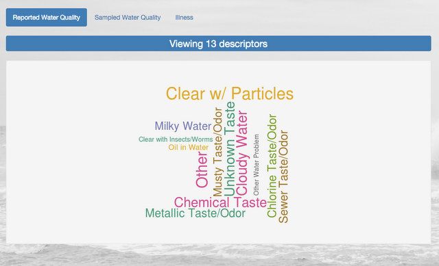
New York City’s drinking water is one of the best in the country, but it doesn’t mean that issues don’t occur. After all, some parts of the water system are 174 years old, with the Croton Aqueduct completed in 1842. This week, Columbia University statistics professor Tian Zheng shared her students’ exploration of New York City’s water complaints via Twitter. The online app created by students Schinria Islam, Richard Wang, and Josh Dillon addresses many aspects of water quality issues, with the home page a “complaint” cloud from comments ranging from “I’m sick because of my water,” to “My water got turned off.” There are maps, charts and graphs that track the location and type of complaints by year and by borough.
The data in the app can be viewed over three years, 2013 to 2015. In Manhattan in 2015, over 72% of complaints had to do with heat and hot water delivery. 17% of complaints were related to the water system itself, and a little over 9% were related to leaks:
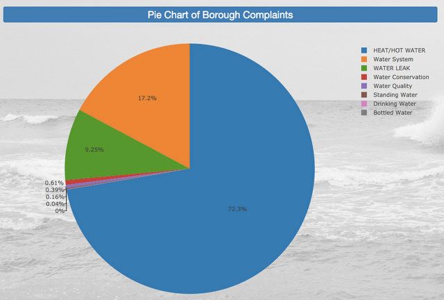
Complaints in Manhattan, 2015
In Brooklyn, the pattern is similar but with a higher incidence of water leaks and water system problems proportionally. In addition, water conservation complaints had 2.4x high incidence in Brooklyn:
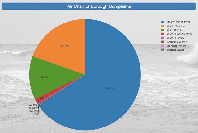
Complaints in Brooklyn, 2015
In Queens, water leaks had a lower incidence but water system complaints took a much larger share of the pie as well as complaints about water conservation:
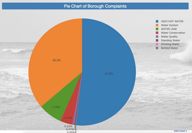
Complaints in Queens, 2015
In Staten Island, though total water complaints seem lower based on the heat map, standing water complaints indexed significantly higher than the other boroughs, along with water quality complaints:
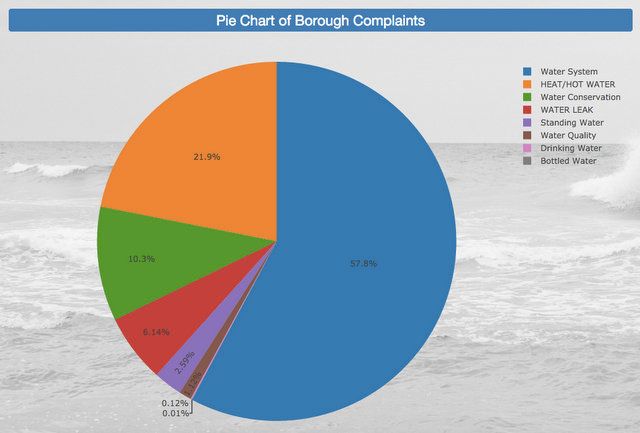
Complaints in Staten Island, 2015
In the Bronx, heat and hot water complaints had the highest incidence proportionally compared to the other boroughs:
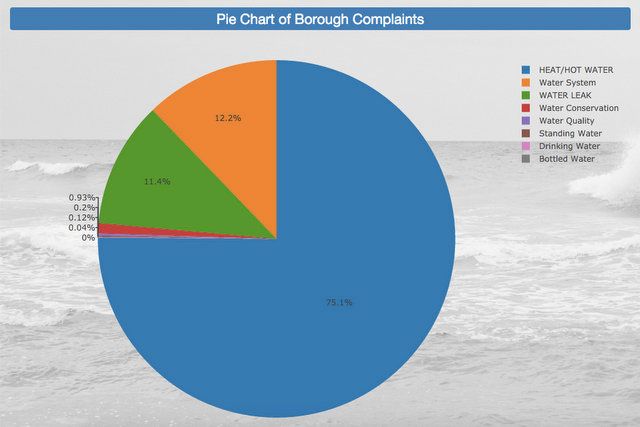
Complaints in the Bronx, 2015
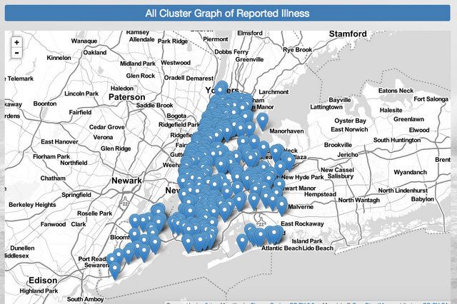
In the interactive map, reported illnesses are mapped and can be clicked to reveal address of complaint:
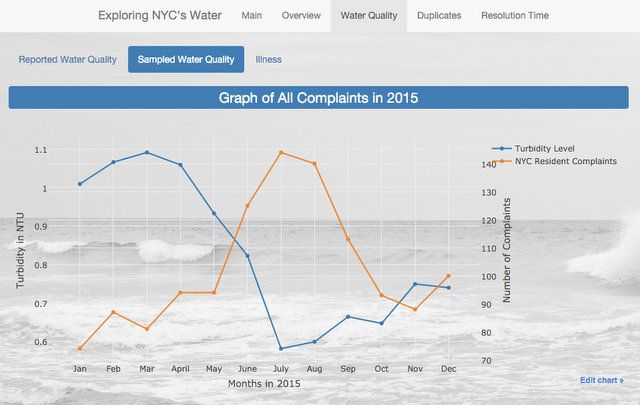
A graph comparing turbidity levels and number of complaints, showing a clear inverse relationship:
Next, discover how a large percentage of NYC’s drinking water comes from drowned towns in the Catskills.
Subscribe to our newsletter