10 Giant Menorahs That Will Light Up for Hanukkah in NYC
From Brooklyn to the Bronx, we’ve rounded up the most exciting giant menorahs that will light up throughout the next eight evenings!


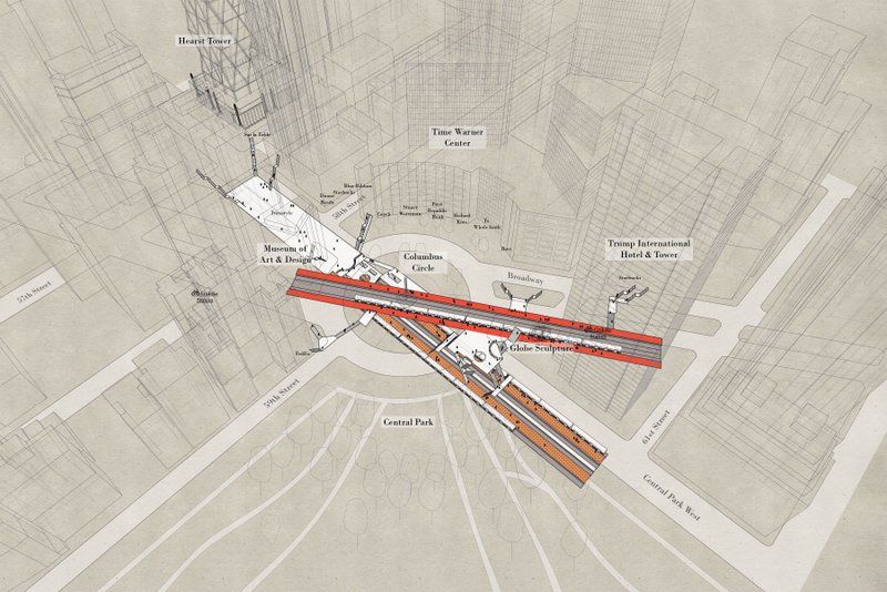
All maps courtesy Candy Chan
Two years ago, we reported on Project NYC Subway by architect Candy Chan, who showed through blueprint-like sketches some of the city’s most complex subway stations – Columbus Circle, Times Square, Herald Square, Madison Square, and Union Square.She made the maps using first-person observation and data collection, then transferred her sketches to AutoCAD.
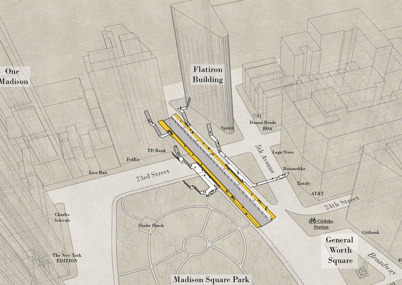
Now, Chan has released a new set of drawings she’s calling “X-Ray Area Maps” that show the same five stations within the context of their built surroundings.
Asked about her motivation for expanding her subway work, Chan tells Untapped Cities: “My ‘maps’ from 2015 were really ‘diagrams’- they were more abstract and focused on the connections within the station. This time around I wanted to make drawings that are more realistic and provide more context in the city – landmarks like Central Park, Union Square, Wholefoods, Koreatown etc – basically the destinations people look for, and can relate to, rather than just the intersections (i.e. SW corner of 14th and 8th). So they become about the areas, not the stations.”
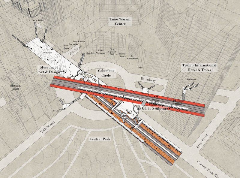
At Columbus Circle, you can see the two platform levels (the 1 line on top, and the A/C/B/D below), within the context of the Time Warner Center, Central Park and the Trump Hotel. In the zoomed out version, you also see the architecture of the Hearst Building.
We asked Chan whether her process evolved from the last, and she tells us:
My process involves me taking my original model from before, then downloading 3D models from cadmapper.com and adding details (like windows and signage where appropriate) by looking at 3D views on Google Earth / Google Street View. From there it’s just taking liberty with adding colors, people, trees, and labels, and most importantly, having fun.
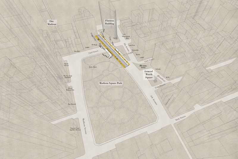
At 23rd Street, the N/R line aligns with the edge of Madison Square Park and juts out onto Broadway alongside the Flatiron Building. In all the maps, Chan also notes the location of local businesses and Citi Bike stations.
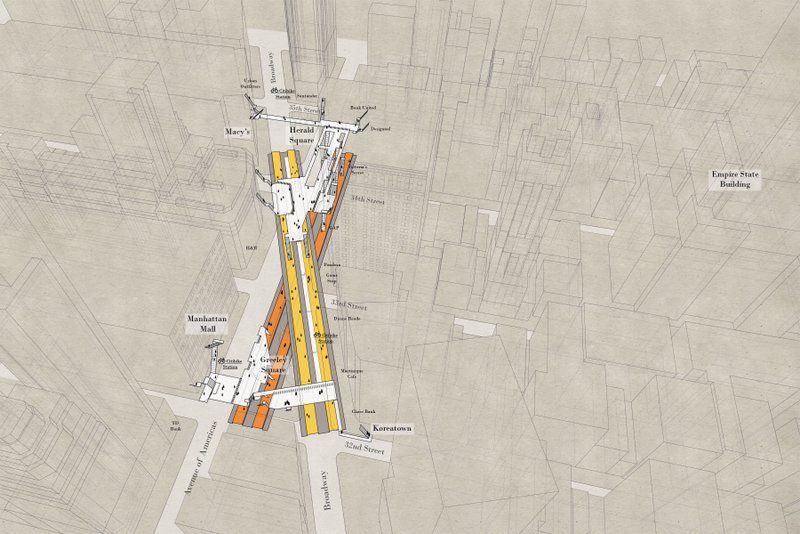
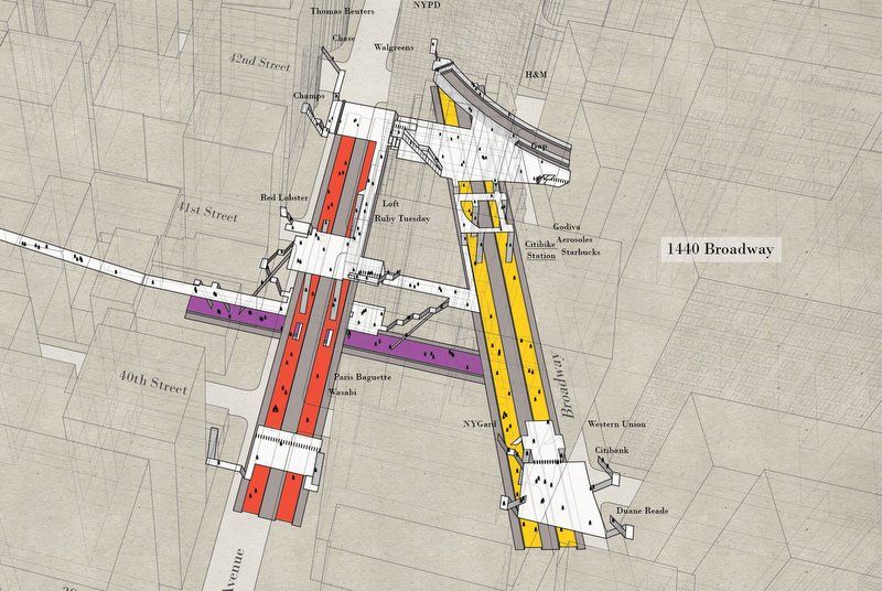
At 34th Street – Herald Square, you see the relative positioning of the N/R/W/Q and B/D/F/M lines:
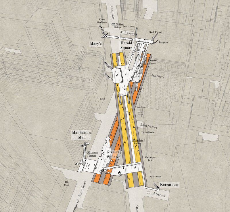
In a zoomed in version, you can see how the stairs, and multiple exits figure within the streetscape:
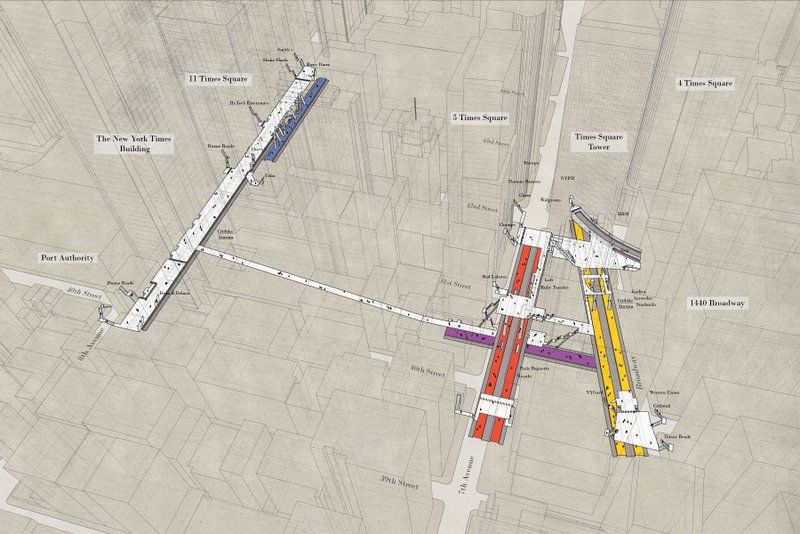
At Times Square, you really get the sense of the long walkway between Port Authority and the rest of the Times Square station:
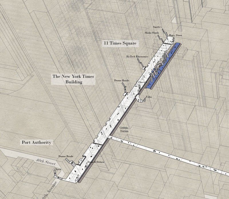
The Port Authority side is pretty straight forward (though the map does not denote the abandoned platform):
On the Times Square side, you can see how the 7 line transects below the 1/2/3 and N/Q/R/W lines:
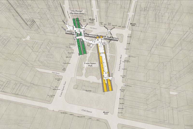
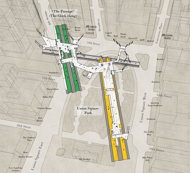
The X-ray map of Union Square shows the parallel paths of the 4/5/6 and the N/Q/R/W, and how the L cuts below the two:
Next, check out the Top 12 Secrets of the NYC Subway.
Subscribe to our newsletter