✨You Can Touch the Times Square New Year's Eve Ball!
Find out how you can take home a piece of the old New Year's Eve ball!


In this two part series, I will analyze two office buildings designed by Clive Wilkinson Architects-the Googleplex in Mountain View, California, and Macquarie Bank in Sydney, Australia. In both, the designers responded in physical form to a strategic need, be it a revolutionary shift in corporate culture as in Macquarie Bank, or an environment that could encourage engineers to communicate while also accommodating rapid growth, as in Google. A key to both designs was the conception of interior space at an urban scale, designing “neighborhoods” with distinct visual and experiential identities. In both buildings, the designs have reinforced corporate values, encouraged social interaction, better allocated real estate space and provided energy savings. Good design can indeed go in tandem with good business, even across such disparate industries as finance and technology. As a note, this article was written based on the original design of Building 43 at Google. I’ll be following up post a visit to Googleplex in January.
In Why Architecture Matters, Paul Goldberger writes that cities must be more than a sum of its parts and that they must also have a balance and coherence. Architecture does not exist in isolation but in relation to the buildings surrounding it. Corporate buildings are not that dissimilar from cities, be it an entire campus headquarters or a high-rise building. Clive Wilkinson Architects design interior spaces with a city scale in mind. Googleplex, the main campus of Google, was the product of a distinct tension (and ultimately a collaboration) between architect and client. While most people think of Googleplex as a corporate campus from a macro perspective-indeed one of the directives was to make the workplace an “extension of university life” -what is more extraordinary was the initiative to make the interior spaces of the headquarters feel like a town. In other words, the floor plan, in addition to the configuration of buildings, was designed at an urban scale.[1]
Google hired DEGW, a strategic design consultancy firm in addition to Clive Wilkinson Architects through an invited competition to work on the headquarters in 2004. At first, it seemed difficult to clarify objectives. The founders, engineers at heart, were not initially very interested in aesthetics, preferring solutions that could happen quickly and create higher efficiency.[2] In addition, the cultural barrier between architect and programming engineer was daunting. Mary Davidge, a workplace consultant who has overseen projects at Apple, Ebay and Yahoo! says, “Most engineers focus so much on how things work and how they’re going to work for them. The way the space is going to look and feel is often not important to them. They’re also often less willing to let the designer design it. They’re used to developing solutions.” [2] As a result, Clive Wilkinson decided to shift gears and present his designs as solutions. The team analyzed how the employees used space and devised thirteen zones, characterizing them from “hot” to “cold” based on level of social interaction. According to Andrew Laing of DEGW, each floor was then divided into sub neighborhoods,[1] identifiable by “landmarks” which are the common spaces.[2] The language of the design, from “landmarks” to “zoning of activity,” to “circulation routes,” underscores the effort to conceptualize the space, micro and macro, as an urban identity.
Using a variety of research methods, including focus groups with employees, interviews and design charettes, DEGW identified four main design priorities at Google:[3]
Each principle is woven into the design of Google Headquarters. On Google’s description of its corporate culture, it is clear that design and physical space have become intertwined with its identity. The opening sentence of the description reads, “At lunchtime, almost everyone eats in the office café, sitting at whatever table has an opening and enjoying conversations with Googlers from different teams. Our commitment to innovation depends on everyone being comfortable sharing ideas and opinions.” [4] The design, as well as the quirkiness that is embedded into the architecture, also reflects a mission to democratize (or at the very least, open up) its hierarchy. The description continues, “because we believe that each Googler is an equally important part of our success, no one hesitates to pose questions directly to Larry or Sergey [the founders] in our weekly all-hands (“TGIF” ) meetings–-or spike a volleyball across the net at a corporate officer.” [4]
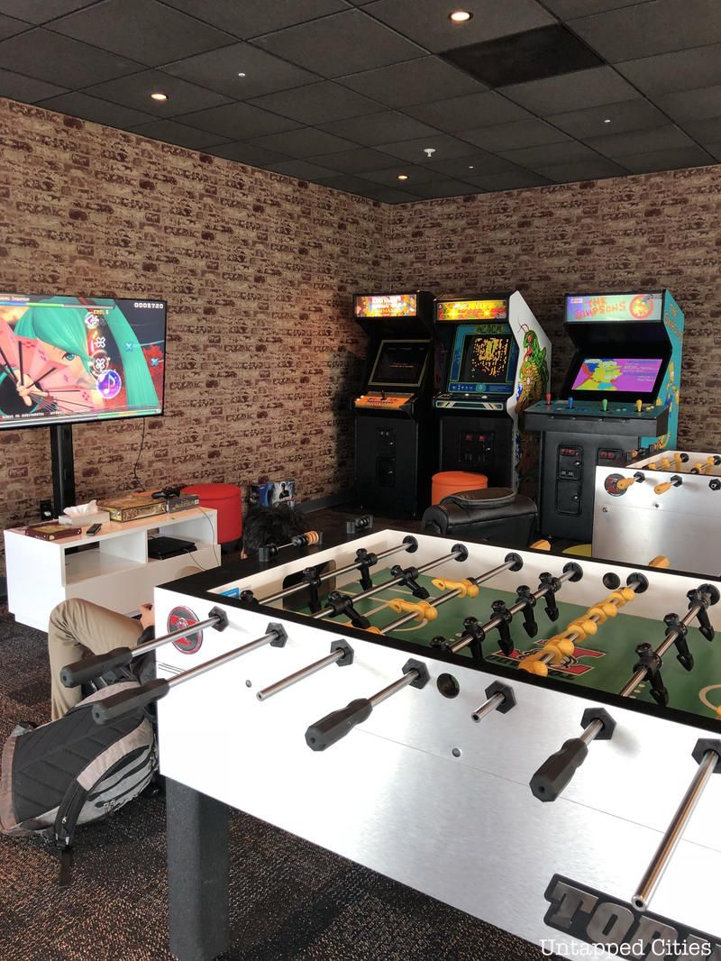
Google’s offices around the globe are not identical, further reads the description, but they share some main characteristics, including “Googlers sharing cubes, yurts, and huddle rooms-and very few solo offices, laptops everywhere-standard issue for mobile coding, email on the go and note-taking,” games such as foosball, pool tables, volleyball, ping pong, and gyms, break rooms with hundreds of snacks and “grassroots employee groups for all interests, like meditation, film, wine tasting and salsa dancing.” [4] Yurts, also created by Wilkinson, are small fabric structures made of recycled denim that are used as meeting rooms. They are “easily assembled or torn down” [2] allowing for flexibility in spatial configuration and impromptu collaboration. According to Google, yurts also make heating and cooling more efficient.[5]
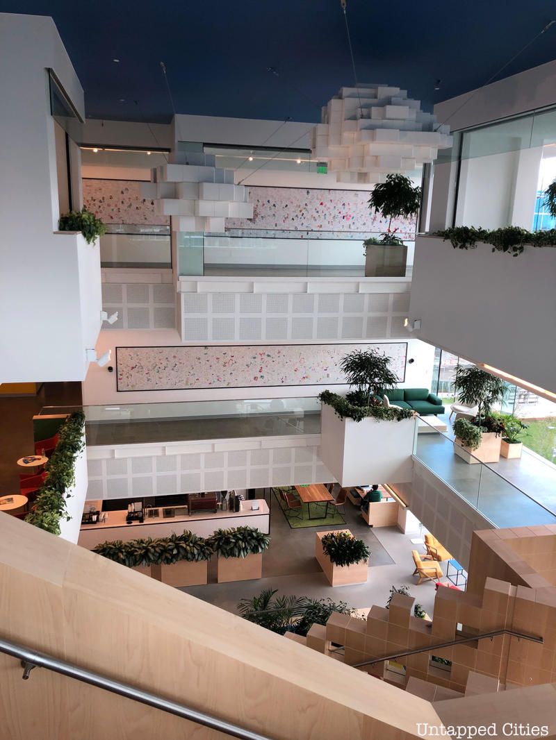
The first building completed at Googleplex (Building 43, above) was formerly used by Silicon Graphics, Inc., so the design was less focused on faà§ade as it was on internal space, engaging adjacent spaces within the building and activating peripheral space on the exterior. As in a city map, the main circulation route on Wilkinson’s plan is denoted in a different color (light orange) from the other laneways (white). Parking is concealed underground, which improves walkability between buildings and allows for social activation around the building, which includes seating areas, grass lawns and organic farms.
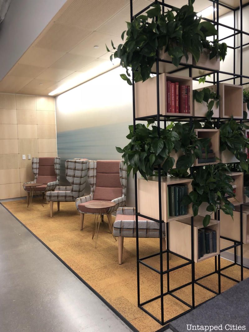
The main route is also punctuated by “landmarks,” or the main social nodes. These nodes all have adjacencies to other social areas. Google believes these adjacencies create interdependencies that enable work flow and social interaction.[6] For example, an outdoor courtyard is accessible through the kitchen, which is adjacent to a lounge and library. The kitchen/lounge/library combination is repeated at the far end of the building, but in the center of the building the kitchen and lounge sit adjacent to a game room. There are also tech stops in three locations (originally named “i-bars” on the Wilkinson diagram). According to Jeanice Gantus, a technology manager at Google Mountain View, tech stops are similar to Genius Bars at the Apple store.[7]
In more densely packed working areas, a “slice” kitchen replaces the full kitchen but is still close by or next to another social area, be it an tech stop, lounge, or a copier. The slice kitchens are more akin to a smoothie bar. DEGW writes that one of the directives for design at Google was that “density and proximity are key for information flow.” [3] In Harvard Business Review, Anne-Laure Fayard and John Weeks write about that photocopiers and other gathering points are “wonderful stimuli for informal interactions, because they give people natural reasons to launch into conversation.” [8]
The curvilinear shape of the main circulation route appears to have been derived from findings in a user focus group:
The circulation route was further developed into a “Main Street” lined with what Wilkinson calls “shared-use building blocks.” Much like Paul Goldberger’s belief that good streets can matter more than buildings, all activity in Googleplex Building 43 is programmed from the building’s Main Street outwards. It was important to Google that the circulation was “multi-functional” [6] and that the neighborhoods had permeable boundaries. The architect’s sketches reveal many of his concepts, including flow, shared-use and light:
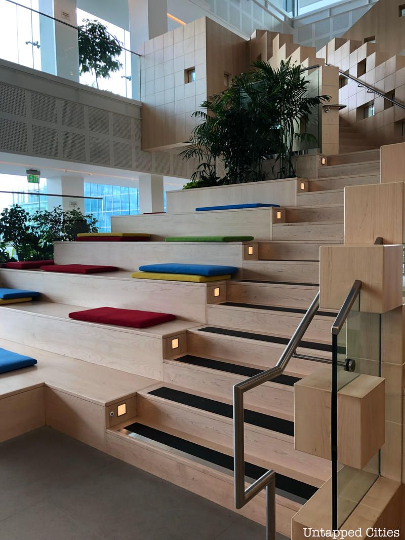
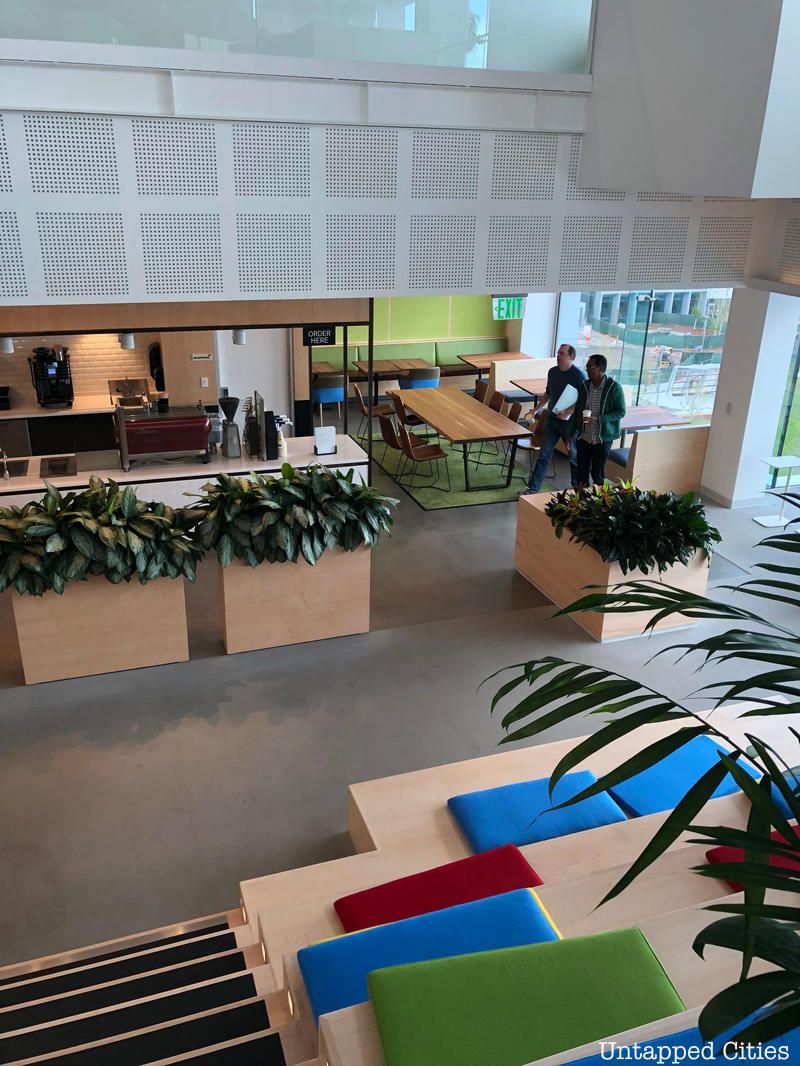
The main atrium of the building is also activated with amenities that encourage use of the space for work purposes-the grand staircase is equipped with outlets for laptops and wi-fi.
Another of the main criteria, according to DGW’s Andrew Laing, was “how to make engineers communicate.” [1] In addition to the physical configuration of workspace, sound and acoustic integrity were additional design points. However, despite being “fanatical about air quality and preservation of natural light,” [2] the founders also “insisted on having offices alongside almost all of the windows.” [2] Wilkinson solved this conundrum by creating glass tent offices that permitted light to flow in to the middle of the building. The peak of the glass tent conceals infrastructure, including HVAC, sprinklers and air diffuser, and the glass is made of acrylic-coated polyester to help reflect light. The glass tents can be built quickly, thus solving a critical need in Google’s “immense expansion curve” [9] at the time.
Because the founders were fond of working in dense conditions from the start-up days, the glass tents were designed to be shared by three employees. Nonetheless, the building was not designed without concern to individual work space. The DEGW review of key issues during the pre-design phase also included the need to support a wide variety of spaces, including those for “collaboration, quiet concentration, informal meetings, large scale gatherings, relaxation.” This sketch from Wilkinson demonstrates his ideas on the flow between public and private.
Finally, Googleplex has also embraced green initiatives. The buildings use only sustainably harvested wood, the company actively reuses material from remodeling and the furniture is LEED and Cradle-to-Cradle certified. 9,212 photovoltaic panels supply 1.6 megawatts of electricity or about 30% of peak electricity needs and solar panels supply energy to the fleet of plug-in hybrid electric vehicles.[2] Other initiatives include community bikes and an organic farm that supplies a portion of the café produce.
Clive Wilkinson Architects only built out Building 43 but Google constructed the rest based on the company’s designs. Today, Googleplex consists of 20 buildings, which contain 19 cafés that serve 3 meals per day and 960 micro kitchens. But what makes Googleplex successful as a design is that the architects recognized that Googlers would want to put their own mark on the space. Laing says, “What was brilliant about Clive [Wilkinson’s] design is that it’s a bright white, light space that becomes almost a neutral background for all the stuff they were going to throw at it. If you designed a space that tried to be Googley, it would have been too much.” [5] With contests for best office space and a penchant for decorating with quirky objects, Google employees have activated the space and given it its personality. Daily, the Google office hosts 200 pets in addition to its visitors, many surfaces are writeable for collaborative work and capturing serendipitous brainstorms, and colorful additions are not unusual in the form of camping tents, wall decorations and patterned carpets. You can see part of the interior using Google Maps Interior View. Search for Googleplex at 1600 Amphitheatre Parkway Mountain View, CA 94043 [Map]
Follow UntappedCities on Twitter and Facebook. Get in touch with the author at @UntappedMich. This article was written based on the original design of Building 43. She’ll be following up post a visit to Googleplex in January.
[1] Laing, Andrew (of DEGW). Presentation in Columbia University Real Estate class, The Networked City. November 28, 2011.
[2] Chang, Jade. “Behind the Glass Curtain.” Metropolis Magazine. June 19, 2006.
[3] DEGW (with Corenet Global) “The Total Workplace at Google” for Google Berlin. December 2008.
[4] “The Google Culture.” https://www.google.com/about/corporate/company/culture.html
[5] Google, “Life at the Googleplex” (video). May 1, 2009. https://youtu.be/eFeLKXbnxxg
[6] CoreNet Global Summit Las Vegas. “#1 The Google Philosophy.” 2009.
[7] Gantus, Jeanice. Interview with the author. December 3, 2011.
[8] Fayard, Anne-Laure and John Weeks. “Who Moved My Cube?” Harvard Business Review. July 2011.
[9] Clive Wilkinson Architects. “Google Headquarters.” https://www.clivewilkinson.com/work/google_desc.html
Subscribe to our newsletter