Last-Minute NYC Holiday Gift Guide 🎁
We’ve created a holiday gift guide with presents for the intrepid New Yorker that should arrive just in time—


Most people (even residents) never realize how New York City’s iconic skyline has been shaped by the city’s zoning codes. The variety in architectural styles is as much related to trends in design and technology as it has to do with changes in the zoning code over time. Moreover, certain key buildings themselves inspired the zoning resolutions of 1916 and 1961. On the 50th Anniversary of the 1961 New York City Zoning Ordinance, here’s a look back.

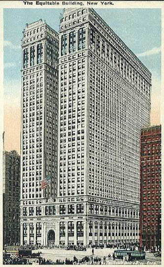
Image via Wikimedia Commons
The 1916 Zoning Ordinance was the first zoning regulation in the country. It imposed height and setback limits and distinguished between residential and industrial districts. Its purpose was clear–to prevent buildings at the scale of the Equitable Building (above), an imposing skyscraper in downtown Manhattan that blocked out natural sunlight due to its large footprint and height. New Yorkers feared that this type of building, if unchecked, would encourage carte blanche by developers and potentially plunge the city into darkness. Thus, in the 1916 zoning code, even though you could build out to the entire lot size, after a certain height you had to “set-back,” which led to the “wedding-cake” design style like the New York Telephone Building, built in 1926:
Not surprisingly, the New York Telephone Building became interwoven into the popular culture of the time period–its forms ripe for the Cubism interventions of Modernist artists like John Marin. In Telephone Building, Lower New York, any sense of traditional perspective is lost in the abstraction of forms and multiplicity of viewpoints. The walls of the Telephone Building are fractured, creating overlap with other parts of the skyscraper. What is highlighted by Marin’s abstraction is that the setbacks, while functionally allowed for light to hit the streets, also captured our aesthetic eye.
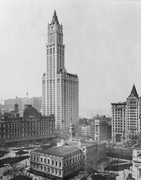
The Woolworth Building was built before the 1916 zoning ordinance but served as a model for the new code. A 1913 photograph of the Woolworth Building demonstrates how iconic the building was given the existing context at the time. At 25% lot area coverage, you could build up to any height, which allowed for such landmark skyscrapers as the Woolworth building, the Empire State building, Chrysler building and residential towers along the Upper West Side such as the San Remo. The General Electric Building on Lexington Avenue and 51st Street is another byproduct of the possibilites of this zoning code.
 Woolworth Building (1913). Image via Wikimedia Commons.
The 1961 Zoning Code corrected for certain limitations of the 1916 zoning, including minimum dimensions for inner lots (to prevent the sliver dumbbell shaped shafts in tenement buildings) and windows were required to face the street or inner lot. Most important was the shift to Floor Area Ratio (FAR) which essentially limits the height of the building based on lot size. For example, if the maximum FAR is 10 in your zoning area and you want to fill the entire lot, you can only build 10 stories. But if you set back, you have more floors to work with. In 1989, the city added contextual zoning in certain districts to regulate maximum height and other specifications.
But in 1961, automobile was king, so the zoning code contained parking requirements for development. That has since been reversed in Manhattan Community boards 1 to 8 and in two Queens Community districts, where parking is not required and cannot exceed 35% of the dwelling units or 200 spaces, whichever is less. There is a current study by the department of city planning to reduce the parking requirement in other areas of New York City but the recommendation currently is to cut it by 50% but not eliminate it.
As the Woolworth Building provided inspiration for the 1916 code, the 1961 code was greatly influenced by the Seagram Building on Park Avenue, designed by Mies van der Rohe and Philip Johnson. The sleek skyscraper with glass curtain and large plaza setback became the model for skyscrapers all over the city (and the world). These plazas, created by developers in exchange for bonus FAR, often become the privately owned public spaces (POPs) that have become so debated with Occupy Wall Street.
However, in recent decades there has been a reverse tide against setbacks and plazas (particularly because the space could be better allocated to shops and community facilities that can activate the street), and the setback requirement has been removed in residential areas while retained in commercials areas.
This is a typical residential development set back from the street with a plaza:
Tower on a base zoning was introduced in 1994 as a response to concerns about excessive height in residential areas. On wide streets in certain districts, towers must be built on a 5-8 story base that reaches the street line. This may be one of the most recognizable commercial/residential forms in New York City in the last twenty years. Here are some examples:
As we have seen, zoning is by no means fixed. The code adapts, shifts and evolves, reflecting the concerns of residents and developers at a given time. I anticipate that in the future there will be changes in the zoning code to reunite living and working areas. While zoning originated as a way to separate noxious industrial activities from where people lived, codes today still reflect this outdated necessity. Also how does the trend towards curvilinear facades, Ã la Frank Gehry, impact zoning codes which deal primarily with rectilinear floor plates and building dimensions?
100 years is not a long period in terms of shaping a city, especially compared to European cities. We think of New York as nearly built up but the best cities are dynamic, changing entities. My question is, can zoning be used to encourage iconic architecture in New York City, as it once did? Or have we become so practical and blasé that we accept homogenous forms? If zoning so strongly impacts physical form, does the city have a responsibility to think beyond the technical? In 1916, the city surely did, commissioning grand drawings to illustrate the aesthetic potential of the zoning code. Check out The New York City that Never Was: A Visionary Dream of the 1916 Zoning to see the promise that zoning once had for the city.
Special thanks to New York City Department of City Planning Zoning Division for the informative presentation to the Columbia University GSAPP Real Estate program and for bottom two images.
Get in touch with the author @untappedmich.
Subscribe to our newsletter