Last-Minute NYC Holiday Gift Guide 🎁
We’ve created a holiday gift guide with presents for the intrepid New Yorker that should arrive just in time—


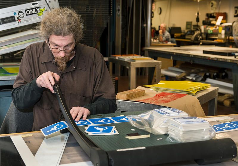
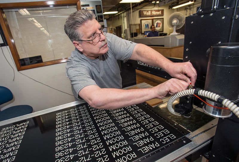
Navigating the immense sprawl of the New York City subway system can seem like an intimidating task, but it is the job of a small group of craftsmen in Crown Heights, Brooklyn to ensure that the process is as painless as possible. Workers at the Bergen Sign Shop, located between Albany and Troy Avenues, manufacture the thousands of subway signs plastered around all of the city’s 472 subway stations, the most stations of any transit system in the world. Nearly six million people who ride the rails on a daily basis rely on these directional signs to efficiently navigate the ever changing routes of the system.
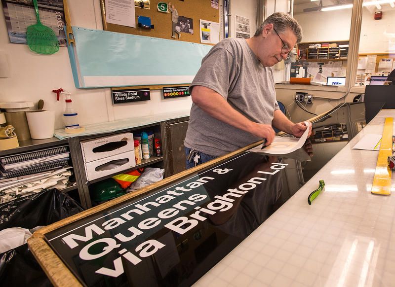
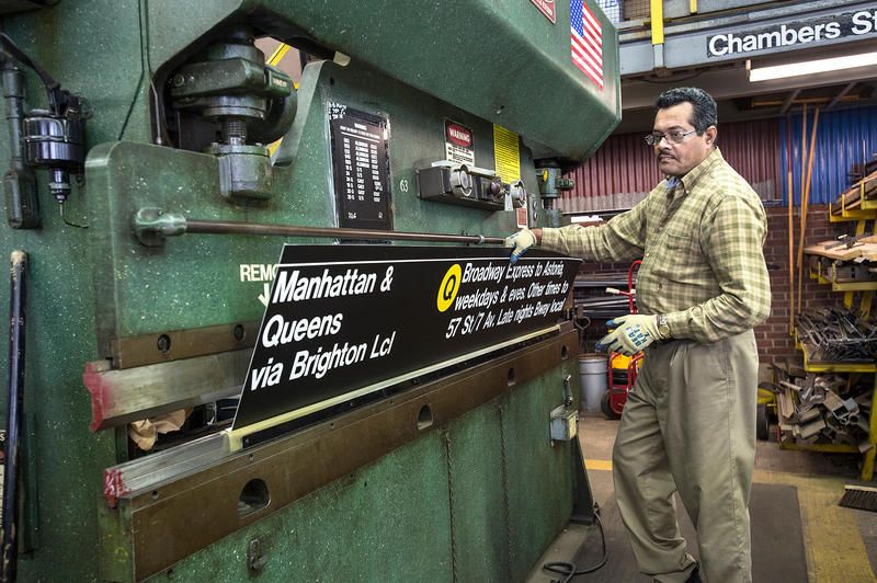
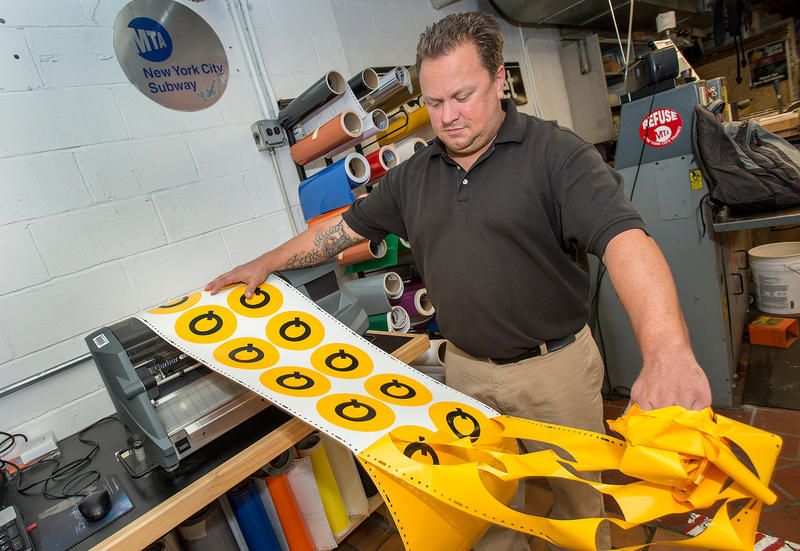
Opened over 60 years ago, the Bergen Sign Shop originally produced signs for trolley coaches and served as a bus garage until 1960, when trolley coach service ended in Brooklyn. Today, it turns out around 99,000 signs a year for the MTA to disperse throughout the New York City subway system. At the signage shop, the iconic, white Helvetica font is digitally arranged and printed, then manually transferred to a sign’s black metal body. The subway signs are then laminated and sent to the tin shop where they are bent for hanging.
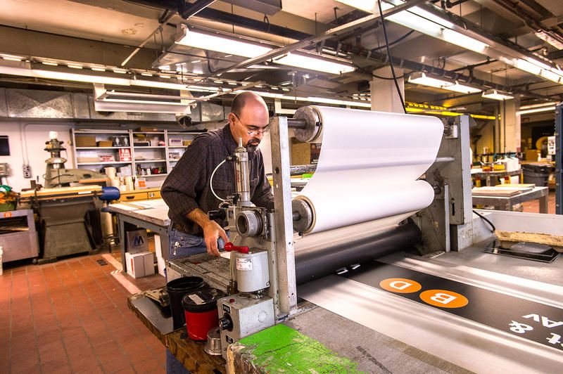
As inconvenient and frustrating as route changes can be for commuters, they mean a massive amount of extra work for the crew of a dozen people working at the signage shop. At the Times Square station alone, there are 1,640 signs. In 2010, when W train service was terminated, 3,000 signs had to be replaced. Employees were asked to forgo vacation time during the bustling two months it took to produce the new signs. Quite similarly, when the Q train started making local stops overnight in 2014, the crew hustled again to create 200 new signs that were installed at 31 stations. Obsolete signs are often sold online — and can make for a unique piece of home decor — or added to the city’s transit archives.
The simple and iconic design of New York City subway signage is based on ideals set forth in the 1970 Graphics Standards Manual, created by Bob Noorda and Massimo Vignelli. Vignelli and Noorda were tasked with creating a uniform system of signage for the subway, which, at the time, was made up of three separate systems: the IND, the IRT, and the BMT. The original font dictated by the manual was Standard Medium, which was eventually replaced by Helvetica. Additionally, the manual called for white signs with black lettering, but that has since been flipped to discourage graffiti. Despite these changes, the original design — featuring basic colors, precise verbiage, and simple shapes and symbols — has largely remained the same.
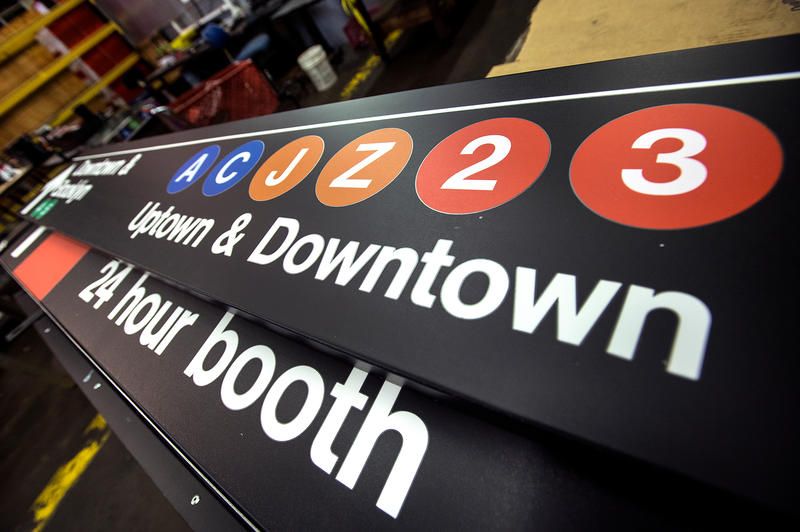
All the signs you see on your daily commute are produced by the able hands of workers at the Bergen Sign Shop. The next time you find yourself lost, then set straight again with the help of a sign, you know who to thank for showing you the way.
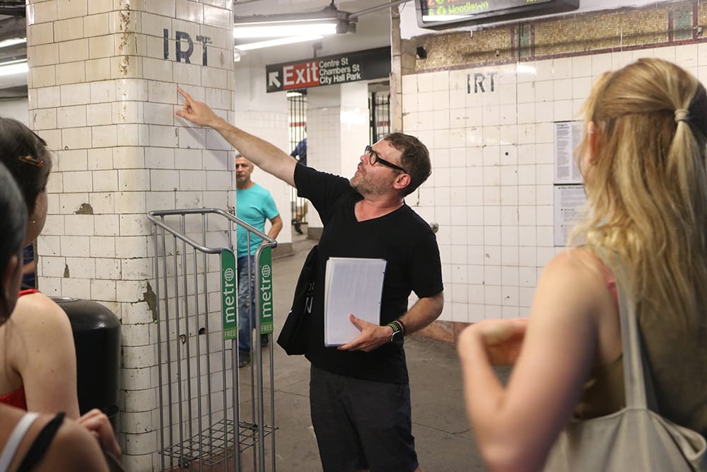
Ride through the oldest stations, uncover hidden art, and more!
Subscribe to our newsletter