Arts & Culture
Last Chance: The Annual Orchid Show Soars at the New York Botanical Garden
The vibrant colors of Mexico come to NYC for a unique Orchid Show at NYBG!
The vibrant colors of Mexico come to NYC for a unique Orchid Show at NYBG!

Join photographer Michael L. Horowitz for a journey through 50 years of photographs!

See waterfalls of fabric, intricate threadwork, massive tapestries, and more!


The New York City Department of Health has been releasing COVID-19 coronavirus testing data by zip code daily on GitHub, the repository of data and code for nerds. Untapped New York contributor Ben Huff, who is a Master of Science graduate in Urban Planning from Columbia University Graduate School of Architecture, Planning, and Preservation (GSAPP), created these interactive maps using that data for us by layering the zip code shape file from NYC Open Data with the Department of Health data. This map and article will be updated regularly with new data released by New York City Department of Health (the first article we published with the map and data was on 4/2/20, the second map we released is from the data released on 4/5/20, the third map from the data released on 4/13/20, and today’s from 4/20/20).
Using this map, you can see the comparative number of cases by zip code, with lighter colors having fewer cases and darker colors more. Click on a zip code area, and you get a pop-up that shows the number of tests, the number of positive cases, net new cases since 4/1, and % of total population. Below you will also find a map which normalizes the data by population showing cases per 1,000 of inhabitants per zip code.
Some notes: Williamsburg zip code 11249 continues to be missing from the Github data file, but we have heard NYC Department of Health has been assigning 11249 cases and deaths to 11211. As such, we have combined those zip codes in the latest version of the map so that Williamsburg does not look misleadingly low in terms of cases. The data is also limited by access to testing by zip code — areas may have more cases because more people can be tested, but may not mean there are actually more cases. Until widespread testing is available and the data set is more complete following the crisis, the true picture of what is happening by neighborhood cannot be assessed. And even at that point, we may never know the full number of cases.
For this round, we have also created a second map (above) which normalizes the data by population. The map shows number of cases per thousand of people, and helps better understand areas that are harder hit. The population numbers are based on the 2014-2018 5 Year American Community Survey Census estimate which is the best count available before the 2020 Census is complete (fill out the 2020 Census!) This data has been fixed to zip code tab area by the NYC Department of City Planning, so we know the geographical area between the two data sets is aligned. Huff notes, however, that this second map changes a lot per day.
Fatality data is not currently connected to zip code, so we have to wait to create a geographical map on that front. The NYC Department of Health has released data by race of confirmed COVID-19 cases per 100,000 as of April 16, 2020, though it is not geocoded. That being said, the racial demographic data is only complete as of 24% of total cases (completion rate is significantly higher for hospitalizations and deaths). The Department of Health notes that this is because the “vast majority of data is reported by labs and race/ethnicity information is often missing because it is not received on the test requisitions from providers.” Looking at the most complete data set, deaths at 88% completion, we see that so far, Black/African Americans are dying at a little over 2x the rate of whites, Hispanics/Latino at 1.64x the rate of whites. You can see the graphics released by NYC Health below:
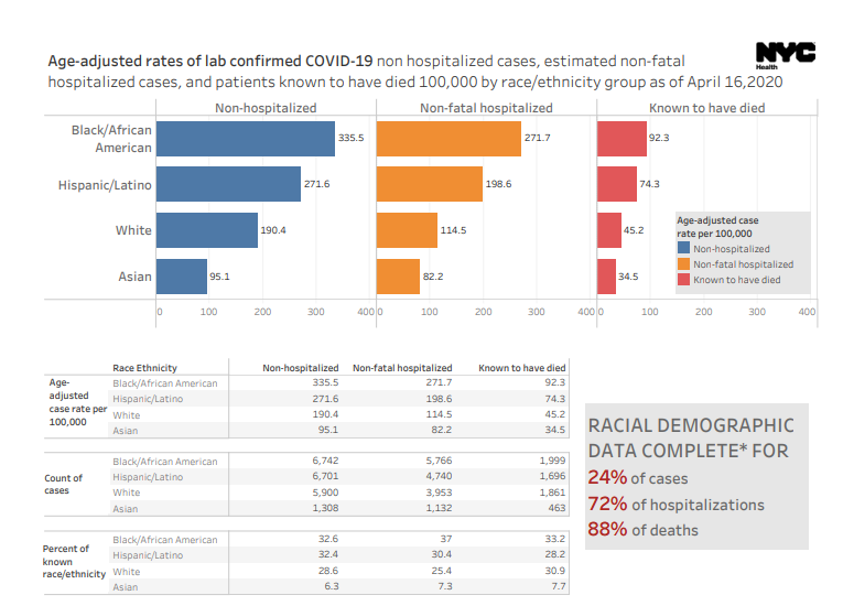
Graphic from NYC Department of Health
We are also deliberately waiting to do further analysis using socioeconomic data until the data set is more complete (over time) to determine the level of correlation between income and coronavirus incidence. At initial glance, you are seeing higher number of cases in the far outer boroughs. In The New York Times‘ own analysis of the data on April 1, 2020, they write, “many of the neighborhoods with the most confirmed virus cases were in areas with the lowest median incomes, the data shows.”
Ben Wellington, Visiting Assistant Professor in the City and Regional Planning program at the Pratt Institute, a quantitative analyst, and the founder of the website I Quant NY, goes deeper using regression analysis of the data on April 2nd. He writes, “positive testing rates, given the disparities in testing, is likely not a good proxy for the rate of infection when comparing across income lines.”
Wellington had previously mapped the ridership drop in the subway on March 18th, which he found to be far less extreme in less affluent neighborhoods where the population may have less ability to work from home. He wrote, “What’s troubling is that this may mean an additional health burden on those who may have less access to quality healthcare and are less likely to have paid sick time (or a security blanket for lost income). The health risks of keeping the subway open are not evenly distributed among income groups.”
To look deeper at the possible correlation with income, Wellington looked at data from symptom surveillance data also from NYC Department of Health that shows symptom counts from emergency room visits. He writes, “A quick analysis seems to confirm that there is a relationship between median income in a Zip Code and the ER visit rate for respiratory symptoms…And here is the striking thing – it turns out there is no mathematical correlation between hospitalization rates and positive test rates, adding the evidence that positive test rates is not a great proxy for understanding the spread.”
We have made our maps from open source data and produced it in a form that is embeddable you can use the codes below. Please just give credit to Ben Huff/Untapped New York:
COVID Cases by Zip Code:
<iframe width=”100%” height=”520″ frameborder=”0″ src=”https://bhuffs.carto.com/builder/b230af1e-0bfa-43b4-b5fe-8ecee83a0948/embed” allowfullscreen webkitallowfullscreen mozallowfullscreen oallowfullscreen msallowfullscreen></iframe>
Covid Cases by Zip Code, Normalized by Population:
<iframe width=”100%” height=”520″ frameborder=”0″ src=”https://bhuffs.carto.com/builder/ef7566fe-1a90-44c7-8833-4f01125e862a/embed” allowfullscreen webkitallowfullscreen mozallowfullscreen oallowfullscreen msallowfullscreen></iframe>
Next, check out our complete coverage of coronavirus in New York City including a look inside the Central Park field hospital. Check out 12 groundbreaking hospitals that have closed in NYC.

Subscribe to our newsletter