The New York City Department of Health has been releasing COVID-19 coronavirus testing data by zip code daily on GitHub, the repository of data and code for nerds. Untapped New York contributor Ben Huff, who is a Master of Science graduate in Urban Planning from Columbia University Graduate School of Architecture, Planning, and Preservation (GSAPP), created these interactive maps using that data for us by layering the zip code shape file from NYC Open Data with the Department of Health data. This map and article will be updated weekly with new data released by New York City Department of Health (we published our first map on April 2, 2020). [September 30, 2020 update: If you are looking for the hotspot zip codes for the latest COVID spike, see our latest article].
Using the first map, you can see the comparative number of cases by zip code, with lighter colors having fewer cases and darker colors more. Click on a zip code area, and you get a pop-up that shows the number of tests, the number of positive cases, net new cases since 4/27, and % of total population. Below you will also find a map which normalizes the data by population showing cases per 1,000 of inhabitants per zip code.
Some notes: Williamsburg zip code 11249 continues to be missing from the Github data file, but we have heard NYC Department of Health has been assigning 11249 cases and deaths to 11211. As such, we have combined those zip codes in the latest version of the map so that Williamsburg does not look misleadingly low in terms of cases. Rikers Island zip code is connected to Elmhurst, so in this map, the data is not separated out for the detained population on Rikers. The data is also limited by access to testing by zip code — areas may have more cases because more people can be tested, but may not mean there are actually more cases. Until widespread testing is available and the data set is more complete following the crisis, the true picture of what is happening by neighborhood cannot be assessed. And even at that point, we may never know the full number of cases.
We have also created a second map (above) which normalizes the data by population. The map shows number of cases per thousand of people, and helps better understand areas that are harder hit. The population numbers are based on the 2014-2018 5 Year American Community Survey Census estimate which is the best count available before the 2020 Census is complete (fill out the 2020 Census!) This data has been fixed to zip code tab area by the NYC Department of City Planning, so we know the geographical area between the two data sets is aligned.
On May 18th, NYC Department of Health released coronavirus death data by zip code. If you compare the map of coronavirus cases by zip code and the deaths by zip code, you get a pretty similar picture. The areas with the highest number of deaths are in the Bronx, central Queens around Elmhurst, Rockaway in Queens, and on Staten Island, Willowbrook and Stapleton-St. George, which aligns closely with where greater numbers of positive test cases are taking place. Read more analysis about this data in our most recent article.
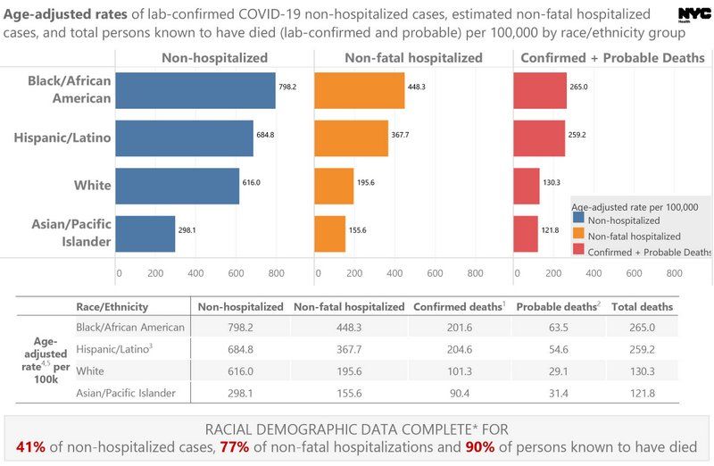
The NYC Department of Health has also released data by race of confirmed COVID-19 cases per 100,000 since April 8th, 2020. Since this data was first released in early April, the non-hospitalized data completion rate has improved (at 41% now versus 24%). Completion rate is significantly higher for non-fatal hospitalizations (77%) and deaths (90%). The low completion rate of non-hospitalization data is important — the Department of Health notes that this is because the “vast majority of data is reported by labs and race/ethnicity information is often missing because it is not received on the test requisitions from providers.”
Looking at the most complete data set, deaths at 90% completion, we see that so far if we include confirmed and probable deaths, Black/African Americans are dying at a little over 2x the rate of whites, Hispanics/Latino at 1.99x the rate of whites. according to DOH, “A death is classified as probable if the decedent was a New York City resident who had no known positive laboratory test for SARS-CoV-2 (COVD-19) but the death certificate lists as a cause of death ‘COVID-19’ or an equivalent.” You can see the graphics released by NYC Health below.
We are also deliberately waiting to do further analysis using socioeconomic data or until the data set is more complete (over time) to determine the level of correlation between income and coronavirus incidence. Ben Wellington, Visiting Assistant Professor in the City and Regional Planning program at the Pratt Institute, a quantitative analyst, and the founder of the website I Quant NY, went deeper using regression analysis of the data on April 2nd. He writes, “positive testing rates, given the disparities in testing, is likely not a good proxy for the rate of infection when comparing across income lines.”
As Huff tells us, “I have been looking at this data since the Department of Health started releasing it on April 1st. We have focused to map the data that is available, and given by DOH, rather than try to interpolate from it and make assumptions on who it is affecting. Zip Codes are not the best geography for understanding race and class, as they cast a wide net and capture a lot of variation within their boundaries. However after mapping for over a month a few things are clear. Although very dense, lower Manhattan has been spared the worst of the epidemic. Total number of cases, and when normalized for population shows concentrations in the outer boroughs, and particularly in communities of color. It’s clear that certain neighborhoods were hit with greater intensity, including most of the Bronx, central Queens around Elmhurst, upper Manhattan and neighborhoods of Brooklyn outside of the brownstone neighborhoods.”
We have made our maps from open source data and produced it in a form that is embeddable you can use the codes below. Please just give credit to Ben Huff/Untapped New York:
Michelle is the founder of Untapped New York and the author of The Art Spy (HarperOne, forthcoming) Secret Brooklyn, Secret New York Hidden Bars & Restaurants, and Broadway. michelleyoungwriter.com