100th Anniversary Great Nave Tour at the Cathedral of St. John the Divine
Celebrate the 1925 construction of the stunning nave inside the world's largest Gothic cathedral!


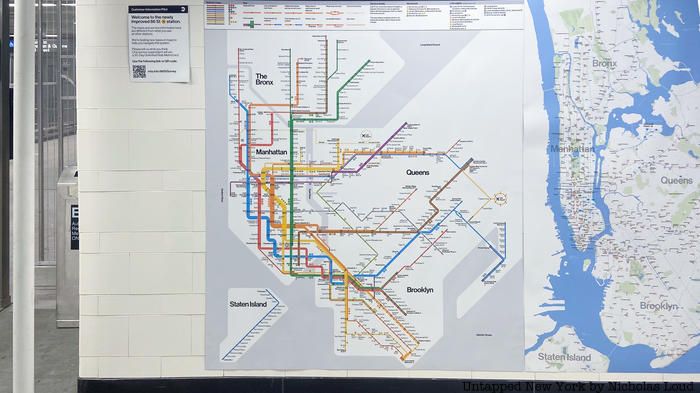
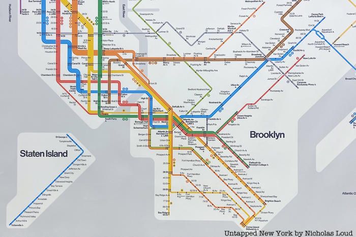
The map of New York City’s subway may be getting a makeover. Six new map designs have popped up inside the 86th Street station in Bay Ridge, Brooklyn. The maps currently works in progress and the MTA is hoping that riders who see them will share their opinions to help make improvements. One of the new maps harkens back to an iconic design used in the 1970s.

The non-geographic and simple design of Italian designer Massimo Vignelli’s 1972 subway map made it a favorite of design and transit aficionados. Vignelli’s map, which was in use from 1972 to 1979, is so revered that it earned a spot in the Museum of Modern Art’s postwar design collection, and fans rejoiced when a vintage Vignelli was uncovered in 2017 at the 57th Street/6th Avenue F train subway station. Now, one of the new subway maps proposed by the MTA reimagines the beloved map’s modernist approach to wayfinding. Subway lines are depicted in bold, bright colors and station names are written in black. As was the case in Vignelli’s map, the physical shape of New York City’s land is more representative than realistic.

In contrast to the more design-forward version, another proposed subway shows a highly realistic map, geographical map of New York City. Subway routes denoted in thin colored lines that accurately follow the shape of the route and are dotted by station names. Parks, bodies of water, and streets are all included in the map’s design.

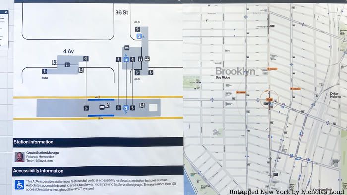
Other maps being tested at the station include maps of nearby attractions in the neighborhood within a walk or bus ride and two different versions of a station map that show accessibility features. Subway riders are encouraged to share their feedback on the maps on the MTA’s websit here. One respondent will even win a 30-day unlimited ride metro card. It is unclear if the prototype maps will be put up in other stations.
Next, check out Vintage 1970’s Vignelli Subway Map Unearthed At Subway Station in Midtown, NYC
Subscribe to our newsletter