Last-Minute NYC Holiday Gift Guide 🎁
We’ve created a holiday gift guide with presents for the intrepid New Yorker that should arrive just in time—


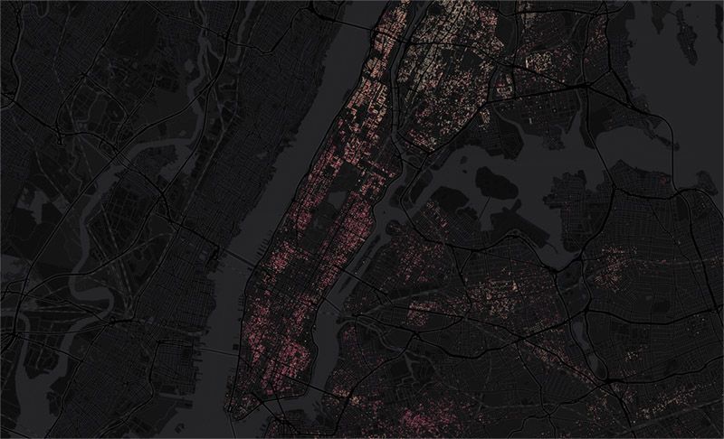
Between 2013 and 2015, around 450,000 evictions were filed, and almost 100,000 were carried out, according to JustFix.nyc, a startup that provides digital services for housing rights. Now the startup has made an interactive map of the city, showing exactly where these evictions have taken place and how many per building. The highest concentration of evictions in New York seem to be in Brooklyn and the Bronx, particularly the Flatbush and Bed-Stuy areas and near the Concourse.

Image via JustFix.nyc
As Gothamist noted, tenants in neighborhoods with high concentrations of rent-stabilized buildings were in greater danger of eviction, particularly in Brooklyn. It is relatively easy in New York for a landlord to de-stabilize an apartment, and evicting tenants makes this process even easier. A few years ago, Gothamist also reported on another map that tracked the deregulated apartments in the city.
JustFix.nyc, a civic-tech startup, works extensively with data visualization, and works to provide tenants with a platform for documenting their homes, connecting with legal experts, and filing complaints. They also recently created other tools to track affordable housing changes. The service came out of an app that won the NYC BigApps 2015 competition.
Next, check out more fun maps of NYC and the Judgmental Map of NYC.
Subscribe to our newsletter