Last-Minute NYC Holiday Gift Guide 🎁
We’ve created a holiday gift guide with presents for the intrepid New Yorker that should arrive just in time—


On October 21st, the Museum of Modern Art will re-open with 45,000 square feet of new space and a new approach to displaying modern and contemporary art. Designed by Diller Scofidio + Renfro in collaboration with Gensler, the expansion adds more than 30% more gallery space, additional guest amenities, and enables the Museum to exhibit more art in new and interdisciplinary ways. The expansion not only adds more room in the Museum, but also provides new ways for visitors and passerby to experience the collections.
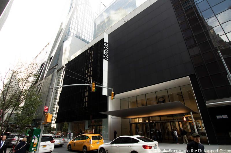
The Museum’s original building was constructed in 1939 and over the years, many prominent architects from Philip Johnson to Yoshio Taniguchi have had their turn at making it over. This most recent renovation and expansion, which costs $450 million, adds two new sections to the west of the existing Museum structures. The new construction includes a stack of innovative spaces in what is called the Jerry Speyer and Katherine Farley Building (where the former Folk Art Museum once stood), and new galleries inside the David Geffen Wing which occupies the lower levels of 53W53, a supertall tower by Jean Nouvel. The exterior facade of the Museum’s 53rd Street entrance has been redesigned to include a more open and welcoming entrance topped by a thin, but incredibly heavy (85,000 pounds!) steel canopy which is cantilevered over the doorway. Glen D. Lowry, The David Rockefeller Director of The Museum of Modern Art, likened the slim sheet to a butterfly’s wing.
Free ground floor gallery space
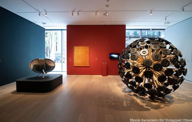
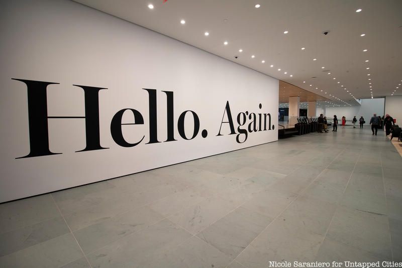
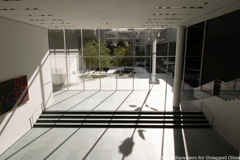
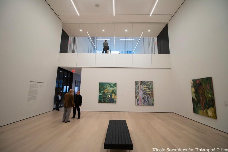
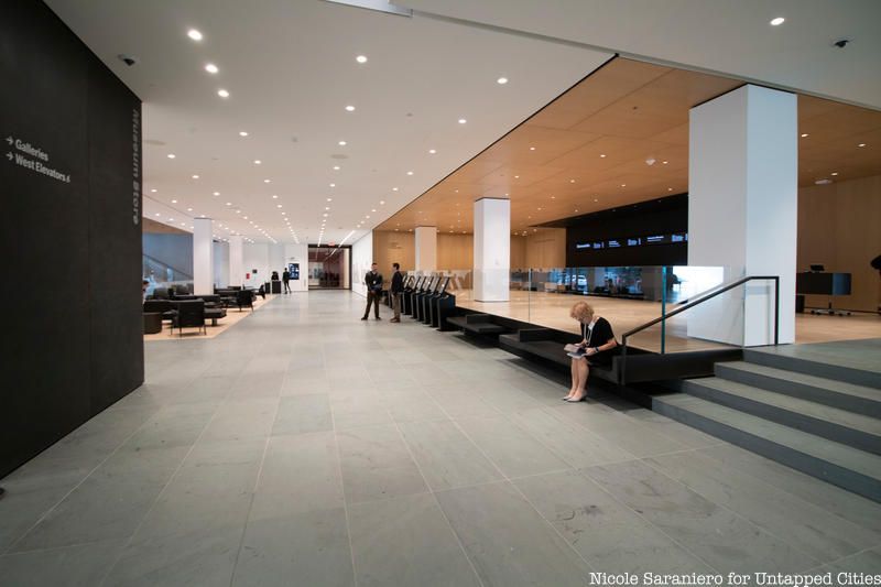
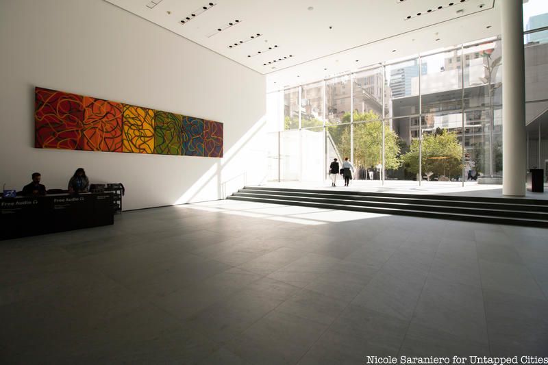
Unlike other museums, the Museum of Modern Art is on street level, not set back and perched atop a flight of imposing stairs. One of the main goals of the renovation and expansion was to enhance this inherent connectivity to the street and further engage with the city directly. The entire ground floor now includes 3,900 square feet of gallery space that is free and open to the public, including the double height Project Gallery which will display experimental works of art. Walking into the museum, visitors are greeted with an open and airy double height atrium which looks straight through to 54th Street. The sunken gift shop is another double height space which can be viewed from the street through the ground-level windows, and from the lobby above. There are also large windows in the ground level spaces and street facing spaces of the Jerry Speyer and Katherine Farley Building.
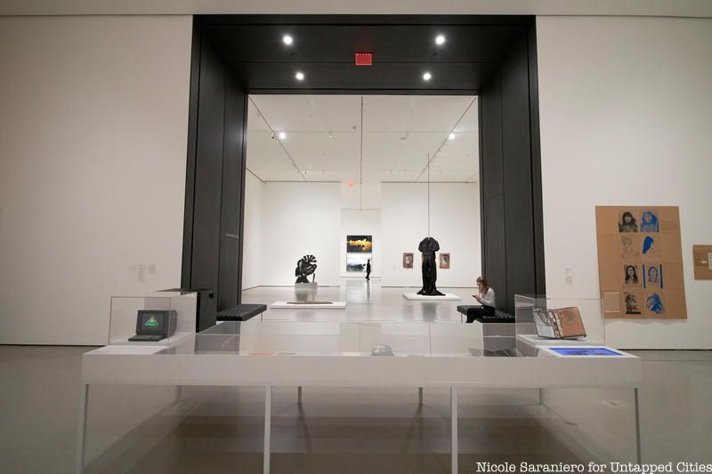
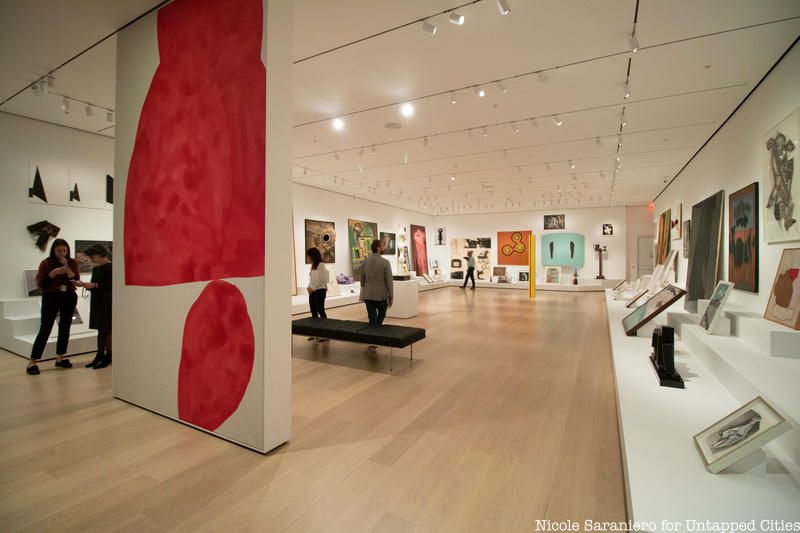
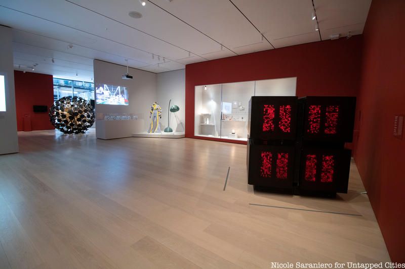
The second, fourth and fifth floor galleries of the Museum have all been expanded into the new David Geffen Wing with uninterrupted circulation between the existing and new spaces. The new square footage allows more than 1,000 additional works to be on display. The new spaces are marked with black steel portals and the flooring is made of 8-inch planks instead of 4-inch planks. Beyond these demarcations, the transition from old to new is nearly seamless.
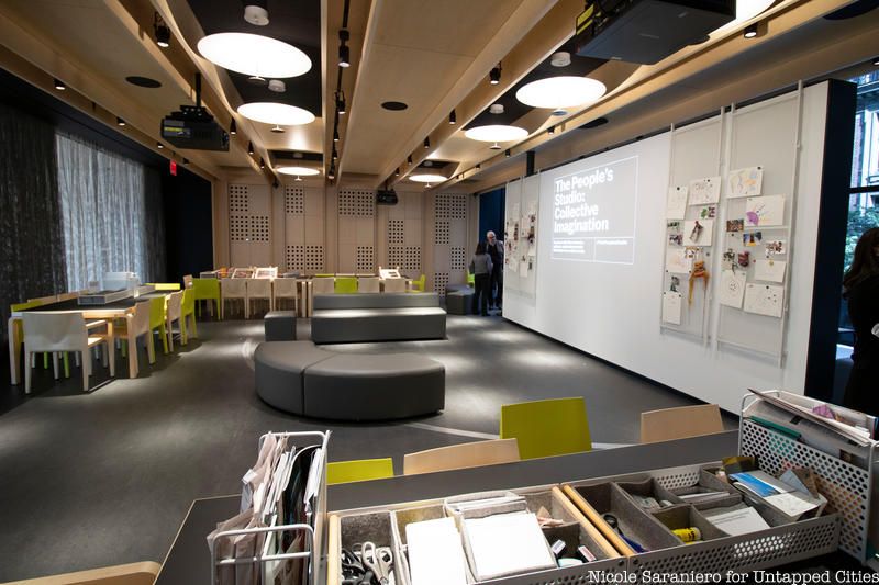
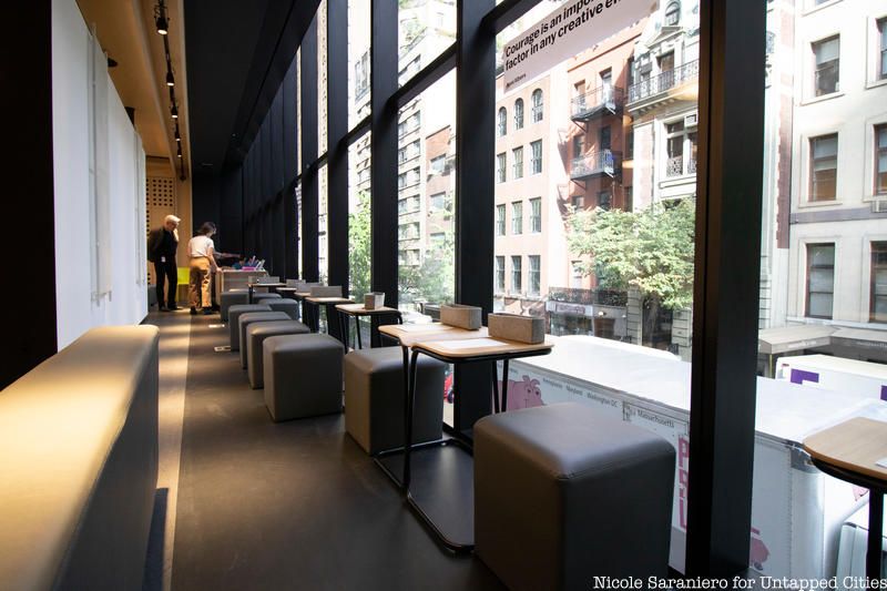
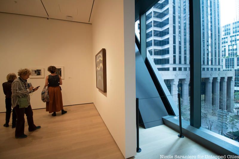
What sets the new spaces apart from the old is their flexibility and adaptability. Architect Elizabeth Diller noted at a preview of the new spaces that the Museum of Modern Art was the first to introduce windows into gallery spaces and the team wanted to bring that idea into the new expansion. The architect team gave curators the flexibility to change the spaces based on their needs. Everything in the expansion is temporary, so curators can choose whether they want windows exposed or covered by gallery walls. In the Jerry Speyer and Katherine Farley Building, the second floor has a Daylight Gallery which is flanked by windows overlooking 53rd Street and the open space above the ground floor Project Gallery. There is also a new Creativity Lab where events programmed by the Education Department will explore ideas, questions and art processes.
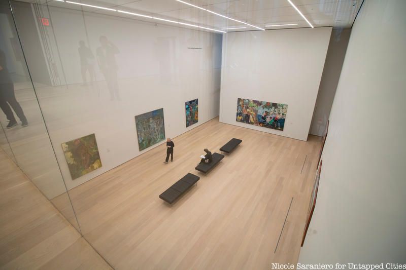 View of the ground floor project gallery from the 2nd floor
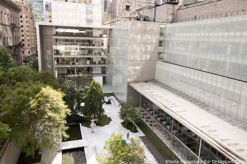
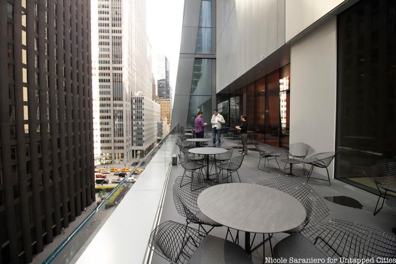
The fourth floor hosts the Marie-Josee and Henry Kravis Studio, a 2,000 square foot, black-box performance space. On the fifth floor, visitors will find a terrace that leads out to a view of the Museum’s garden courtyard. A new restaurant, The Carroll and Milton Petrie Terrace Cafe tops off the Museum at the sixth floor. Outside the interior portion of the cafe there is an outside terrace.
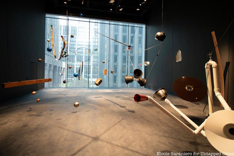
Fourth Floor Blackbox
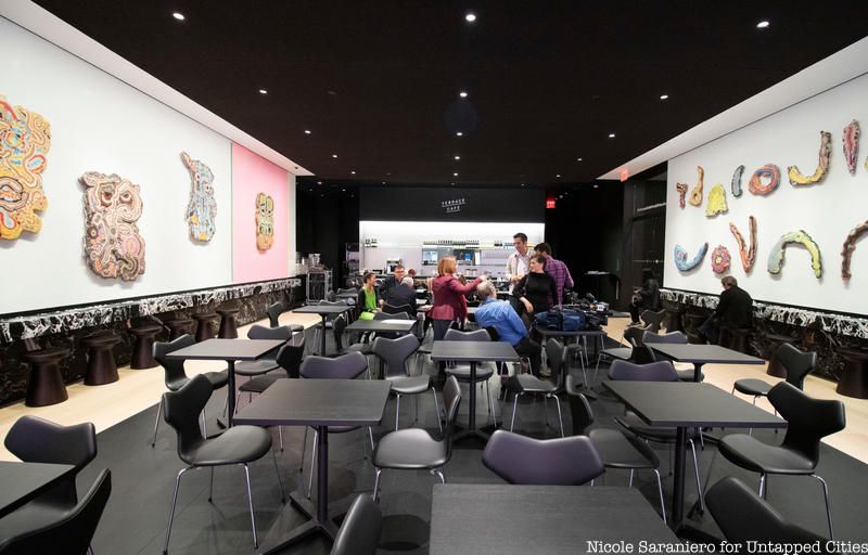 Sixth Floor Cafe
The shiny new spaces don’t just allow for more art to be hung, but they allow the Museum to rethink how the art is arranged and how visitors interact with it. Glen D. Lowry, The David Rockefeller Director of The Museum of Modern Art, noted that the first director of the museum, Alfred Hamilton Barr Jr., saw the Museum as a laboratory where the public was invited into the experiments and nothing was permanent. Today, the museum is getting back in touch with those ideals. Lowry notes that over the years the museum “settled into a pattern of showing art in a certain way,” and this expansion breaks that pattern. Museum staff have been learning about previously overlooked artists and pieces in its own collection that, with the expansion, can now be shown among the masterpieces the museum is known for.
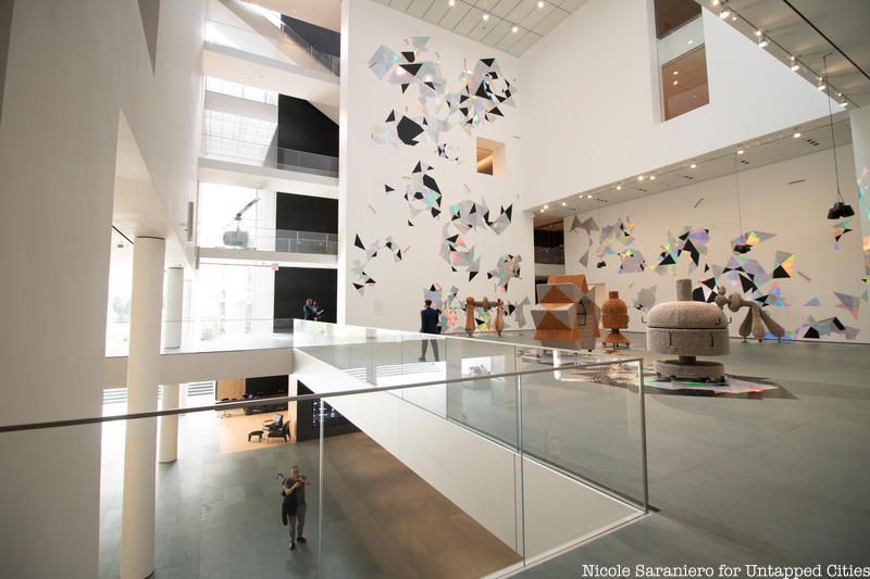
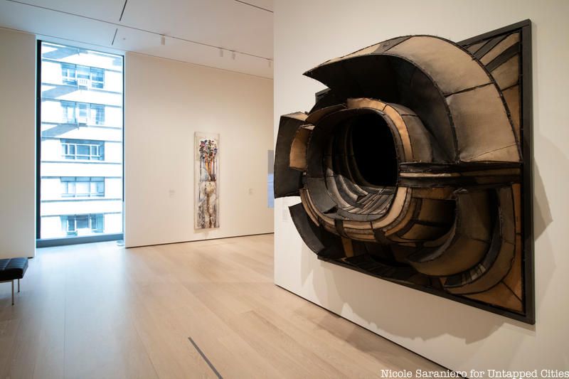
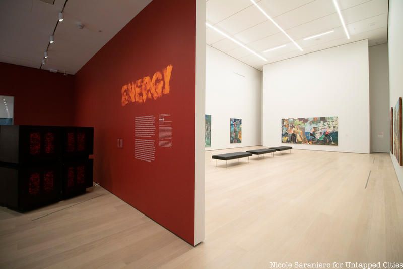
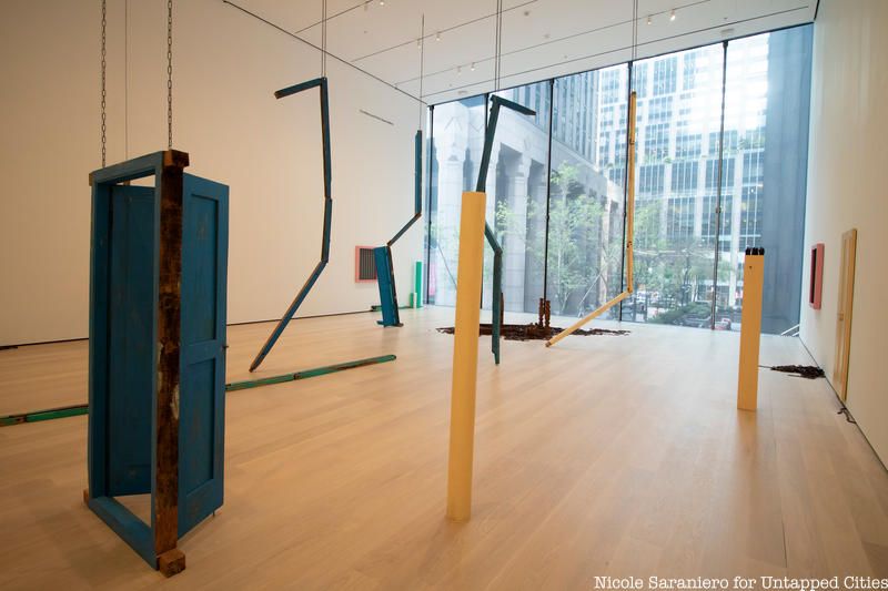
One-third of the collections within the Museum will be rotated or reinstalled every six-months. “What makes modern and contemporary art exciting is the debate and conversation that is still going on,” said Lowry. Works in the museum will constantly be put into new contexts to show different narratives and relationships between different art movements, locations and mediums. The collections will remain in a roughly chronological order based on the floor levels, but paintings will be shown with sculptures and films with photography, in a new interdisciplinary way.
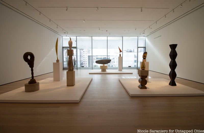
Fifth floor
Walking around the new and upgraded spaces, Diller noted how there is more freedom for visitors to craft their own narrative as they walk through the space. Circulation through the old and new galleries is uninterrupted. There are mulitiple entrances to the Museum itself and its galleries and more ways to get up and down between the levels. Those wanting to see the iconic pieces of the Museum’s permanent collections can make a beeline to the highlights and those wanting to wander or go straight to the new exhibits can do so easily. The expansion and renovation of the Museum of Modern Art gives visitors the freedom to explore, question and experience art on their own terms.
Check out more photos of the new spaces in the gallery below:


Next, check out 14 New Public Art Installations to Discover in NYC October 2019
Subscribe to our newsletter