A Salvaged Banksy Mural is Now on View in NYC
This unique Banksy mural goes up for auction on May 21st in NYC!


The second phase of Hunter’s Point South on Long Island City now has a developer, architect and non-profit partner. Hunter’s Point South is not only the largest development in the Bloomberg administration but also the largest affordable housing project in over three decades, since Co-op City in the Bronx and Starrett City in Brooklyn. Architecture firm ODA has released initial and design evolution renderings (below) for Parcel C, the largest block of the development located along Hunter’s Point South Park. ODA beat out BIG (in association with Related), ShOP Architects and Perkins Eastman for the bid.
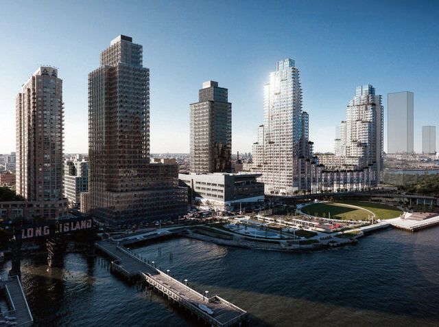
Developed with TF Cornerstone, there will be 1,193 new apartments (a mix of studio, one, two and three bedroom units), 796 will be affordable apartments run by Selfhelp Community Services) and 696 will be targeted to moderate and middle-income families. From those, 100 units will be set aside for senior citizens who also meet the financial criteria.
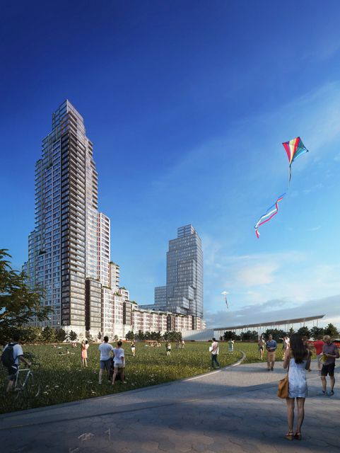
In terms of the design, ODA has taken cues from NYC’s iconic architecture, like Rockefeller Center, Central Park West’s residential skyscrapers and Madison Square Park’s prewar office buildings. While at a distance, the new development fits aesthetically into the existing glass skyline, a closer look reveals unique design decisions.
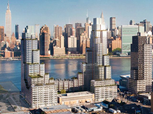
The stepped forms that make up the double towers will be built of 25-foot wide townhouse-scale vertical modules that create stepped terraces. In the rendering, they are filled with greenery, a direct reference to terraced agriculture. There will also be two urban farming plateaus, rooftop yoga, viewing decks, lounges and playgrounds on the terraces.
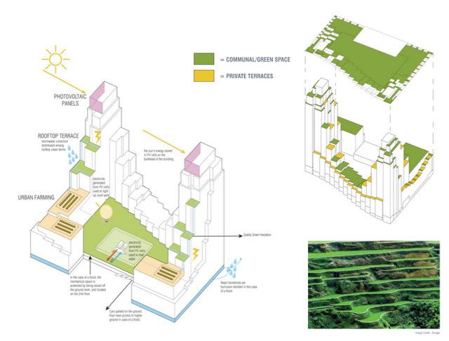
By merging the tower and courtyard into one, the architects aim to create a continuous activity strip in the development, which also connect courtyard to the waterfront. By breaking down the community spaces into smaller fragments, the designers intend to encourage more human scale interaction in public gathering areas.
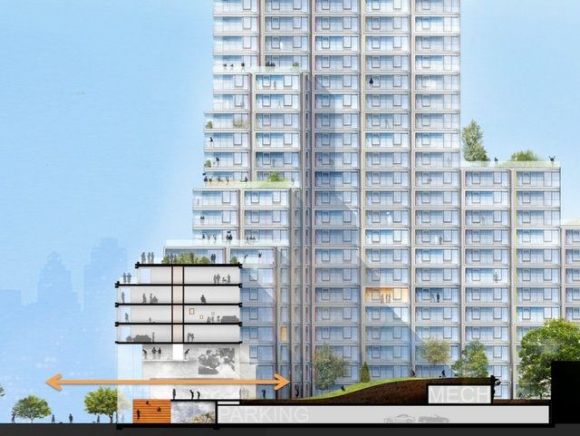
Also essential to the design was breaking up the traditionally linear street wall. Staggering the modules creates additional ground floor interest as well as allowing for corner windows in the units.
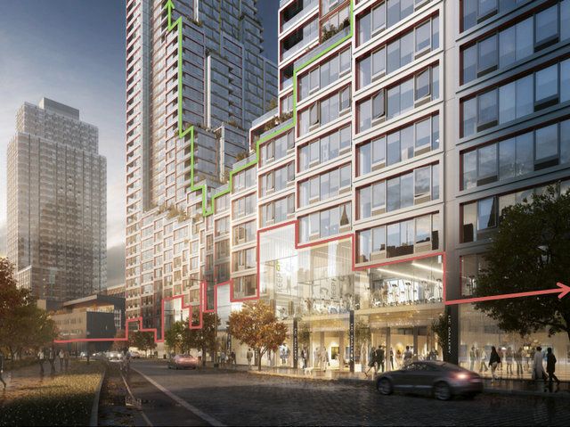
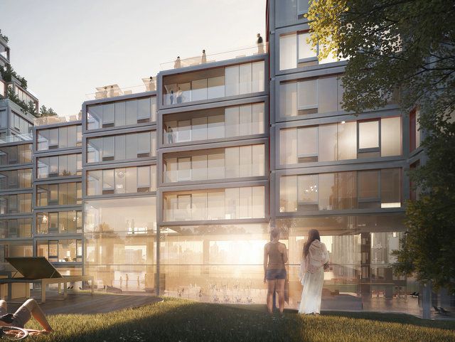
Part of the Hunter’s Point South design guidelines was to differentiate building parts so it looks like the neighborhood was built over time. The renderings by ODA below give you an idea of the differentiation in the tower designs and the variation in materials:
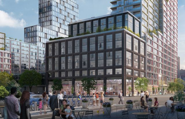
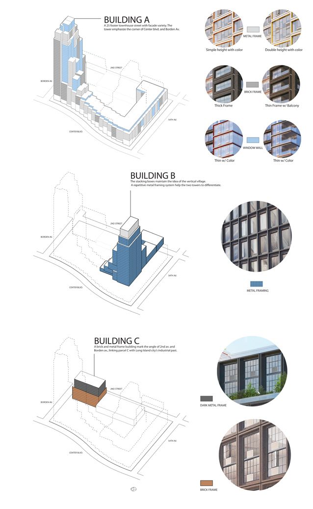
The de Blasio administration will be in charge of developing the rest of Hunter’s Point South. See more projects by ODA here, which include The James hotel, 15 Union Square West, and The National Museum for Art, Architecture and Design in Israel.
Read more about Hunter’s Point South on Brownstoner Queens. Get in touch with the author @untappedmich.
Subscribe to our newsletter