Last-Minute NYC Holiday Gift Guide 🎁
We’ve created a holiday gift guide with presents for the intrepid New Yorker that should arrive just in time—


Why all the hoopla? Is this designer of metallic museums and curvy concert halls, luxury houses, and flashy corporate headquarters, truly our Greatest living Artist?
-Hal Foster, “Why all the hoopla?” (2001)
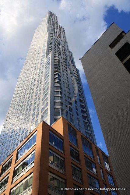
A shining light strikes everyone who is near City Hall Plaza. It pulls people into a hypnotic stance — light that reflects from the undulating waves of the stainless steel façade of the tallest residential tower in the Western Hemisphere. As you walk closer, the shining beacon looks as if it’s going to melt everything near by, revealing an 870-foot tower sitting on a five-story brick schoolhouse that serves as an austere and banal podium. Aptly or adversely, reviewed by some as counterproductive to social responsibility and sustainability, but honored by New York Times critic Nicolai Ouroussoff as the “finest skyscraper to rise in New York since Eero Saarinen’s CBS building,” the critique highlights the contradiction that is New York by Gehry.

New York by Gehry, formerly known as Beekman Tower, first opened its doors in Manhattan’s Financial District in 2011. As the name suggests, it was designed by Frank O. Gehry, the Canadian American Pritzker Prize winning architect, famous for forging a new aesthetic of architecture with visually astonishing buildings, such as Guggenheim in Bilbao, the Walt Disney Concert Hall in LA, and Manhattan’s IAC building, often with the power to engender economic redevelopment (aka the “Bilbao Effect”). An architect who in his own words approaches each project with a new insecurity, almost like approaching the first project he ever did, was yet again able to redefine the skyline of Manhattan after the void left post 9/11 attack.
Hailed by Mayor Bloomberg as a symbol of downtown progress, New York by Gehry stands out amongst the imposing cluster of avant-garde architectural manifestations around City Hall, including Cass Gilbert’s 1913 neo-Gothic Woolworth Building and Morphosis’s Cooper Union Building, another venture in stainless steel cladding. The design of New York by Gehry evolved from an unusual public-private partnership. The tower’s developer, Forest City Ratner, in partnership with New York education officials, agreed to incorporate a public elementary school into the project. Forest City was responsible for the construction of the school, the Department of Education then bought the building from the developer. In return the developer was able to secure $203.9 million in tax exempt Liberty Bonds to finance construction.
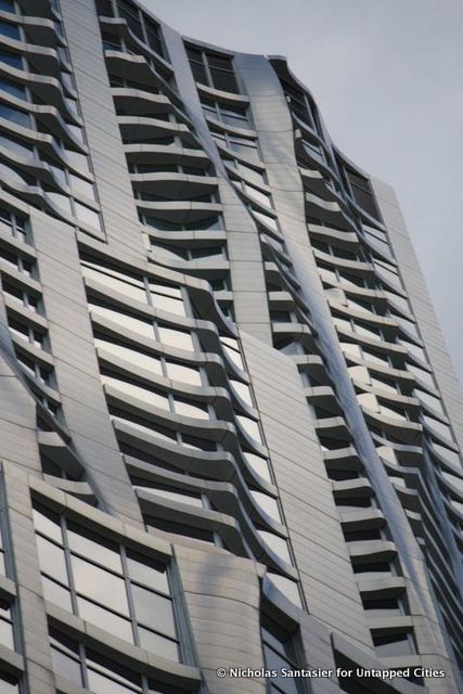
Nonetheless, Gehry broke away from the conventional broker-imposed conservative limits on the interior layout of the actual apartment with a simple idea – “resurrection of the bay window.” He successfully managed to provide a unique outer space in each layout offering a variety of views across New York. These bay windows, or in some cases patios, are what give the building the pattern of ripples and folds that look like a frozen rivulet shifting at each step and gives the sense of slenderness to the building which nonetheless ends in a classic T-shape plan at the base. Gehry spent days in a room experimenting with dozens of iterations before finalizing the undulating skin.

The design of course reflects the skill of an architect who has mastered the art of industrial production. The façade is fabricated from 10,500 individual steel panels, 9,000 of them unique. Yet, despite the technical complexity, the tower came in under budget and on schedule. The innovative unitized curtain wall system was shop fabricated, saving costly field labor, and was installed quickly without expensive staging. Rain screen panels, which can curve out as much as much as 6 feet or as little as 6 inches, were installed on top of standardized glazed panels. In addition, the use of sophisticated digital tools, including building information modeling (BIM) and computer-numerically controlled (CNC) cutting tools helped automate much of the fabrication process.
New York by Gehry represents architecture that is cost efficient, utilitarian but also allows for aesthetic risk taking. But behind the glimmering steel facade, there are also reasons to reflect on this shining beacon.
First, the stainless steel facade is so reflective that apart from visual sublime effect, it doesn’t address the tactile range of human perception, namely texture and sound. Second, the building doesn’t inscribe to the contingencies of regional climate nor does it optimize the use of universal technique, sensitively modulating the qualities of local light with fenestrations. Third, the two plazas on either side of the banal schoolhouse indicate an absence of the public realm, resisting the potential of place-based form in as dense and urbanized city as New York. The tower ends up serving only for sublime effect, in itself, for itself.
I am not an expert to decide if the residential tower is an epitome of “expression” and “public art” or if its anti-social art. But whenever faced with such contradiction, I go back to the quote by Kenneth Frampton, one of the greatest architectural historians,
All the architectural production stems from a high level of patronage, without which, a reasonable standard of general production can neither be achieved nor sustained, for building is a public art that demands great social commitment as well as high levels of investment, matched by an appropriate capacity in terms of both craft and industrial production.”
Is it time for us as patrons to be more reflective and critical, and as residents to demand more out of the architecture and spaces of New York City?
Subscribe to our newsletter