100th Anniversary Great Nave Tour at the Cathedral of St. John the Divine
Celebrate the 1925 construction of the stunning nave inside the world's largest Gothic cathedral!


Architect Philip Johnson is most known for his modernist buildings like New York City’s the Seagram Building and the David A. Koch Theater at Lincoln Center, but did you know he also had a hand in designing subway stations? In the 1970s, the Transit Authority was adding new stops and looking to spruce up some of the old ones. Designers were hired to make the subway stations more hospitable and visually appealing for riders. One of the subway stations Johnson helped revived with a funky new look was the 49th Street N/Q/R/W station.
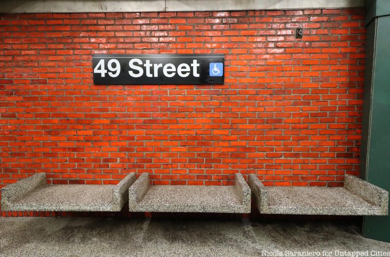
The subway station’s experimental renovation cost $2.5 million and was funded by a grant from the Federal Urban Mass Transportation Administration. Instead of white subway tile and mosaic station signs, the walls are covered with bright orange glazed brick. This was the first appearance of orange walls in the subway, though the color would later coat Bowling Green. The platform floor is terrazzo and all of the columns have been removed to give it a more open feel. The benches, which are attached to the brick walls, seemingly float above the ground. Even the infrastructure of the station was upgraded to make the ride through the station quieter and more smooth. The tracks were welded and acoustical material was put in the ceiling and under the platforms to reduce noise, another first in the system.

The 49th Street Station was one of six new or remodeled stations which made their debut in the 1970s. Other stations that were new or improved included 42nd Street, 47th-50th Street, 57th Street, 60th Street and Bowling Green. In a 1977 New York Times article, Robert A. Olmsted, head of the transportation planning department of the Metropolitan Transit Authority at the time, noted that the stations improved the customer experience by having “more escalators, fewer columns, more color, more attention to acoustics and higher ventilation standards.” Removing columns continues to be one of the design and engineering choices in station renovations — something you can see at the Cortlandt Street subway station which does not have a single column on the platform.

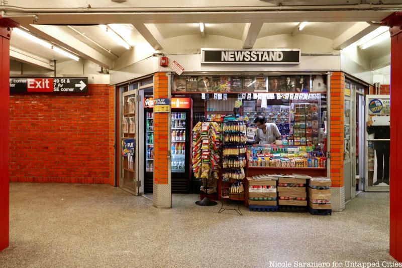
Every station in the New York City subway system has something unique to offer, but this station certainly stands out among them. Even the newsstand is accented with orange bricks. Today, the subway system continues to grow and improve. Recent upgrades have brought a sleek and bright aesthetic with digital screens and black and silver metal accents. There are still fun elements too like the giant flower mosaics revealed in the 28th Street Station and the Weimaraners of 23rd Street, works of art installed through MTA Arts & Design.
To discover more hidden gems of the New York City subway, join us for an upcoming Secrets from Below: Underground Tour of the NYC Subway!
Underground Tour of the NYC Subway
Next, check out The Top 20 Secrets of the NYC Subway and 20 Original Examples of NYC Subway Art
Subscribe to our newsletter