Fiber Arts Take Over a Former Seaport Warehouse in NYC
See waterfalls of fabric, intricate threadwork, massive tapestries, and more!


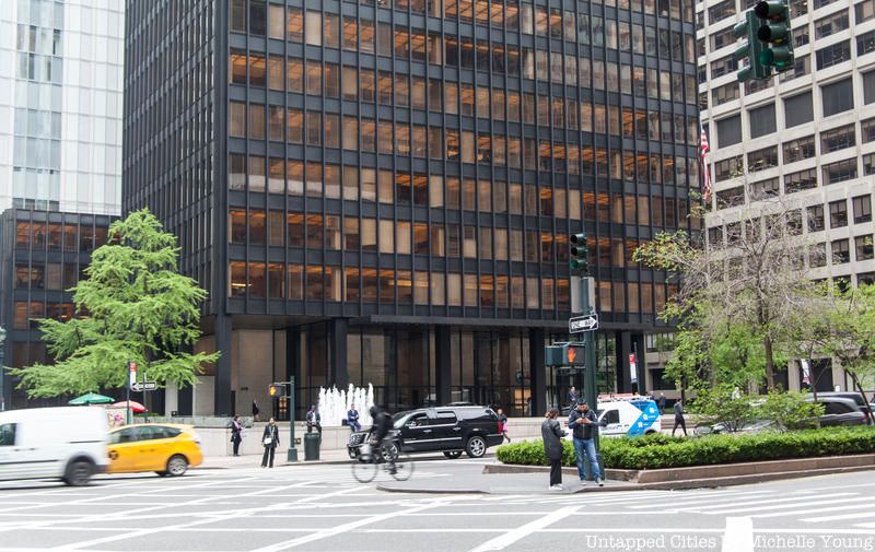
When most people think of the New York City skyline, they probably think of skyscrapers like the Empire State Building, the Chrysler Building, and the new One World Trade Center first. However, there is one vital New York City skyscraper that they perhaps overlook: The Seagram Building.
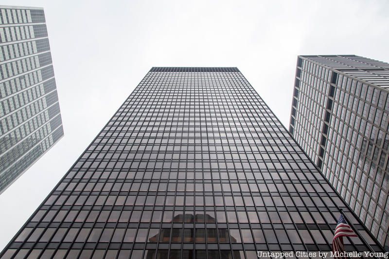
Located at 375 Park Avenue, this sleek black structure, which is 38-stories and 515-feet tall, was created in 1958 for the Canadian alcoholic beverage distilling company, Joseph E. Seagram & Sons. While its height may pale in comparison to the other giants of the New York City skyline, it set crucial standards for the architecture of American corporate offices surrounding us everyday.
German architect Ludwig Mies van der Rohe was the Seagram Building’s architect and came up with idea for its innovative design. Mies was also a director of Berlin’s Bauhaus school, the site of the beginnings of modernist architecture. Surprisingly, Mies himself never actually attended design school and opted for a trade school instead, where he learned sketching and gained more hands on experience instead.
When the Nazis closed the Bauhaus in 1933, Mies and his groundbreaking, minimalist architectural concepts moved to the United States in the late 1930s at age 51.
The Seagram Building could not have been built without a persistent, visionary woman named Phyllis Lambert, who was the daughter of Samuel Bronfman, owner of Joseph E. Seagram & Sons. Lambert served as the building’s planning director. In a NY Times article, she said she had wanted to choose someone who could “make the greatest contribution to architecture.”
Before its creation in 1959, several architects like Eero Saarinen, I.M. Pei, Pietro Belluschi, and Louis Kahn proposed their plans for the building to Lambert. Lambert seriously considered the designs of Swiss-French architect Le Corbusier, but still preferred Mies’s design.
She cared so much that she wrote a seven-page letter to Bronfman when he showed her the initial plans for the building, emphatically explaining why it wasn’t right. She even rejected Frank Lloyd Wright, the architect of the Guggenheim Museum and several other famous structures, who proposed constructing a 100-story building.
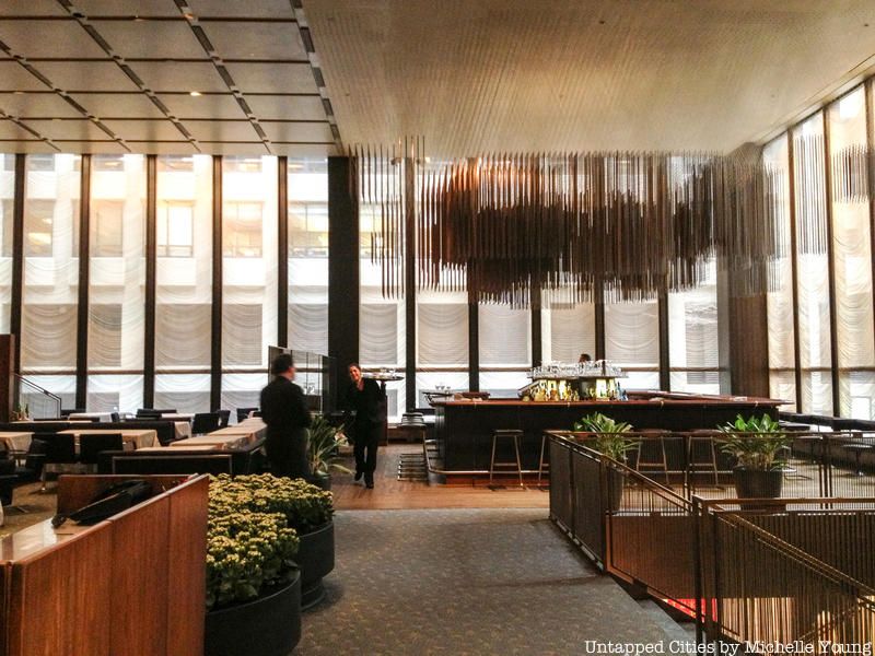
While the Seagram Building’s exterior is most known for leaping architectural boundaries, its interior was also innovative. Once Lambert chose Mies to design the exterior, Mies decided to make American architect Philip Johnson responsible for its interior. (Fun fact: Lambert and the executives chose the Seagram Building’s architect in the Glass House’s living room).
The office space above the building’s crisp lobby are lit with ceiling panel lights and receive as much natural lighting as possible since the floor to ceiling windows are glass panes with grey topaz. He also used a lot of marble and bronze, contributing to its overall decorative nature (and hefty price). There are also vertical bars in the window panes to match and highlight the building’s vertical exterior.
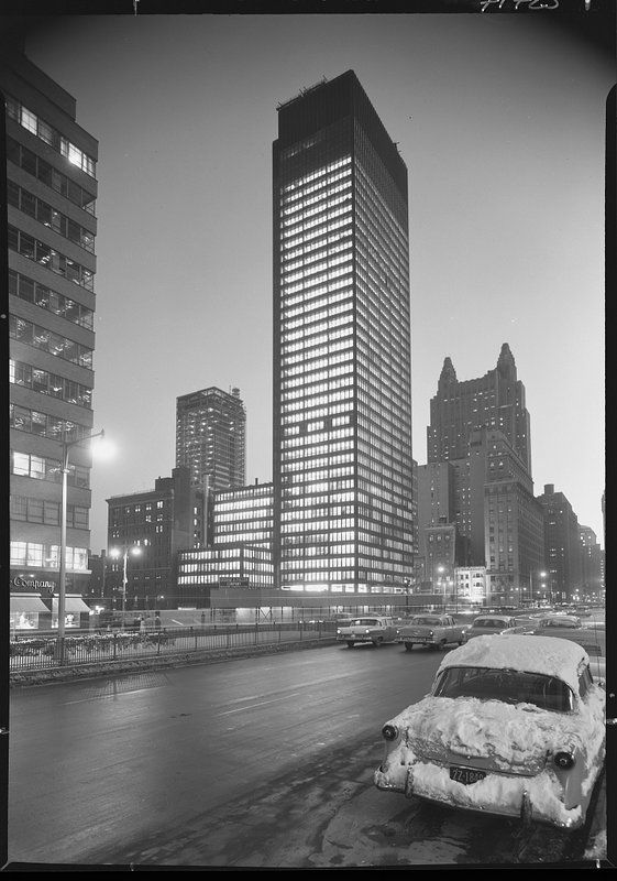
Photo via Library of Congress
Mies firmly believed that the building’s structural aspects alone create natural beauty and allow the building to transparently communicate with anyone who saw the building. His ideas were strictly minimalist; he found extravagant decoration superfluous.
In fact, according to an article in Phaidon, the common phrase “less is more” can be attributed to Peter Behrens, who was a “godfather figure” to Mies and is considered the first industrial designer ever. Behrens first gave him this advice while Mies showed him sketches in his office, and it remained with him throughout his architectural career.
Lambert agreed with Mies’s principles; in 1954 she wrote, “Mies forces you in. You might think this austere strength, this ugly beauty, is terribly severe. It is, and yet all the more beauty in it.”
Though Mies wanted everyone to see the building’s actual steel frame, American building codes mandated that fireproof material cover the steel frame. Though most architects used concrete to cover structural steel, Mies also used bronze-toned I-beams to cover this concrete layer so that the structure would not be completely hidden.
Altogether, he used 1500 tons of bronze when creating the building. Since then, this strategy of using a “reinforced concrete” covering has been increasingly used – one of many ways the Seagram Building is an architectural legacy.
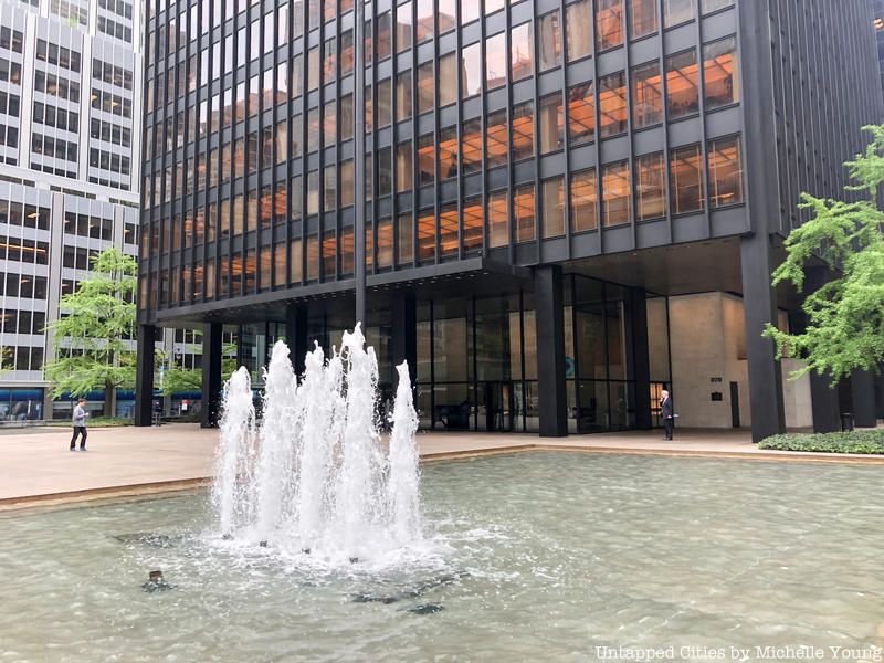
A granite plaza with a sprawling staircase lies in front of the building’s entrance. With fountains on either side of plaza in perfect symmetry and a large sculpture, both passerby and Seagram’s office workers are free to relax in this area.
The Seagram Building became one of the original structures to have such an area. In 1961, New York City significantly revised its 1916 Zoning Resolution, giving incentives for planners and architects to create “privately owned public spaces” like the Seagram Building’s plaza.

The Four Seasons Restaurant’s pool room
Besides hundreds of offices, the Seagram Building is also home to New York City’s iconic restaurant, The Four Seasons, which was also designed by Mies and Johnson. Unfortunately, the opulent restaurant’s lease ends this June, and the owners don’t plan to keep it open.
The Four Seasons, which opened at the Seagram Building in 1959, also crossed its own boundaries in the restaurant business. It created the concept of changing menus with season in American restaurants, was the first go-to restaurant to print English menus, and the first in the nation to cook with fresh, wild mushrooms.
Take a look inside the Four Seasons Restaurants as it was and an exhibit about the Glass House that was in lobby of the restaurant in 2015.
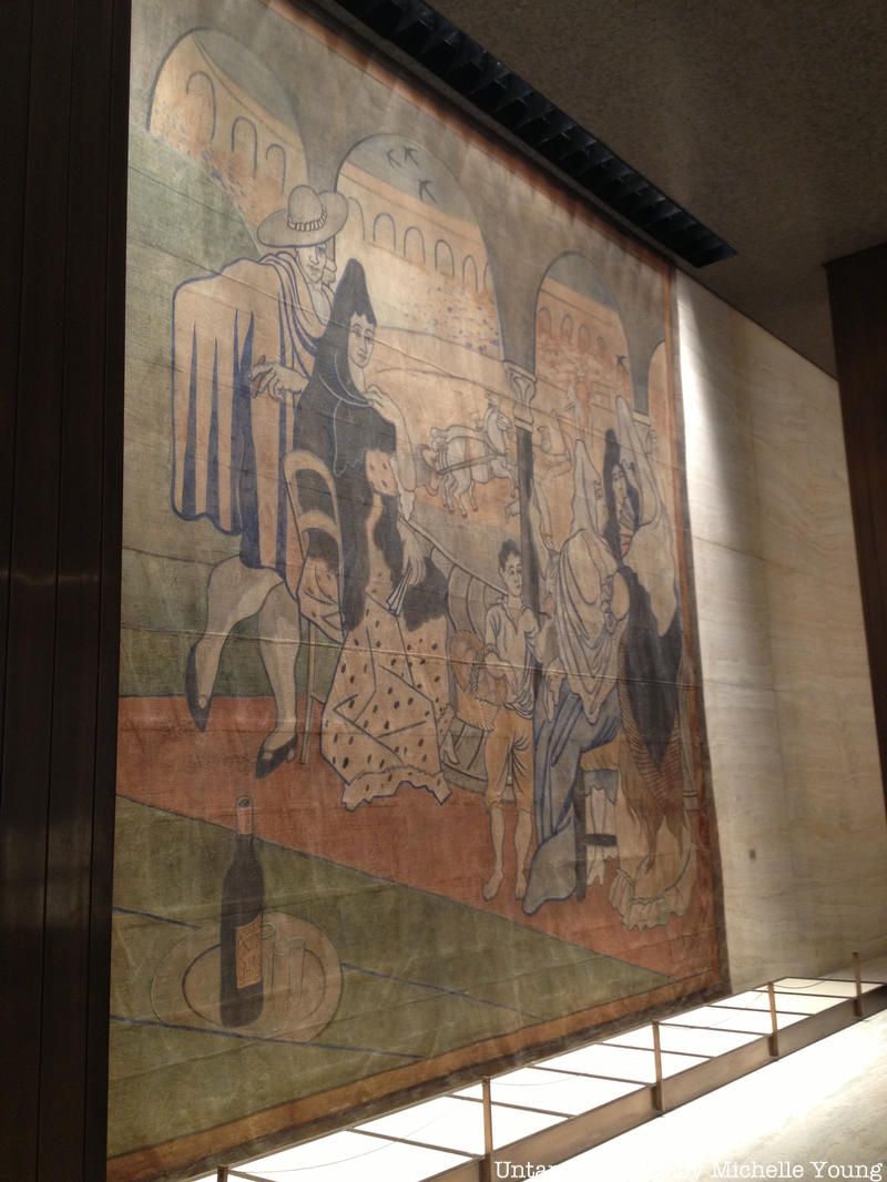 Picasso’s “Le Tricorne” on display at the Four Seasons.
Lambert and the planners struggled to find an artist to paint murals for the Four Seasons. In 1958 she initially hired Mark Rothko to do this, but he backed out due to resentment of the restaurant’s high-class connotations.
Lambert initially met Picasso for lunch at his Cannes studio, and he eventually gave her the 20 square foot “Le Tricorne,” a stage curtain he made in 1919 for the Ballets Russes. It was gifted to the New York Landmarks Conservancy and after significant controversy about the preservation of the curtain, it is now displayed at the New York Historical Society.
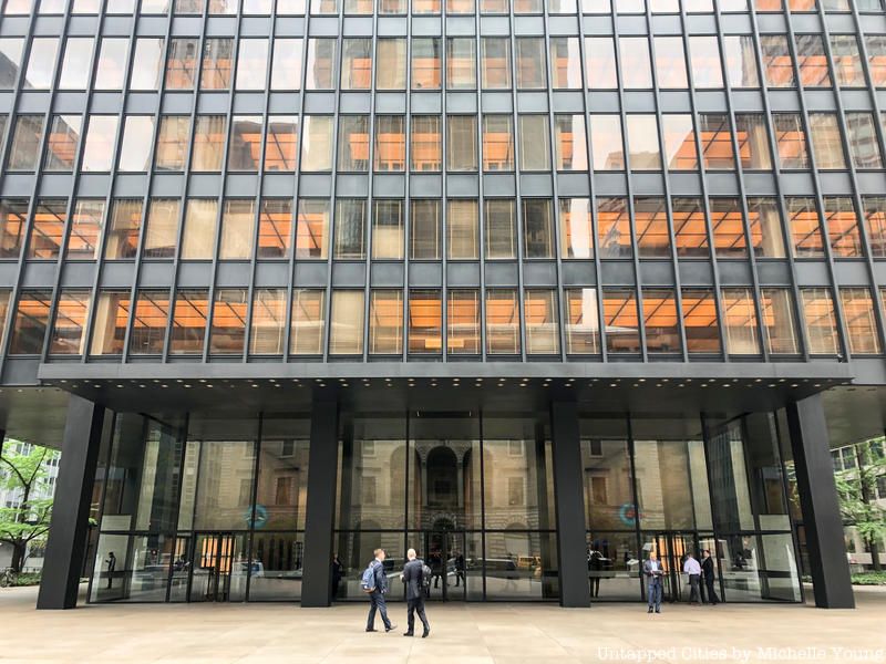
Due to its use of pricey, quality materials for both its interior and exterior, like bronze, travertine and marble, the Seagram Building’s construction cost a whooping $36 million dollars (in mid-century dollars). Though the $3.9 billion in costs for the construction of the One World Trade Center in 2014 make it the world’s most expensive skyscraper, $36 million would be at $297.6 million today.
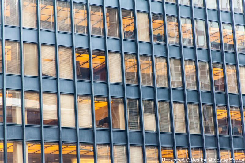
Mies clearly had an eye for neatness; the sight of window blinds drawn to different heights from the outside irked him. To fix this, he dedicated much effort into creating precise window blinds for the offices in the Seagram Building in order to avoid this lack of uniformity among workers’ window blinds. As you could probably observe when looking at the building, the blinds only open in three ways: completely drawn, half drawn and completely open.
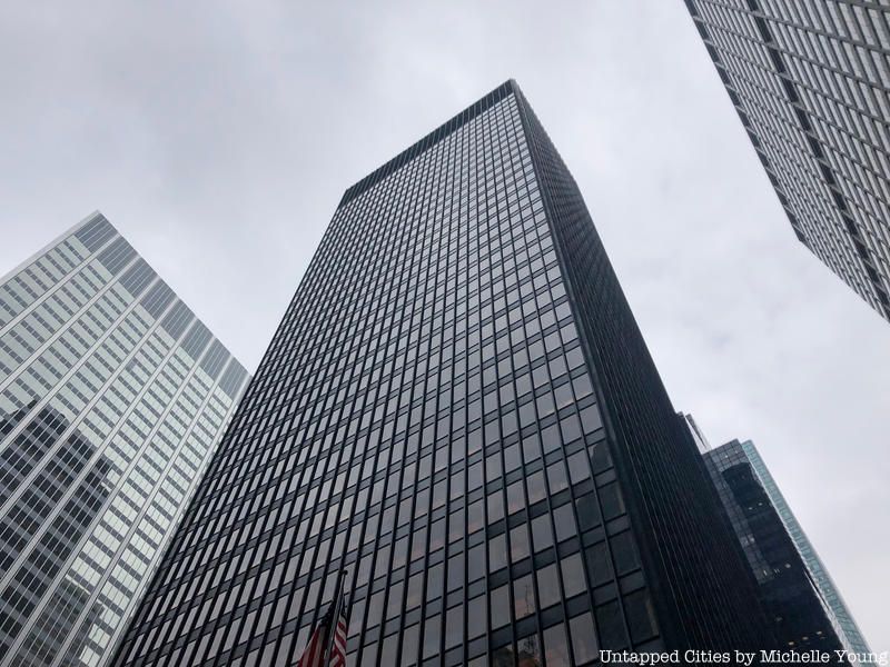
Though the Seagram Building clearly deserves much praise, like everything, it isn’t perfect. Its score of 3 out of 100 on the Energy Star ratings (a score less of 50 is the median building energy performance), puts it at the very bottom of the list of energy-saving buildings.
Older buildings in general tend to score low; the Seagram Building’s single-pane glass walls and fluorescent lighted ceilings aren’t compatible for conserving energy. Upon hearing this news, RFR realty announced it would invest at least $12 million to upgrade the building with technology like motion sensors and fans and pumps that are only used when needed.
Next, try The Top 10 Tallest 100+ Floor Skyscrapers in the World Today, The Top 10 Tallest Buildings in NYC, Existing and Planned and Inside the Four Seasons Restaurant in the Seagram Building [Photos]. Get in touch with the author @sgeier97
Subscribe to our newsletter