Secrets of NYC
How to See the Liberty Bell...in Queens
A copy of the famous American bell can be found inside a bank, which itself is modeled after Independence Hall!
A copy of the famous American bell can be found inside a bank, which itself is modeled after Independence Hall!

Do you live near a CSO (Combined Sewer Outflow)? Learn what a recent Supreme Court ruling might mean for the safety and quality of NYC's bodies of water.
This zany NYC tradition celebrates a major milestone!


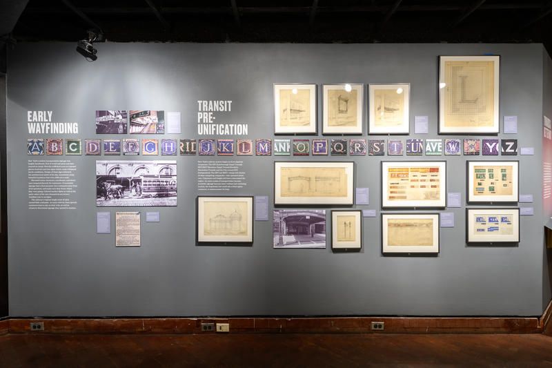
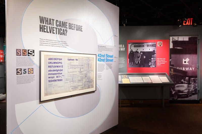
When traversing the New York City subway system, sometimes you will come across signs that reference earlier systems, defunct lines, or graphics from the era before Helvetica. In a new exhibit inside the New York Transit Museum’s Grand Central Gallery, Changing Signs, Changing Times: A History of Wayfinding in Transit, you can get the big picture and see the evolution of New York City signage explored through photographs, objects, and archival materials drawn from the Museum’s vast collection.
Photograph by Filip Wolak
Wayfinding and information signage was standardized by the Metropolitan Transportation Authority (MTA) more than fifty years ago, giving us the system wide color scheme and Helvetica font we recognize today. However, before that, signs were largely handmade and came in a plethora of materials, shapes, sizes, colors and fonts. Some of the earliest signs from the 19th-century were designed to attract customers to one specific mode of transportation over another. There were elevated trains, horsecars, omnibuses, streetcars, and railroads all vying for commuter attention with signs made of wood and paint and later enamel and metal. Keeping with the trends of the day, the fonts were often fanciful and flourished, making the signs pretty to look at, but hard to read.
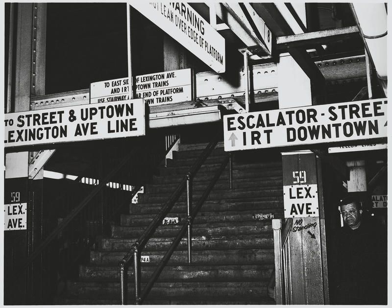
Lexington Ave–59 Street 1968 – New York Transit Museum Collection
As even more modes of transportation were thrown into the mix, more signs appeared and things got even more confusing. To start, the New York City subway was run by three separate entities, the IRT (Interborough Rapid Transit), BRT/BMT (Brooklyn Rapid Transit/Brooklyn Manhattan Transit), and the City-owned IND (Independent). These companies would all come together in 1940, but sorting out the signage would take time.
Photograph by Filip Wolak
Photograph by Filip Wolak
Photograph by Filip Wolak
In 1967, a cohesive aesthetic for signage throughout systems run by the New York City Transit Authority was finally created by Unimark, a design firm headed by Massimo Vignelli and Bob Noorda. This look was extended to bridges, tunnels, and regional rails run by the MTA in 1968. Today, all of the signs you see come from a shop in Crown Heights, Brooklyn. In the new exhibit, you will be able to see the signs that helped lead to the system we have today, including what worked and what didn’t, trace the evolution of signage design from ornate, hand-painted pieces of wood to digital kiosks, and learn about principals of design, wayfinding and advertising.
The exhibit will be on view through November 6th, 2019 at the New York Transit Museum Gallery & Store at Grand
Central Terminal.
Next, check out Inside the MTA Transit Sign Shop That Makes All of NYC’s Subway Signage and 10 Fun Facts About the NYC Transit Authority Graphics Standard

Subscribe to our newsletter