How to Make a Subway Map with John Tauranac
Hear from an author and map designer who has been creating maps of the NYC subway, officially and unofficially, for over forty years!


In the early days of modernism America was pretty resistant to being made modern—or “Mod,” as the Millennials say. Americans tended to prefer derivative styles—Renaissance Revival, Colonial, Neo-Gothic—and wanted their homes to look dignified and elegant. What better way to accomplish that than imitate historical styles? Marilyn F. Friedman chronicles the saga of how Americans came to embrace modernism, modified for their New World sensibilities, in her latest excellent book, Making America Modern: Interior Design in the 1930s (Bauer & Dean).
The early 20th century had been a ferocious time of wars and terrors, so designers and architects were intent on breaking with the past and coming up with something new. The design revolution started in Europe and stayed there for decades, though émigrés brought here skills and design ideas they had acquired at Modernist schools and ateliers abroad, says Friedman, generating architecture and interiors reflective of their education and training.
The U.S. didn’t even participate in the important Paris Exposition des Arts Décoratifs of 1925, which nonetheless became a catalyst for the development of modern design in America. American-born designers who had seen the exposition brought back ideas, and the U.S. Department of Commerce made a report public that exhorted American business to produce modern design. The department even published a blueprint on how to do this without too much financial risk. An exhibition of over 400 modernist objects from Paris toured big-city museums, including New York, Boston, Chicago, Detroit, and Minneapolis.
While Americans were latecomers to the modernist revolution, New-York-based shelter and design magazines trumpeted the glories of the innovative new furnishings in the late 1920s and New-York-based department stores, such as Lord & Taylor and R. H. Macy, financed elegant exhibitions to show just how one might do this in one’s own home. The Livable House Transformed was the confident title of Brooklyn-based Abraham & Straus’s exhibit: “A Presentation of Modern Art in an American Home.” The department stores, of course, were hoping to profit from the furnishings they were displaying so lavishly, a topic Friedman covered in her previous book, Selling Good Design: Promoting the Early Modern Interior (Rizzoli, 2003), which had analyzed retail efforts to promote modernism in the 1920s. The department store barons were savvy merchandisers who knew that if they were going to keep selling goods, they had to wean their customers away from their old tastes—and substitute for the old a demand for an entirely new look.

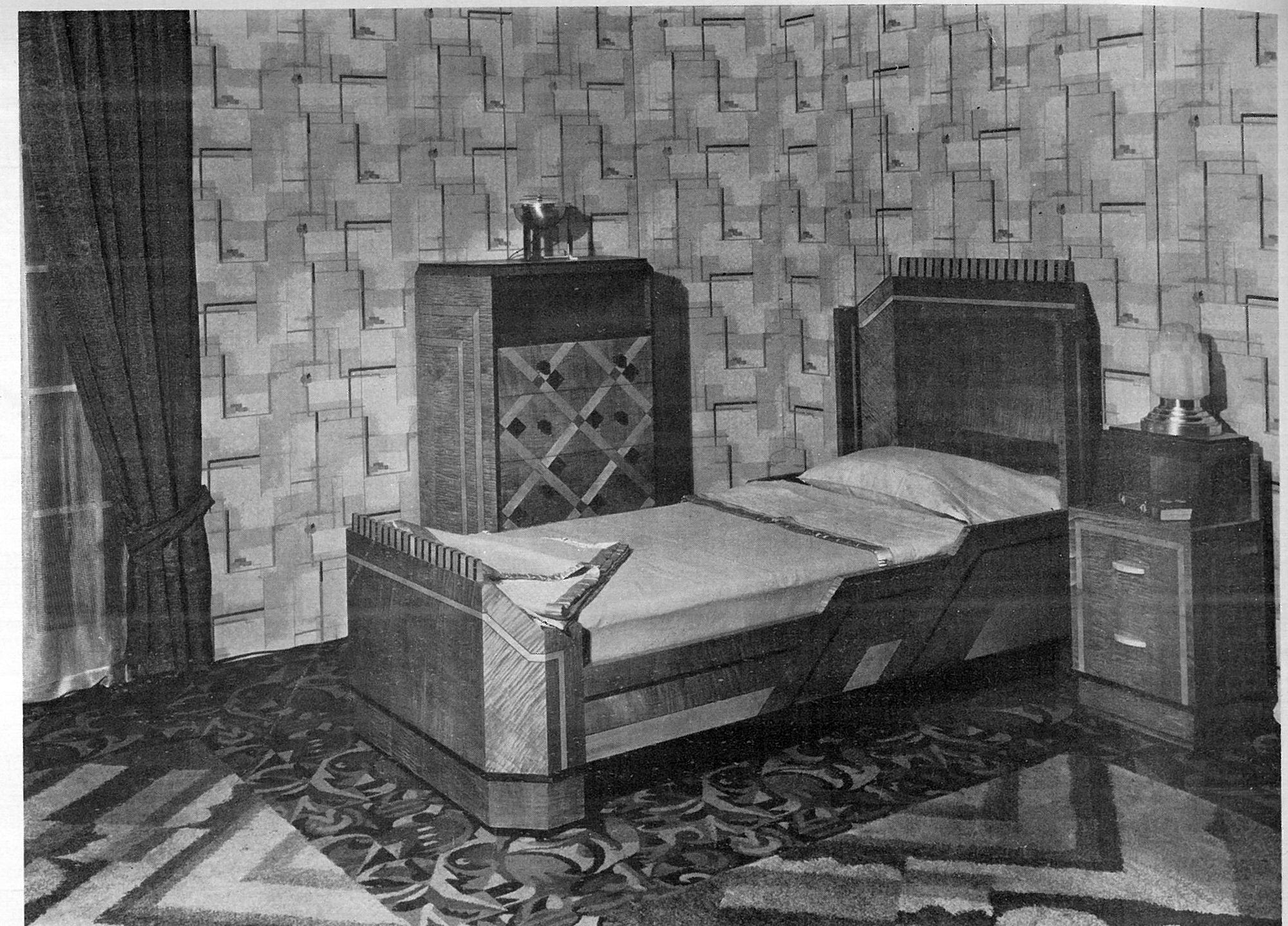
The early iteration of modernist American style, shown in Alon Bement’s bedroom above, was often stylistically complex and, while following the Europeans in disdaining applied ornamentation, American style had plenty of decoration built in. Designers working with department stores and shelter magazines tried to lead, but also defer to, the taste of likely buyers.
It’s an American lesson, but more rightly a New York lesson: commerce married to art can enrich both and actually make lasting contributions to culture and social, although the path is seldom smooth. Recognizing the importance but also the dangers of department store support, designers based in New York “formed associations to promote their work and to mount efforts to prevent design piracy,” says Friedman. In 1928 a large group of designers, architects, and artists established the American Union of Decorative Artists and Craftsmen (AUDAC) in order, in their words, to direct the modern art movement “along more intelligent lines.” The group aimed to bring the sophisticated principles of design promoted in Europe by the likes of the Paris Exposition or the Bauhaus to decorative arts in the U.S.

Designers struggled to make their interiors look distinctly American and appealing. Brooklyn’s AUDAC exhibition was a step forward in showing furniture that was curving rather than harshly angled, with soft almost pudgy upholstery rather than stiff, unforgiving surfaces. The look was low and orderly but not brutally functional. Donald Deskey, who designed interiors for Radio City Music Hall, put rounded corners everywhere, an impulse made easier by the new technology that permitted tubular steel and chrome to be used in lamps and tables. Friedman says, “He channeled the sleekness of Art Deco, but substituted manufactured materials for the expensive, handcrafted natural elements usually associated with the French traditionalists, thus reflecting the developing American interest in adapting technological advances for home use.” He believed, and was proved correct, that industrial materials would be the wave of the future in interior design.
“Their work hinted at a move away from the domination of European concepts of modern design, toward an American version that incorporated multiple strains of European modernism and melded them with ideas and ideals developing at home,” writes Friedman.
The stage was set, particularly in the big cities, led by New York and Los Angeles.

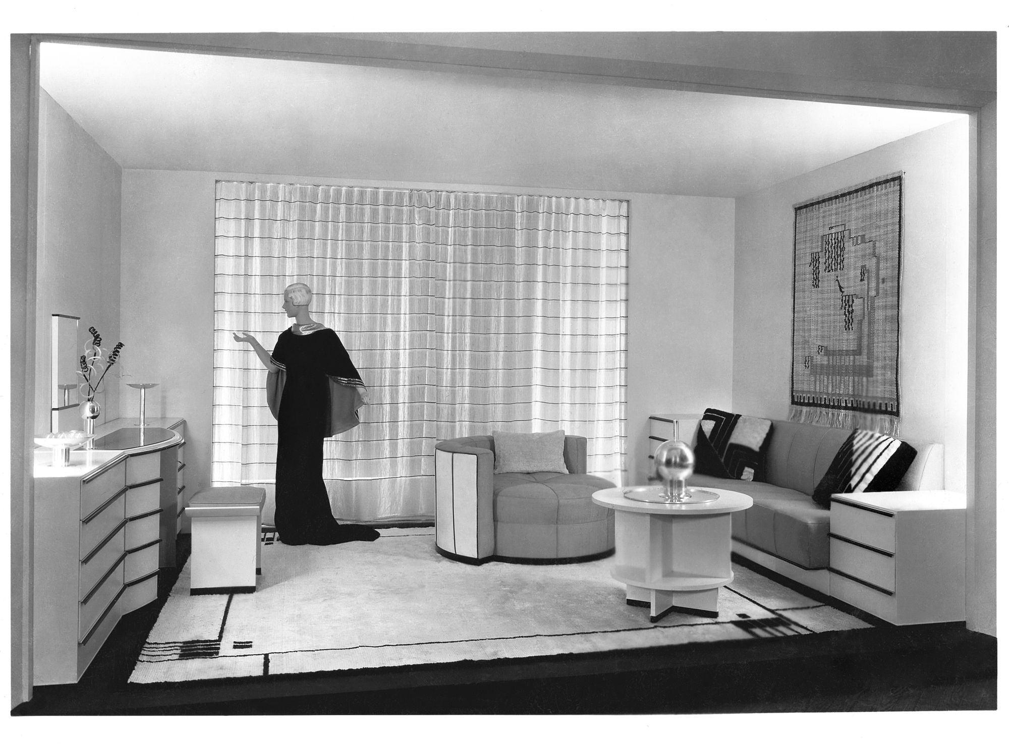
Eliel Saarinen, Room for a Lady at the Metropolitan Museum of Art, New York City, 1934. The Metropolitan Museum of Art. © 2017 Marilyn F. Friedman
The compelling elegance of Eliel Saarinen‘s 1934 room summed it all up: curves, clean lines, metal as an attractive element, recessed lighting, comfortable seating, sparse decorative elements, and subtle storage. The room has a certain icy splendor but who would turn down an invitation from Saarinen’s dazzling manikin?
As social commentators have noted about the current Millennial love affair with Mid-Century, modernism’s ideas are peculiarly suited to urban markets that feature restricted and very expensive living spaces. “Younger generations living in cities are likely living in smaller apartments and condos, so a minimalist aesthetic is more appropriate — perhaps even necessary! — for the size of their spaces,” says Modsy. Except for his rather retro wording, Saarinen’s “Room for a Lady” would be perfect for Modsy’s younger generations living in small spaces today.

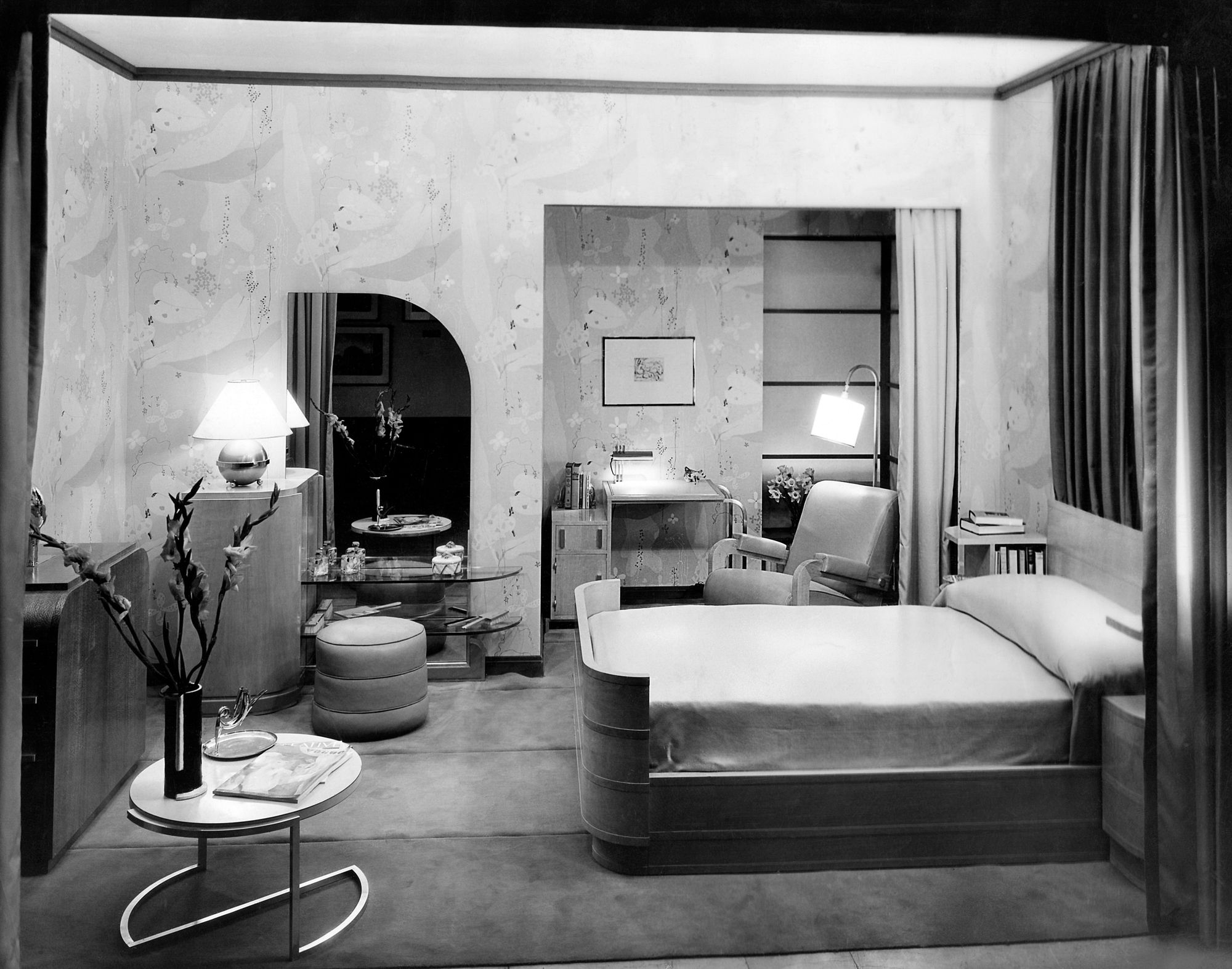
Similarly, Deskey’s Milton dining room above displays American, particularly New York, urbanity. Rather than harsh Bauhaus functionalism, it has curves, recessed lighting, hidden storage, technologically innovative building materials, and a spectacular round mirror.

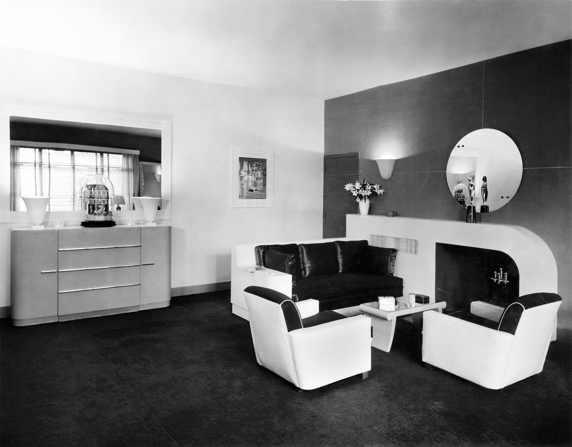
One of the most famous industrial designers in history, Raymond Loewy designed streamlined interiors years before designing streamlined steam locomotives, Lincoln Continentals, Studebakers, Leisurama houses, Le Creuset French ovens, vacuum cleaners, and many more. He even designed the MTA’s R40 subway car for the IND/BMT division, beloved by many for its futuristic, 10-degree slanted end, although it had to be retrofitted with guide and guard rails for safety. An advocate of Streamline Moderne, which stripped Art Deco of its ornament but left the aerodynamic lines, Loewy built his own living room (above) to embody his principles of rounded edges, a horizontal orientation, and chrome hardware. A lovely Art Deco statue on the curved fireplace mantel is shown front and back, thanks to the mirror. Its presence is perhaps meant to express Loewy’s affection for Art Deco, often reviled as pretentious and fraudulent in the 1930s, as a design approach.
Conveying a sense of prosperity but also serenity, Loewy’s living room remains irresistible today, along with his many other renowned creations.

In the end, the 1936 magazine ad for a model living room in the Rockefeller Apartments, itself a model development finished in 1936 and landmarked by New York City in 1984, may say it all. While Friedman says her primary focus is practical modernism for the home, who would not want to live in this fabulous high-gloss apartment? The New York Times wrote (2007) that living here “are a self-selected group of architecture, design and art makers and aficionados, for whom the sans-serif International Style type still found on each front door is a meaningful reality. Owning an apartment here is a bit like owning a Rudolph M. Schindler house in Los Angeles. It’s a club whose membership is determined by eye, not by bank account.”
Today we look back and recognize the 1930s as a defining era for New York City, which, despite the horrors of the Depression, came into its own as a design capital. Friedman’s book is a crucial contribution to our understanding of how and why one phenomenon, cutting-edge interior design, helped New York develop into the city we know today.
Julia Vitullo-Martin is a senior fellow at the Regional Plan Association. Get in touch with her @JuliaManhattan.
Next, check out The Top 10 Most Stunning Art Deco Buildings in NYC
Subscribe to our newsletter