After-Hours Tour of "Noguchi's New York" Exhibit
Join an exclusive curator-led tour at NYC's Noguchi Museum!


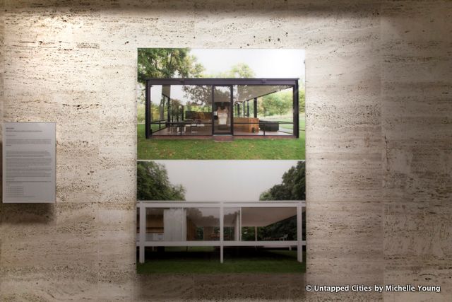
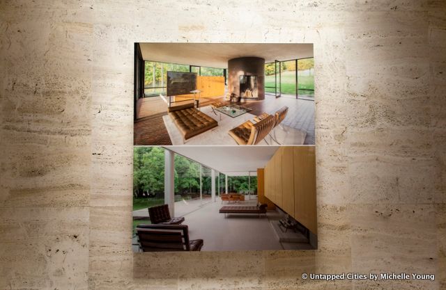
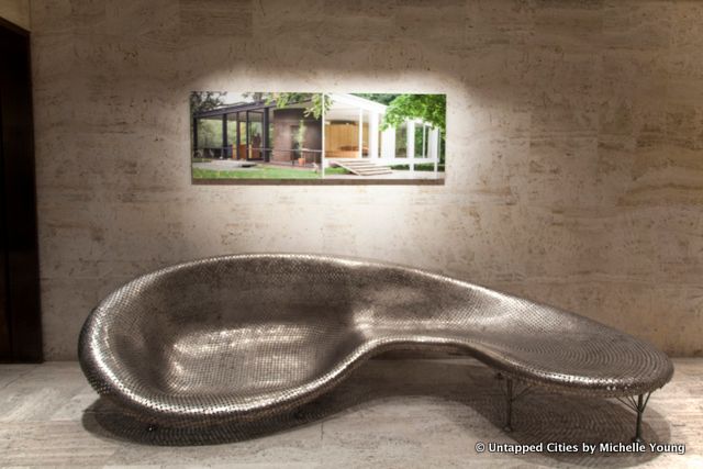
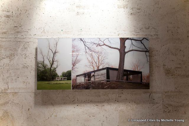
Although the Picasso tapestry at the Four Seasons Restaurant is now on display at the New York Historical Society, the iconic restaurant in New York City’s Seagram Building has offered yet another reason to stop by. A new exhibit, Side by Side by photographer Robin Hill launched yesterday, and for architectural fans it’s a must-see. The Seagram Building by architect Mies van der Rohe is a fitting backdrop, as Philip Johnson designed both the interior of this Park Avenue skyscraper as well as the Glass House in New Canaan, Connecticut. But the juxtaposition of the Glass House and the Farnsworth House–at least in such a formal study–is new.
In fact, Hill told us yesterday at the launch party that when the idea came to him, he did a quick search and was amazed the photographic comparison hadn’t been done before.
But the inspiration for Side by Side can be traced back much further–Hill counts architectural photographer Julius Schulman, most well-known for his image of the Stahl House in Los Angeles, as his hero. They met in 2006 at the opening of the Glass House, three years before Schulman’s death–and Hill’s subsequent work on the Glass House has been published and exhibited widely.

From a theoretical perspective, Hill aims to debunk a commonly held idea about the relationship between the Glass House and the Farmsworth House. As curator Hilary Lewis (co-author of The Architect in His is Own Words and The Architecture of Philip Johnson) writes:
To many, it appeared that Johnson simply jumped the gun on a specific design by Mies–that of the Farnsworth House, which had already been designed, but not yet built. To many admirers of Mies, Johnson had copied the design…and gotten it wrong.

The two architects had met at the Bauhaus and both buildings were designed at just about the same time. One of the most striking photographic comparisons in the exhibit, with the Glass House emerging from an early morning fog, captures the fundamental difference, as articulated by Philip Johnson himself in Philip Johnson: The Architect in His is Own Words
Mies’s was a floating thing, a beautiful rhythm. Mine was a clunky thing that sits on the ground. But I wanted it to sit on the ground. Mine became…an American house, you step one step out and into nature. Mies’s was like Le Corbusier–anti-nature. I was like Frank Lloyd Wright. Nature to Wright was fields, wetlands and wild bushes. Nature to Emerson also was kept nature. My house is a house in the field.

In the full series, available on Hill’s website, you see that he has made comparisons across numerous scales–while the exhibit focuses on comparisons from a macro perspective. In detail shots of the windows, he demonstrates via the reflection of surrounding nature how the Glass House incorporates this into the scene like a decorated wall, whereas the Farmsworth House sets nature apart. He looks at how the same pieces of mid-century furniture are utilized differently–their placement reflecting the inhabitant’s relationship to the exterior world. Even the direction a door opens, photographed in tandem, undergird the central hypothesis, particularly when situated within the whole of the collection.

When asked last night which house is his favorite, Hill sounds almost guilty giving his answer–the Farnsworth House he says, if he had to pick a favorite.
Side by Side is open to the public until September 20th, whenever the Four Seasons Restaurant is open. 50% of the sales benefit the Glass House and the Farnsworth House.
Next, explore further inside the Four Seasons Restaurant and learn about its storied history. Get in touch with the author @untappedmich.
Subscribe to our newsletter