

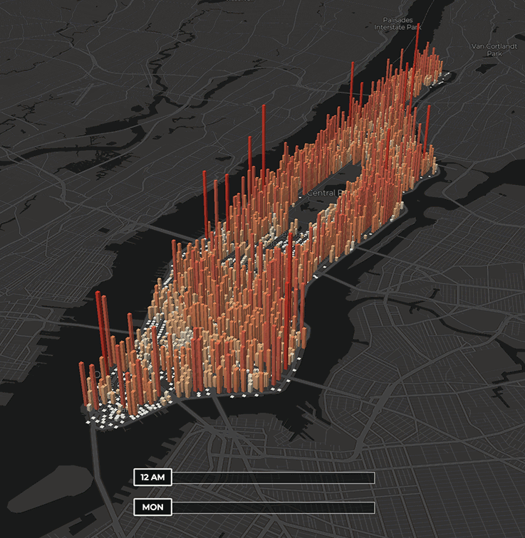
 Gif courtesy @citrusvanilla from manpopex.us ©Mapbox ©OpenStreetMap
Manhattan is a constantly active hub, but a new data visualization map by @citrusvanilla paints a portrait of exactly how many people flow in and out of the borough, hour-by-hour and block-by-block, over the course of a typical Spring week. The visualization, called the Manhattan Population Explorer, uses data from the U.S. Census in conjunction with estimates of subway inflows and outflows — collected from the Metropolitan Transportation Authority’s turnstile database and Steven Romalewski’s MTA subway data — to showcase just how dynamic population movement is. After all, Manhattan is New York City’s most densely populated borough, and it also has the highest ratio of daytime-to-nighttime population (nearly 2 to 1) of anywhere in the United States.
Using two separate sliders that allow you to toggle by hour and by weekday, viewers can compare and contrast population densities for different neighborhoods. According to the map, the 2010 U.S. Census reports that 1.6 million people reside in Manhattan, although the “true overnight population,” as outlined in a NYU Wagner study, is estimated to be 2 million — and beyond that, up to 4 million during the workday as workers and visitors enter in and out. The liveliest hour is, in fact, around 2pm on Wednesdays while Fridays exhibit the lowest peak population levels of the workweek. During the weekend, the lower end is on Sunday around 2am, right before the start of the week.
By no means are these numbers overarching for the borough as a whole. The Population Explorer also segments Manhattan into uptown and downtown sections, which drastically vary in population throughout the workweek. North of Central Park is what’s called a “daytime exporter,” much like the outer boroughs, while below Central Park is a “daytime importer” with the Financial District and Midtown boasting the greatest workday net population increase. There are also exceptions like Morningside Heights, which sees a population increase due to the influx of students from Columbia University, as well as the Lower East Side, which more or less stays population consistent. See the patterns and movement of people yourself via manpopex.us.
