This Fun Maps post is guest-written by Margaret McKenna, Head of Data and Analytics at RunKeeper, a free app for running, cycling and other fitness activities
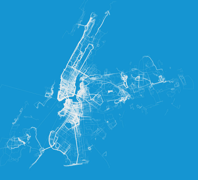
Recently the Flowing Data blog released a series of captivating maps created using public running routes from RunKeeper. Many media outlets picked up the maps, and local newspapers were happy to see a reflection of their hometowns. But tension arose around what the maps meant.
The Flowing Data editor suggested that the maps could be used by public officials for city planning. Meanwhile, The Washington Post’s Know More blog suggested the maps proved that only rich people use apps for fitness. One major problem with each of these arguments was that they assumed that the maps were correct.
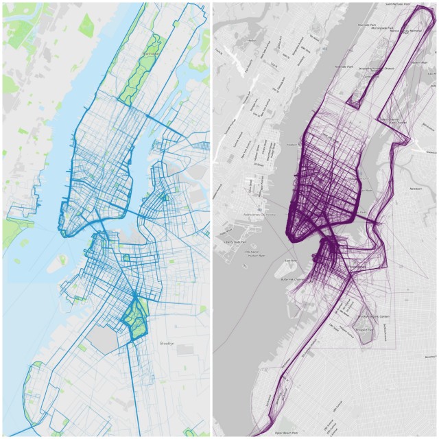 RunKeeper’s map,left, with random data pulled from 2013 in New York City, Flowing Data’s original map at right.
Much has been written about how data visualizations — particularly beautiful, eye-catching ones — can distort the truth, but maps in particular can be a fraught area. Unlike complex graphics, we all know how to read a map. They seem intuitive and natural. They have an air of authenticity. As a result, viewers may be less critical of what the map shows.
Flowing Data’s New York City map offers a great example of how three mapping traps — seasonal bias, location fuzziness, and tagging bias — can lead to a map that does not reflect reality.
There are two things that should immediately tip someone off to the trouble with Flowing Data’s New York City map:
1) There are no running routes in Central Park. Central Park hosts many running races a year, in addition to being one of the world’s most popular running parks. The odds of RunKeeper not having any public routes in Central Park are incredibly low.
2) The most distinctive feature of the NYC map is a conspicuous thick line that starts in Staten Island, heads up through Brooklyn and into the Bronx, and then descends along the east side of Manhattan until coming to a stop in Central Park: the New York City Marathon route. While there were 852 RunKeeper users who ran the New York City marathon last year, that pales in comparison to the more than 30,000 people who ran with RunKeeper in New York in 2013. It wouldn’t be possible for the marathon route to dominate the map like that without under-representing all other runners in New York.
In order to explore what might be wrong with the map, I randomly selected 5,000 public runs from 2013 in New York City, as well as in the nearby communities of Bayonne, NJ, Fort Lee, NJ, Elmont, NY, and Floral Park, NY.**
The resulting map shows entirely different running behavior than the original. I wouldn’t jump to any conclusions about the people running and their socio-economic circumstances, but we feel comfortable saying this is representative of places people run with RunKeeper in New York.
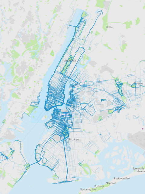 RunKeeper’s map which includes surrounding towns. Parts of all five boroughs are filled in as a result of querying for nearby cities, in addition to New York.
These are the traps the original map fell into:
1) Seasonal bias. Without knowing exactly how the data was pulled, I would wager a fair amount that it was pulled sometime shortly after Nov. 3, 2013. The disproportion of marathon routes compared to everything else, and the complete absence of runs in surrounding parts of Brooklyn suggest this sample is not representative of typical running patterns. Outdoor fitness, more than most things, is highly sensitive to time of year, so a good best practice is to pull a sample that is representative of the entire year.
2) Location fuzziness. There are a million ways you can classify where a run takes place — the starting point, the ending point, a percentage of all the GPS points. There is always a bias there, and unless you know how the classification was done, you have no way to know what areas might get short-shrifted by the method. The best practice here is to label very clearly how the data was bucketed by location.
3) Tagging bias. All of the routes in these maps were tagged by users as “public.” A tiny percentage of overall RunKeeper runs are tagged in this way. In fact, only 10% percent of running routes in New York last year were public. You could imagine that positive things — like a scenic location — could bias people towards making their routes public, and negative things — like safety concerns — could bias people away from making their routes public. Make sure this inherent bias is obvious to your viewers.
Maps can be powerful tools for exploring human behavior, but it’s critical that any and all assumptions that go into the making of the map are revealed to the viewer. Before you jump to conclusions about what a map means, you should have a good understanding both of what’s on the map and what’s below the surface.
See more Fun Maps on Untapped Cities and check out Runkeeper.
**The way we at RunKeeper classify runs by city is to find the nearest town or city to the starting point of a route. The centerpoint of New York City is lower Manhattan. Given that there are parts of New York that are closer to other cities than to lower Manhattan, I included four surrounding cities in my sample: Bayonne, NJ, Fort Lee, NJ, Elmont, NY, and Floral Park, NY.
