 Image via The Standards Manual/Pentagram
When most people think about the New York City subway, they think of the Milanese graphic designer Massimo Vignelli. And when most people think about Vignelli, they think of the typeface Helvetica. Massimo Vignelli arrived in the United States in 1965, and soon started his first project with the New York City Transit Authority. His major work was the New York City Transit Authority Graphic Standards Manual, which unfortunately, was loosely adhered by the NYCTA. The collaboration was not satisfactory to say the least, causing much frustration to the designers, the implementers as well as passengers. Here are 10 secrets of the graphics standard manual, which Vignelli would probably roll over in his graves had he seen the current “designs”.
1. The Typeface Originally Chosen was Standard Medium, not Helvetica

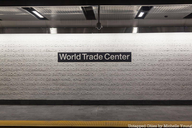
It is widely known that Vignelli was a strong proponent of the Helvetica font, and did express his desire to deploy it to the 1970 manual. Contrary to believe though, the original typeface chosen for the subway signs was not Helvetica, but a very similar typeface – Standard Medium. According to Paul Shaw’s article on AIGA, Helvetica was already offered for sale in New York City at the time, but due to unavailability in American type books as well as barriers in the sign making process, it was “not available” to NYCTA.
In 2011, Paul Shaw’s book Helvetica and the New York City Subway System: The True (Maybe) Story offers readers an in-depth investigation of the emergence of Helvetica in the New York City’s transportation world as well as design world.


