
Insiders Events
The Bodega Cats of NYC
Dan Rimada shares stories from his forthcoming book on the feline residents of NYC bodegas and the people who love them.
Dan Rimada shares stories from his forthcoming book on the feline residents of NYC bodegas and the people who love them.

Get behind-the-scenes insight into the library's latest exhibit!
See how this stunning, historic campus in Chelsea is being restored for a brand new chapter in New York City!


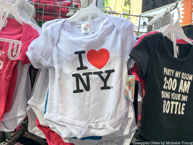
The “I <3 NY” logo is everywhere. It fills souvenir shops, brands billboards and murals, and is found on merchandise around the world. At some point, you’ve probably drank from a logo-branded mug, purchased a keychain for your bag, or perhaps wore the logo on a tee-shirt. Simply put, the logo is a global symbol for New York City ingrained in popular culture. Despite its omnipresence, chances are you’ve never considered how exactly this logo came to flourish. With that said, its history may surprise you—the logo was a quick attempt to help salvage New York City’s failing 1970s economy by saving its tourism industry.
While many associate the logo with New York City, it was actually meant for both the City and State; since its 1977 creation, it’s been used to promote both New York City and New York State tourism. This is why it makes sense that the logo is trademarked by the New York State Empire State Development (ESD), which is the State’s main economic development agency. The ESD is also responsible for licensing the logo’s use to others.
![]() Special “I <3 NY” Metrocards. Image via Wikimedia Commons
Special “I <3 NY” Metrocards. Image via Wikimedia Commons
The story starts during the 1970s, with New York City suffering from an economic crisis and many areas of the city hitting rock bottom. To worsen matters, in 1975, President Ford denied federal aid to rescue the city from bankruptcy, with the Daily News running the headline “Ford to City: Drop Dead.” At the same time, New York City was experiencing historically high crime rates and drug usage. All of this bad publicity gave it a reputation that discouraged tourism, further exacerbating New York City’s already failing economy. It became clear that New York City needed a way to at least boost its morale and reputation—and it needed this fast.
Then came William S. Doyle, then Deputy Commissioner of the New York State Department of Commerce and Mark Donnelly from the Governor’s staff. They hired an advertising agency called Wells Rich Greene to conduct a State marketing campaign, as well as a graphic designer named Milton Glaser to create a campaign logo. Wells Rich Greene came up with the slogan “I Love New York,” accompanied by a hopeful-sounding tune and TV commercial.
![]() The man behind the logo: Milton Glaser in 2003. Image via Wikimedia Commons
The man behind the logo: Milton Glaser in 2003. Image via Wikimedia Commons
All that was left was the logo—which Glaser doodled on the back of an envelope in a taxi on the way to the campaign meeting. His initial design was “I <3 NY” on a single line, and it wasn’t until a little later that Glaser soon “subliminally” decided to stack the “I” and “<3” in a line above “NY,” in the style of Robert Indiana’s iconic, 1970s pop-art sculpture, LOVE.
You can see the logo’s original doodle on the MOMA’s website here.
The logo immediately gained popularity, and wasn’t copyrighted until later in order to allow the logo to flourish and find its way into popular culture. As shown by the logo’s current omnipresence, this success continues today.
The logo experienced a surge of popularity after 9/11, when it became a symbol of unity. During this time, many visitors to New York City purchased “I <3 NY” shirts to show their solidarity. Glaser even created a new version of the logo to commemorate 9/11, changing it to “I <3 NY More Than Ever” with a black spot on the heart to represent the World Trade Center.
On a side note, the logo has become so popular and iconic that cities around the world sell “I <3 NY” merchandise—which has created some problems. As of 2013, NYS filed thousands of trademark objections and cease-and-desist letters. What started as a last-minute doodle in the back of a cab now generates about $30 million annually in official merchandise. What’s even more remarkable is that Glaser designed the logo pro-bono—for free—and to this day, doesn’t receive a cent of the profit.
But what Glaser hasn’t received in money, he’s received in fame. In 2009, he was the first graphic designer to win America’s National Medal of Arts, largely due to the logo’s success. It’s worth noting that Glaser has worked on several significant designs, including the psychedelic poster of Bob Dylan. He’s also worked on designs for the Rubin Museum, Cooper Union, Carnegie Hall, and even ads for Mad Men. He also co-founded New York Magazine! (Is it clear that this guy loves New York yet?)
But why does Glaser himself think the logo was successful? First, he attributes it to the tension between the emotional heart and simplistic geometric letters. He also thinks the fact that people must figure out the logo character by character makes it more meaningful. He said, “You have to figure out that the ‘I’ is a complete word, then you have to figure out that the heart is a symbol for an experience, then you have to figure out that ‘NY’ are the initials for a place. We know that the issue in all communication is moving the brain, and puzzles move the brain. This one makes everyone feel good because they solved the problem.”
And while the logo’s design take elements from Indiana’s LOVE sculpture, Glaser knows that he still created something unique. He said,”My design had a sense of inevitability. The form and the content were united in a way that could not be taken apart.”
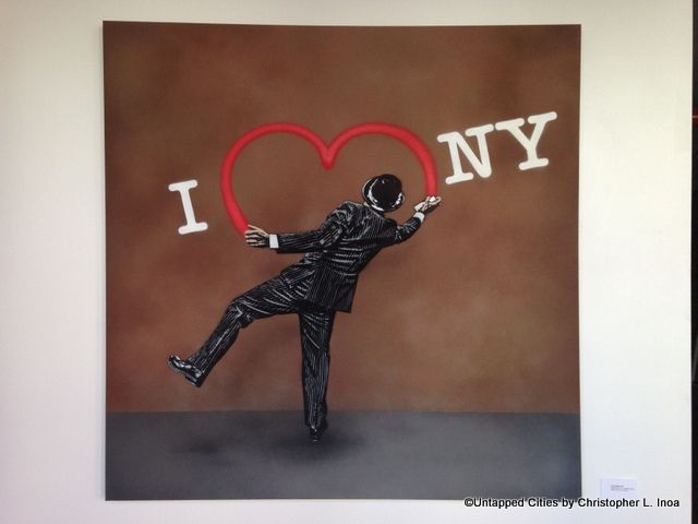 The logo is even found on street art by Nick Walker.
Last but not least, Glaser thinks the fact that the logo came from New York City, which he (rightfully, in our humble opinion) called “the capital of the universe,” ultimately contributed to its worldwide popularity. And it’s a good thing the logo did succeed, as it helped transformed New York tourism into the flourishing industry it is today.
Next, check out NYC Gets Its Own Custom Fonts and Iconography and The Top 10 Secrets of Times Square NYC.

Subscribe to our free newsletters
Free Newsletters
Get the best stories and things to do sent straight to your inbox.