
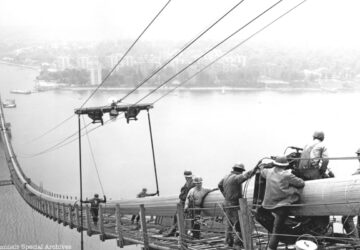
Check out vintage photos of NYC bridges and tunnels run by the MTA, as the agency celebrates its 90th anniversary!
This week, NYC subway station agents will step out of their subway booths and into new roles as they roam around the stations!
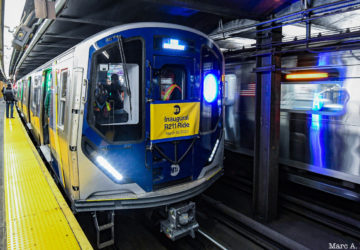
On Friday, straphangers, representatives from the MTA, and local officials took the first ride aboard a new R211 subway car.
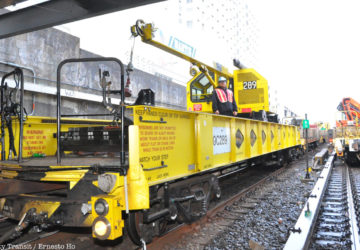
From garbage trains and VakTraks to crane cars and snow blowers, discover the subway cars that help keep the system running!
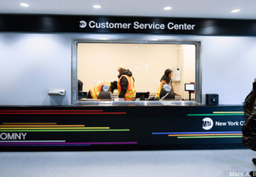
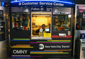
New MTA Customer Service Centers are now open at three NYC subway stations, with more to come across the five boroughs!
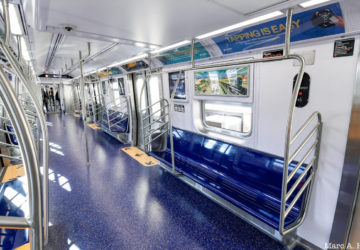
Take a look at the MTA's new R211 subway cars, set to roll out onto the tracks of NYC in spring of this year!
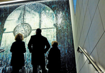
New mosaic art in Penn Station serves as a portal to the past by reimagining an iconic piece of the 1910 building!
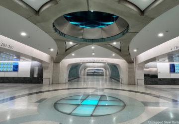
Untapped New York took a ride on the first LIRR train into Grand Central Madison! Come along with us as we explore the new station!
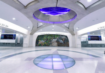
LIRR service into Grand Central Madison is finally set to begin! The first train from is schedules to enter Grand Central on Wednesday.
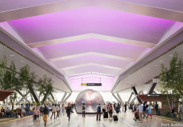
The oldest terminal at JFK Airport, a remnant of its days as Idlewild, has closed to make way for an innovative new terminal!